Beyond the Form: The Blueprint for High-Converting Event Landing Pages
An event landing page is your digital front door, your first handshake with potential attendees. Get it right, and you fill seats, build communities, and create buzz. Get it wrong, and even the most groundbreaking event can fall flat due to a lackluster first impression. The critical difference between a simple registration form and a powerful conversion engine lies in deliberate strategy, intentional design, and a deep understanding of user psychology. This is where your event's success story truly begins.
In this guide, we move beyond generic templates and surface-level advice. We will dissect 8 standout event landing page examples, revealing the specific tactics and replicable strategies that make them so effective. You will learn not just what makes these pages work, but why they work and how you can apply those same principles.
From Apple's minimalist masterpieces and TED's compelling countdowns to SXSW's vibrant digital hubs, you'll gain actionable insights to craft pages that do more than just capture registrations. You'll learn how to build anticipation, communicate value clearly, and convert passive interest into active participation. Prepare to see how the best in the business turn a simple webpage into an essential part of the event experience itself.
1. Apple Keynote Event Landing Page
Apple’s event landing pages are masterful studies in minimalism and brand consistency. They ditch the clutter common on many event pages, opting for a hyper-focused approach that builds immense anticipation. Instead of overwhelming visitors with information, Apple uses a single, powerful hero image or a short, looping video to tell the story. This visual is often a stylized logo for the event or a teasing glimpse of a new product, immediately setting the tone and creating a sense of mystique.
The design philosophy is clear: less is more. The copy is reduced to the absolute essentials, typically just the event name, date, time, and a primary call-to-action like "Add to your calendar" or "Watch the event." This deliberate scarcity of information leverages curiosity, compelling users to tune in to discover what the event is truly about. This strategy makes it one of the most referenced event landing page examples for premium brands.
Strategic Analysis
The core strategy behind Apple's approach is brand-centric mystique. By revealing very little, they elevate the event's perceived value and exclusivity. The confidence to use such a minimalist design stems from their powerful brand recognition. They don't need to sell the event with a long list of speakers or benefits; the Apple brand and the promise of innovation are the main draws.
This approach also ensures an exceptional user experience. The page loads almost instantly on any device, and the single, clear focal point eliminates any confusion about what the user should do next. It’s a design that respects the user's time and intelligence.
Actionable Takeaways
- Prioritize a Single Visual: Use a high-resolution, compelling image or video as the page's centerpiece. This should encapsulate the event's theme or hint at the core announcement.
- Embrace Negative Space: Don't be afraid of white space. It directs the user's eye to the most important elements and creates a clean, premium feel.
- Cut Copy Ruthlessly: Edit your text down to only what is absolutely necessary. Ask yourself: does the user need this information before the event? If not, remove it.
- Focus on One CTA: Provide a single, clear call-to-action. Avoid offering multiple competing options that could lead to decision paralysis.
2. TED Conference Countdown Landing Page
TED’s event pages are masterclasses in building excitement and showcasing value through content. They expertly blend a sense of urgency with deep, compelling information about their speakers and talks. The standout feature is often a dynamic countdown timer, which immediately establishes a deadline and encourages prompt action. This is paired with high-quality imagery of the speakers, instantly conveying the credibility and intellectual weight of the event.
The page design is structured to handle a large amount of information without overwhelming the visitor. It uses a technique called progressive disclosure, where main topics are presented upfront, and users can click to expand sections for more details, such as speaker bios or talk descriptions. This layered approach keeps the initial view clean while still offering the rich content that TED’s audience expects, making it one of the most effective event landing page examples for content-rich conferences.
Strategic Analysis
The core strategy is urgency-driven engagement. By placing a countdown timer front and center, TED creates a psychological trigger that combats procrastination and motivates visitors to secure their spot. This urgency is balanced by a strong demonstration of value. Featuring speakers prominently with their credentials builds authority and answers the visitor's key question: "Why should I attend?"
This infographic illustrates TED's sequential strategy for converting visitor interest into attendee registration.
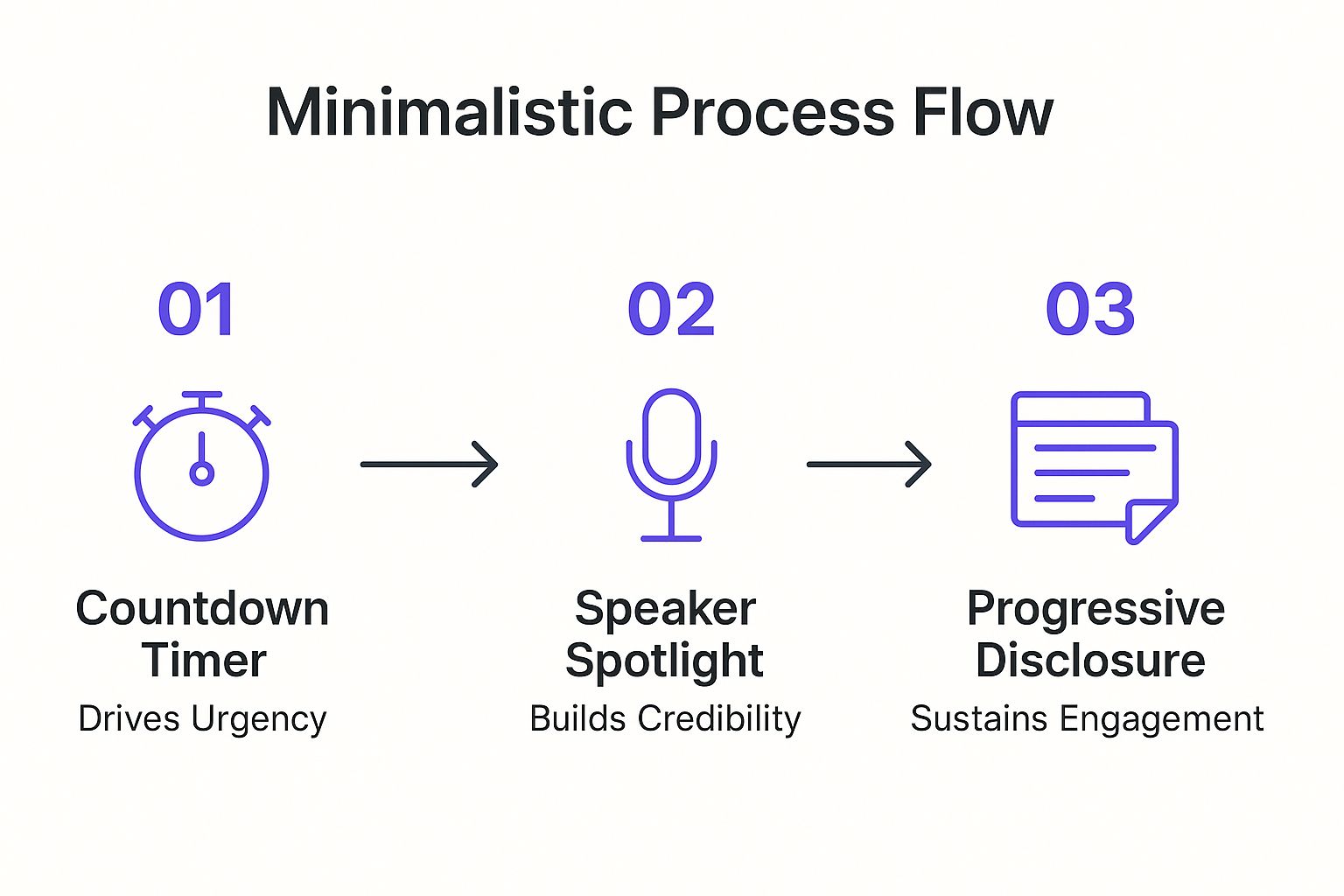
The flow from creating urgency to building credibility and then sustaining engagement with deep content creates a powerful and persuasive user journey. The use of progressive disclosure is crucial for user experience, preventing cognitive overload and allowing visitors to explore content at their own pace, which deepens their investment in the event.
Actionable Takeaways
- Implement a Countdown Timer: Add a visible countdown timer to your landing page to create a natural sense of urgency and drive immediate conversions.
- Spotlight Your Speakers: Dedicate significant visual space to your speakers. Use professional headshots and highlight their key credentials and accomplishments to build credibility.
- Use Progressive Disclosure: Organize dense information like schedules or bios into expandable sections. This keeps the page clean and allows users to self-select the information they care about most.
- Weave in Social Proof: Integrate testimonials, logos of past attendees' companies, or social media feeds to reinforce the event's value and build trust.
3. SXSW Festival Hub Landing Page
Where some events focus on a single announcement, multi-day festivals like South by Southwest (SXSW) face a different challenge: managing overwhelming complexity. Their landing pages masterfully act as a central hub, organizing a massive schedule of music, film, and interactive sessions into a digestible and engaging experience. The design uses vibrant, eclectic visuals and a dense but organized layout that perfectly captures the festival's high-energy, creative spirit.
Instead of minimalism, SXSW embraces a "more is more" philosophy, but with structure. They provide visitors with all the information they could possibly need, from schedules and venue maps to speaker bios and featured artist lists. The key is how they organize this data, using clear navigation, powerful search tools, and filters to empower users to build their own custom itinerary. This approach makes it one of the best event landing page examples for large-scale, multi-track conferences and festivals.
Strategic Analysis
The core strategy is information empowerment. SXSW understands its audience is diverse, with attendees coming for vastly different reasons. The landing page's primary goal is not just to sell tickets but to serve as an indispensable tool for attendees before and during the event. By providing comprehensive information and intuitive tools to navigate it, they enhance the overall festival experience and increase attendee engagement.
This "hub" approach turns the landing page into a long-term resource rather than a one-time registration portal. The inclusion of interactive schedules and personalized planning tools encourages repeat visits, keeping the audience connected and informed. It’s a strategy built on utility, positioning the website as a crucial part of the event itself. For those looking to build a similar resource, you can learn more about creating a complete event website.
Actionable Takeaways
- Implement Robust Navigation: For complex events, use clear top-level menus, sub-menus, and breadcrumbs. Categorize content logically by track, date, or event type.
- Integrate Search and Filtering: A powerful search bar is non-negotiable. Allow users to filter results by specific criteria like speaker, venue, topic, or date to quickly find what interests them.
- Prioritize a Mobile-First Experience: Attendees will be accessing the schedule on their phones while on the ground. Ensure the entire site, especially the schedule and map features, is flawlessly responsive and fast on mobile devices.
- Use Visuals to Delineate Sections: Employ distinct colors, icons, or background imagery for different festival tracks (e.g., Music, Film, Interactive) to help users orient themselves visually.
4. Webinar Registration Landing Page
Webinar landing pages are conversion machines, meticulously designed for a single purpose: lead generation. Unlike brand-focused event pages, these are built around a clear value exchange. Visitors provide their contact information in return for access to valuable educational content. Companies like HubSpot and Zoom have perfected this format, using a direct-response approach that emphasizes the tangible benefits attendees will receive, such as new skills, industry insights, or professional development.
The layout is typically formulaic yet effective. A powerful, benefit-driven headline grabs attention, followed by bullet points that clearly outline what the attendee will learn. Key details like the date, time, and speaker credentials are presented prominently to build credibility and urgency. The centerpiece is a short, simple registration form, often placed above the fold to minimize friction and maximize sign-ups.
Strategic Analysis
The core strategy is direct value proposition and conversion optimization. Every element on the page is engineered to answer the visitor's question, "What's in it for me?" and guide them toward the registration form. The focus is not on mystique but on clarity and persuasion. Social proof, such as logos of companies that have attended past webinars or testimonials, is often used to overcome skepticism and build trust with a new audience.
By making the registration process as seamless as possible, these pages reduce drop-off rates significantly. This is a critical component of many B2B marketing funnels, where webinars serve as a primary tool for capturing and qualifying new leads. The success of these event landing page examples is measured not by buzz, but by a hard metric: the conversion rate.
Actionable Takeaways
- Lead with Benefits: Your headline should promise a clear outcome or solution, not just state the webinar topic. Focus on what attendees will be able to do after watching.
- Simplify the Form: Only ask for the information you absolutely need. Every additional field you add increases friction and can lower your conversion rate.
- Showcase Your Speakers: Include a photo and a brief, impressive bio for your speaker(s). Highlighting their expertise builds credibility and makes the content seem more valuable.
- Incorporate Social Proof: Add testimonials, logos of well-known attendees, or impressive statistics (e.g., "Join 5,000 other marketers") to build trust.
5. Music Festival Visual-First Landing Page
Music festival landing pages are an explosion of color, motion, and sound, designed to transport the visitor directly into the event's atmosphere. Unlike corporate pages, their goal is to sell an experience, not just convey information. They achieve this through a visual-first approach, using stunning photography from past events, dynamic video montages, and bold, artistic typography. The entire design works to capture the energy and community vibe that defines festivals like Coachella or Lollapalooza.
The primary content is often the artist lineup, presented not as a simple list but as a visually engaging poster or interactive grid. This focus on performers taps directly into the main purchasing driver for attendees. While visually rich, the best of these pages still provide clear pathways to purchasing tickets, viewing schedules, and finding logistical information, making them a masterclass in balancing aesthetics with function. This immersive style makes them a crucial category of event landing page examples for experience-driven marketing.
Strategic Analysis
The core strategy is experiential immersion. The goal is to make the visitor feel the event before they even buy a ticket. By prioritizing high-energy visuals and showcasing the artist lineup prominently, these pages build emotional connection and FOMO (fear of missing out). The design isn't just decoration; it's a direct reflection of the event's brand and the promised experience, whether it's the desert chic of Coachella or the eclectic energy of Bonnaroo.
This approach acknowledges that the decision to attend a festival is emotional and social. The visuals provide social proof of the fun and community, while the artist lineup provides the rational justification. The page becomes a shareable asset in itself, with fans often posting the lineup poster on social media, turning the landing page into a viral marketing tool.
Actionable Takeaways
- Invest in High-Quality Visuals: Use professional photos and videos from past events. Generic stock imagery will destroy the authenticity.
- Make the Lineup a Centerpiece: Design the artist lineup to be visually exciting and shareable. Don't just list names; create a piece of art.
- Create an Immersive Atmosphere: Use background videos, vibrant color schemes, and unique typography that reflect your event's specific brand and genre.
- Ensure Visuals Don't Hinder Navigation: Despite the visual focus, make the "Buy Tickets" CTA impossible to miss. Use sticky navigation or contrasting colors to ensure it stands out.
6. Corporate Conference Professional Landing Page
Corporate conference landing pages, like those for Salesforce's Dreamforce or Adobe Summit, are masterful exercises in balancing professionalism with compelling engagement. They eschew the minimalist mystique of a product launch for a structured, information-rich approach. The goal is to clearly articulate business value, presenting a comprehensive overview that allows potential attendees, and their managers, to justify the investment in time and money. These pages are built on a foundation of credibility and trust.
The design is meticulously organized, using a hierarchical layout to guide visitors through key information sections. This typically includes featured speakers, session tracks, networking opportunities, and detailed agenda breakdowns. Unlike a B2C event, the copy focuses on tangible outcomes like professional development, learning new skills, and ROI. This makes it a benchmark for event landing page examples in the B2B space.
Strategic Analysis
The core strategy is value-driven persuasion. Every element on the page is designed to answer the attendee's primary question: "What will I or my business gain from attending?" It builds a business case for attendance through social proof, expert authority, and clear articulation of benefits. The use of high-quality professional photography and consistent corporate branding reinforces a sense of polish and reliability.
By providing detailed information upfront, these pages cater to a longer decision-making cycle common in corporate environments. They often include multiple CTAs tailored to different stages of awareness, such as "Register Now," "View Agenda," or "Convince Your Boss," with downloadable justification letters. This multi-pronged approach respects the professional's need for thorough research before committing.
Actionable Takeaways
- Highlight Learning Outcomes: Clearly state what attendees will learn and how they can apply it to their jobs. Frame sessions and workshops around tangible skills and business value.
- Feature Credible Speakers: Showcase your speakers with professional headshots and brief bios highlighting their expertise and accomplishments. Their authority lends credibility to your event.
- Provide Clear Registration Tiers: Display pricing and package options in a clear, easy-to-compare format. Be transparent about what each registration level includes.
- Incorporate Social Proof: Use testimonials from past attendees, logos of companies that have attended, and statistics on attendee numbers to build trust and create a sense of community.
7. Product Launch Event Landing Page
Product launch event pages are purpose-built to generate maximum anticipation and excitement around a new offering. These pages are masterclasses in balancing mystery with tangible value, combining teaser content, exclusive access opportunities, and compelling value propositions to drive registrations and build buzz long before the official reveal. Companies like Tesla and Google have perfected this model for their vehicle launches and I/O developer conferences.
Unlike a standard webinar page, a product launch page functions as the central hub of a much larger marketing campaign. It uses powerful, aspirational imagery and carefully crafted copy that hints at a problem-solving innovation without giving everything away. The primary goal is to capture leads, often through an email signup for launch notifications or a pre-registration form, creating a captive audience for the reveal. This focused approach makes it a critical part of the best event landing page examples for innovation-led brands.
Strategic Analysis
The core strategy here is controlled information release and community building. By teasing features and benefits without a full disclosure, these pages create an information gap that fuels curiosity and social media chatter. The use of exclusive language like "Be the first to know" or "Get exclusive access" fosters a sense of an inner circle, making potential customers feel special and creating urgency.
This approach effectively turns a simple announcement into a must-see event. It segments an engaged audience who has explicitly raised their hand, showing interest. This pre-qualified list is invaluable for follow-up marketing, early-bird offers, and building initial sales momentum. For those looking to create their own, it's beneficial to explore how to make a stunning event website with RSVP to manage this influx of early adopters.
Actionable Takeaways
- Balance Mystery and Information: Hint at the problem your new product solves and the value it delivers without revealing all the details. Use silhouette images or vague but exciting copy.
- Implement a Strong Lead Capture: The main call-to-action should be focused on capturing an email address. Offer a clear incentive, such as launch-day reminders, exclusive content, or an early-bird discount.
- Use Countdown Timers: A countdown timer is a powerful visual tool that builds anticipation and injects a tangible sense of urgency, compelling visitors to act now.
- Create a Shareable Experience: Encourage visitors to share their excitement. Include easy-to-use social sharing buttons with pre-populated messages like, "I just signed up for the reveal of Product Name! You should too."
8. Charity Gala Storytelling Landing Page
Charity gala landing pages transform a simple event invitation into a powerful, mission-driven narrative. Instead of focusing solely on the glamour of the evening, these pages leverage emotional storytelling to forge a deep connection between the attendee and the cause. They use compelling human stories, impactful imagery, and transparent data to illustrate why the event matters, making attendance feel less like an obligation and more like a meaningful contribution.

The design often blends elegance with authenticity. You'll see high-quality photos of the people the organization serves alongside professional event details. The copy moves beyond logistics to answer the crucial question: "What impact will my attendance have?" This is often achieved through beneficiary testimonials, videos, and clear metrics showing how funds raised will be used. This approach makes it a standout among event landing page examples for its ability to drive conversions through connection, not just benefits.
Strategic Analysis
The core strategy is mission-driven persuasion. Non-profits understand that donors and attendees are motivated by emotion and a desire to make a difference. The landing page acts as the primary vehicle for conveying this emotional appeal. By leading with the "why" (the cause) before the "what" (the event details), they frame the gala as an opportunity to be part of a solution.
This narrative-first approach builds trust and urgency. Visitors see the faces and read the stories of those they can help, making the call-to-action to buy a ticket or donate feel more personal and immediate. It also provides a strong value proposition that extends beyond a nice dinner; the real value is the impact created. Prominently featuring sponsors also serves as social proof, signaling that other respected entities support the cause.
Actionable Takeaways
- Lead with a Human Story: Start your page with a compelling photo, video, or short story about a beneficiary. Make the mission tangible and personal from the very first scroll.
- Show, Don't Just Tell, the Impact: Use specific impact metrics. Instead of saying "your donation helps," say "a $150 ticket provides 50 warm meals."
- Integrate Multiple Giving Options: Alongside ticket sales, include a clear and accessible "Donate Now" button for those who cannot attend but still wish to support the cause.
- Highlight Key Supporters: Create a dedicated section to recognize sponsors and key partners. This adds credibility and acknowledges their crucial role, encouraging future partnerships.
Event Landing Page Examples Comparison
| Landing Page Type | Implementation Complexity 🔄 | Resource Requirements ⚡ | Expected Outcomes 📊 | Ideal Use Cases 💡 | Key Advantages ⭐ |
|---|---|---|---|---|---|
| Apple Keynote Event Landing Page | Low - minimalist and focused design | Low - single hero image/video, text | High impact anticipation, brand recognition | High-profile product/event reveals | Clear focus, fast loading, strong brand |
| TED Conference Countdown | Medium - dynamic timers & interactive | Medium - regular updates, multiple tiers | Drives urgency, sustained engagement | Conferences with diverse content and speakers | Creates urgency, showcases credibility |
| SXSW Festival Hub | High - multi-track, interactive maps | High - complex content management | Encourages exploration & community building | Large multi-event festivals | Handles complexity, builds community |
| Webinar Registration | Low - streamlined forms & focused copy | Low - simple forms, benefit-driven copy | High conversions, lead generation | Educational webinars & training sessions | High conversion, easy optimization |
| Music Festival Visual-First | Medium - rich visuals, interactive elements | Medium-High - video, graphics assets | Emotional connection, shareability | Music festivals emphasizing atmosphere | Emotional impact, strong fan engagement |
| Corporate Conference Professional | Medium - structured info hierarchy | Medium - speaker bios, agenda, testimonials | Builds credibility, appeals to business | B2B conferences and professional events | Professionalism, clear info, lead generation |
| Product Launch Event | Medium - teaser content, multimedia | Medium - multimedia & community features | Builds buzz, exclusivity, high engagement | New product reveals & innovation-focused events | Drives excitement, audience building |
| Charity Gala Storytelling | Medium - narrative & impact focus | Medium - storytelling, donation setup | Emotional connection, attendance, donations | Fundraising galas and non-profit events | Strong emotion, mission communication |
Synthesizing Success: Your Action Plan for a Winning Event Landing Page
Throughout this exploration of diverse event landing page examples, a clear theme emerges: the most effective pages are never just digital flyers. They are meticulously crafted conversion engines, built on a foundation of strategic intent, psychological triggers, and user-centric design. We've seen how Apple uses minimalist precision to spotlight value, how TED masterfully builds anticipation with urgency, and how charity galas leverage powerful storytelling to connect on an emotional level.
The journey from a passive visitor to an engaged attendee is paved with intentional choices. Your landing page is the critical first step in that journey, setting the tone for the entire event experience. It's where you transform curiosity into commitment.
Core Principles for Your Next Event Landing Page
Distilling the insights from our analyzed examples, several core principles stand out as universally applicable. Before writing a single line of copy or choosing a hero image, ground your strategy in these key areas:
- Define Your Primary Conversion Goal: What is the single most important action you want a visitor to take? Is it registering for a webinar, buying a festival pass, or signing up for launch notifications? Every element on your page, from the headline to the CTA button, must support this singular goal.
- Embrace Targeted Design: A corporate conference page demands a different aesthetic than a vibrant music festival hub. Your design choices, color palette, and typography must align with your brand identity and, more importantly, resonate with the expectations of your target audience.
- Communicate Value, Not Just Features: Don't just list speakers; explain what attendees will learn from them. Don't just show a schedule; frame it as a day of transformative experiences. As seen in the product launch and webinar examples, successful pages focus on the "what's in it for me" for the attendee.
Turning Inspiration into Action
Armed with these event landing page examples, you are now equipped to build a high-performing asset for your next campaign. The key is to move from passive inspiration to active implementation. Start by auditing your current landing page process against the successful strategies we’ve discussed. Identify one or two key tactics, whether it’s adding a countdown timer for urgency, incorporating social proof through testimonials, or clarifying your value proposition above the fold.
Remember, a great landing page is just one part of a larger ecosystem. To truly maximize its impact, you must ensure the post-registration experience is just as seamless. For many, this means optimizing the entire funnel by automating your sales processes to efficiently manage new leads, nurture interest, and drive conversions long after the initial sign-up. By connecting your front-end marketing with a powerful back-end system, you create a cohesive journey that turns registrants into loyal brand advocates.
Ready to build a landing page that not only looks great but also fills your virtual or physical seats? Take the friction out of the final conversion step. Explore how Add to Calendar PRO can automatically generate optimized event landing pages complete with customizable RSVP forms and the essential "Add to Calendar" functionality every attendee needs.