Think of an event landing page as a purpose-built webpage with one mission and one mission only: getting people to register for your event. It’s not like a regular website with dozens of pages and potential distractions. Instead, it’s a clean, direct path designed to take someone from "I'm curious" to "I'm in."
Why Your Event Landing Page Is Your Most Important Asset
Don't think of your event landing page as just another page on your site. Picture it as your most valuable team member. It’s your 24/7 salesperson, the central hub for every marketing campaign you run, and the very first handshake that builds trust with potential attendees.
Every email, social media ad, and blog post you publish will probably point right back to this one page. Its performance doesn't just nudge sign-ups along; it flat-out determines the success and potential of your entire event.
The Central Hub for Your Marketing
Consider all the places you're promoting your event - email newsletters, LinkedIn posts, X (formerly Twitter), and paid ads. They all need to lead somewhere. A well-designed landing page creates a single, unified experience for everyone, no matter how they found you.
This consolidation is incredibly powerful. It means every potential attendee gets the same core message, sees your consistent branding, and follows the exact same steps to register. It cuts out confusion and smooths the journey from discovery to commitment.
A Powerful Engine for Conversions
A generic webpage is like a hotel lobby with lots of doors and signs pulling you in different directions. An event landing page, on the other hand, is the VIP entrance with a red carpet leading to a single destination: registration. Every single element, from the headline down to the final button, is there to persuade and convert.
This focused approach really pays off. While the median conversion rate across all industries is a respectable 6.6%, the events industry often sees an impressive 12.3% - nearly double the average. This shows just how effective a dedicated page can be. You can explore more data on landing page performance to see the full picture.
A polished, professional page immediately signals credibility. People are more likely to commit their time and money to an event when it looks legitimate and trustworthy from the very first click.
Building Anticipation and Trust
A great landing page does more than just take registrations. It’s a storytelling tool. It doesn't just list speakers and dates; it builds genuine excitement and clearly communicates the value of showing up. It uses strong copy, great visuals, and social proof to answer the one question on every visitor's mind: "What's in it for me?"
This page is your prime opportunity to:
- Establish Credibility: Show off your sponsors, highlight your amazing speakers, and share glowing testimonials from past attendees.
- Create Urgency: Use a countdown timer or mention that "early bird" tickets are limited to encourage people to act now.
- Eliminate Friction: Give them all the details they need - the agenda, location info, and a solid FAQ section - to clear up any doubts that might stop them from signing up.
When you do this right, registration stops feeling like a chore and becomes the exciting first step of the event experience itself.
The Anatomy of a Page That Drives Registrations
A fantastic event landing page doesn’t just happen. It's a machine, carefully put together, where every single piece has a job - guiding a visitor from just being curious to actually signing up. Think of it like a blueprint for persuasion. Get the structure right, and the conversions will naturally follow.
The whole page needs to answer four questions for a visitor almost instantly: What is this event? Why should I care? When and where is it? And how do I sign up? A winning page makes the answers to these questions obvious and exciting, leaving no space for confusion.
Here, we'll break down the essential elements that every high-converting event landing page needs. Think of this as your checklist for turning casual browsers into confirmed attendees.
| Element | Purpose | Best Practice Example |
|---|---|---|
| Compelling Headline | Grab attention and state the core benefit immediately. | Instead of "Marketing Conference 2024," try "Master Advanced Marketing in Two Days." |
| Persuasive Copy | Tell a story, answer questions, and build excitement. | Detail the sessions, speakers, and what attendees will learn, using clear and engaging language. |
| Captivating Visuals | Show, don't just tell. Convey the event's energy. | Use high-quality photos or a short video from a past event to create an emotional connection. |
| Trust-Building Social Proof | Reduce skepticism and prove your event's value. | Display sponsor logos and feature glowing testimonials from previous attendees. |
| Frictionless Registration Form | Make signing up as easy as possible. | Keep the form short, asking only for essential info. Use a clear call-to-action button. |
| Clear Call-to-Action (CTA) | Guide the user to the next step without any guesswork. | Use action-oriented text like "Save Your Spot" or "Register Now!" on a prominent button. |
Each of these parts works together to build a case for your event. Let's dig a little deeper into how they function.
The Foundational Elements of Conversion
While every event has its own unique flavor, the building blocks of a great landing page are pretty consistent. These are the non-negotiables that form the backbone of your registration strategy. Nailing these is your first step to filling every seat.
- A Headline That Hooks: This is your first impression. It has to grab someone's attention right away and be driven by the benefit to the attendee. Focus on the outcome.
- Copy That Persuades: Good copy tells a story. It paints a picture of the event experience, anticipates questions, and eases any doubts a potential attendee might have. Every word should serve the goal of getting them to act.
- Visuals That Captivate: A picture really is worth a thousand words. High-quality images or videos from past events can instantly communicate the energy and value of being there. They break up text and create an emotional hook that words alone can't.
Building Trust and Credibility
Before anyone commits their time or money, they need to trust you. Social proof is your best tool for building that trust on the spot. It's a powerful signal that your event is legitimate, valuable, and worth the investment.
According to a survey by Cvent, for nearly half of large-scale event planners, total registrations and attendance are the ultimate benchmarks for success. Trust is the currency that buys those registrations, and social proof is how you earn it.
Showing off the logos of well-known sponsors or partners gives your event instant credibility. In the same way, featuring testimonials from past attendees offers real, relatable proof that other people found it worthwhile.
The Path of Least Resistance
The final, and you could argue most critical, piece of the puzzle is the sign-up process itself. All the amazing copy and social proof in the world won't matter if registering is a pain. Friction is the number one enemy of conversion.
Your registration form should be as short and simple as you can possibly make it, asking only for what you absolutely need. Every extra field is another chance for someone to give up and leave. And your call-to-action (CTA) button? It needs to be impossible to miss, with direct, action-focused text like "Save Your Spot."
Below is a great visual of how you can test different versions of a form to see what works best.
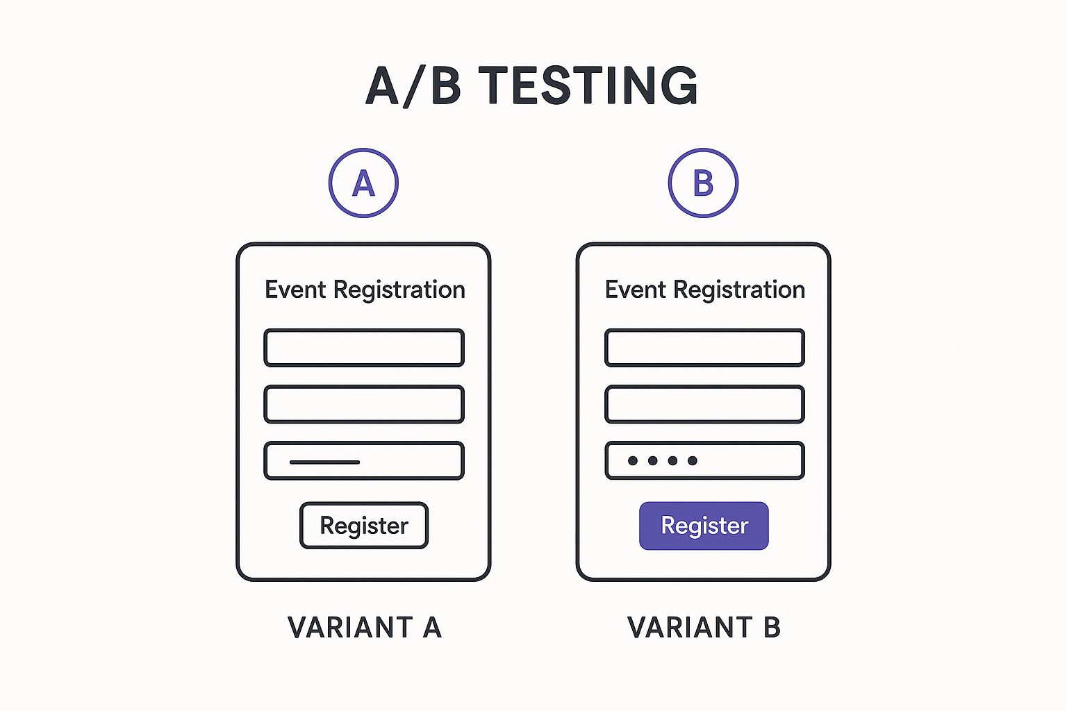
This graphic shows how even small tweaks, like cutting down the number of fields, can be A/B tested to find the version that gets more people to complete the sign-up process. It's all about making it easier for them to say yes.
Making Your Event Discoverable with Smart SEO
Building a fantastic event landing page is a great start, but it's only half the battle. If people can't find it, does it even exist? This is where Search Engine Optimization (SEO) steps in.
Think of SEO as giving search engines a crystal-clear map to your event. It guides them so they can lead the right people straight to your registration page.
This isn't just about stuffing a few keywords into your text and hoping for the best. Smart SEO for event landing pages is a more thoughtful process. It's about making sure that when someone searches for "digital marketing workshop in Chicago," your page doesn't just show up - it stands out. This is how you attract people who are genuinely looking for what you're offering.
Your goal isn't just traffic. It's qualified traffic. You want visitors who are ready to stop browsing and start registering.
Mastering On-Page SEO Fundamentals
On-page SEO is like the basic signage for your event. These are the first things search engines look at to figure out what your page is all about. Getting them right is absolutely fundamental to being seen.
Your page's title tag is the clickable headline people see in the search results. It needs to be direct, include your main keyword (like the event name), and specify the location or if it's "virtual." For example, "InnovateTech AI Conference 2024 | San Francisco" works much harder than a simple "InnovateTech."
Next up is the meta description. This is the little blurb of text under the title in search results. While it doesn't directly influence your rank, a great meta description works like ad copy, convincing people to click by highlighting why they should attend.
Finally, your page headings (H1, H2, H3) give your content structure for both humans and search engines. Your main event title should always be an H1. Use subheadings for sections like "Agenda," "Speakers," and "Venue Details." This clean structure makes your page easy to read and helps search engines understand the key topics. For a more detailed look, check out an ultimate guide to on-page SEO.
The Power of Event Schema Markup
Okay, so you've nailed the basics. Now for the secret weapon: Event Schema. This is a special bit of code you add to your page that basically speaks search engine language.
Imagine handing Google a perfectly organized flyer for your event. Instead of letting it guess the details, you're literally pointing out, "This is the name, here's the date, this is the time, and here's the location." That's exactly what Event Schema does. It eliminates any guesswork for search engines, allowing them to understand and classify your event information perfectly.
By implementing Event Schema, you enable search engines to display your event in "rich results." These are the eye-catching listings you see at the top of a search page, often featuring dates and locations prominently, which can dramatically increase click-through rates.
This structured data is the key to getting noticed. When Google can confidently read your event details, it's far more likely to feature your page in special event-focused search formats. This is a huge deal for catching the eye of people actively looking for things to do.
Automating SEO for Better Discoverability
Let's be honest - manually adding and managing Event Schema can feel intimidating, especially if you're not a developer. The code has to be just right, or it simply won't work.
This is where automation becomes a lifesaver. Our service, Add to Calendar PRO, handles all of this for you. When you create an event page using our platform, we automatically generate an SEO-optimized landing page that includes perfectly formatted Event Schema. No coding, no debugging, no headaches.
- Effortless Implementation: We manage all the technical stuff in the background, making sure your event is instantly understood by search engines like Google.
- Maximum Visibility: This built-in optimization helps your event show up in those valuable rich results, pulling in more clicks from people who are truly interested.
- Focus on Your Event: You can get back to promoting your event, knowing the technical SEO is already taken care of.
If you're curious about the nitty-gritty, you can learn more about how Event Schema works and see why it’s so vital for event marketing today. By automating this crucial step, you make sure your landing page isn't just a destination - it's a magnet for organic traffic.
From Registered to Attending: Closing the Commitment Gap
Getting someone to hit that "Register" button feels like a win, and it is! But it’s not the finish line. The real victory is getting them to actually show up.
What happens in the moments right after they sign up is absolutely critical. This is your window to turn a casual registrant into someone who is genuinely planning to be there. It’s a shift from chasing sign-ups to nurturing the ones you’ve already earned.
The journey doesn't end with a click. A whole new phase begins, and your follow-up game needs to be on point. After all the effort you put into a killer landing page, knowing how to effectively follow up with sign-ups is what separates a packed event from a list of no-shows. A weak follow-up process can kill your attendance rates.
A huge part of this is closing what we call the "commitment loop." Someone might register with the best intentions, but life is busy. Forgetting about your event is a surprisingly common problem, leading to high no-show rates even for things people were excited about.
Turning a Registration Into a Real-Life Reminder
So, what's the most powerful way to lock in that commitment? Get your event on their personal calendar.
A calendar entry isn't just another notification. It’s a persistent, visible reminder that lives right next to their most important daily appointments. It becomes part of their schedule, making them far more likely to plan their day around it.
This is where a little automation changes everything. Instead of hoping they'll remember to add it manually, you can make it a seamless, almost automatic next step in the registration process.
Think of it this way: a confirmation email can easily get buried in a crowded inbox. A calendar event, on the other hand, sends its own notifications. It actively works for you to keep the event top-of-mind, saving your attendee the mental effort of having to remember.
The Simple Power of an Automated 'Add to Calendar' Button
This is exactly why our service, Add to Calendar PRO, automatically generates dynamic 'add to calendar' buttons. It’s a simple, professional touch that gives attendees an instant way to save your event details right to their Google Calendar, Outlook, Apple Calendar, or whatever they use.
Here’s how this one small feature makes a huge difference in bridging the gap:
- It Solidifies Commitment: The physical act of adding an event to a calendar is a small psychological step. It helps shift their mindset from "I might go" to "I'm planning to go."
- It's a Persistent Nudge: Once it's on their calendar, their own apps will send reminders. This dramatically reduces the chance of them simply forgetting.
- It Slashes No-Show Rates: Forgetting is the #1 enemy of attendance. By putting a reminder directly in their daily workflow, you tackle this problem head-on.
- It Looks Professional: A smooth, one-click experience shows you’ve thought about the attendee’s journey beyond just getting their email address. It reflects well on your brand.
This small but mighty feature ensures your event doesn't just get registered for; it gets remembered. It’s a crucial piece of any post-registration strategy that respects an attendee's time and attention. For those who want to manage sign-ups directly, you can even create an RSVP link that builds this functionality in from the start.
It's a simple, automated step to make sure the excitement you build on your landing page translates into actual people at your event.
Alright, let's break down what separates a good event landing page from a great one. Theory is one thing, but seeing how successful brands pull it off in the real world is where the real learning happens. It’s time to move from abstract ideas to concrete tactics you can steal, tweak, and make your own.
We're going to deconstruct a few pages from different corners of the event world. By looking under the hood, we can see exactly how they build trust, create a sense of urgency, and make signing up feel like the most natural next step. Each one offers a masterclass in effective design.
Example 1: The Tech Conference
Big tech conferences are often brilliant at generating hype and proving their value. Just look at the landing page for MozCon. It strikes a perfect balance between a clean, professional feel and a boatload of must-have information.
- Powerful Visuals: The page immediately hits you with high-quality photos and videos from past events. You don't just read about the conference's energy; you feel it. That's an emotional hook that text alone just can't deliver.
- Crystal-Clear Value: The headline and opening lines cut right to the chase, spelling out the dates and core benefits. There's zero confusion about what the event is or who should be there.
- Social Proof on Display: They aren't shy about showing off their speaker lineup and glowing testimonials. This builds instant credibility by borrowing the authority of industry experts to win over new visitors.
This page works because it makes the event feel both established and unmissable. The message is clear: "This is a serious event for pros like you, and you're going to want to be here."
Example 2: The Niche Summit
Now for something more focused. The MENA Conversational AI Summit is a fantastic case study in how to nail a landing page for a very specific professional audience.
Its real strength is in its structure and clarity. The page is organized with almost surgical precision. As you scroll, you get another layer of detail without ever feeling overwhelmed - a critical detail when your topic is highly technical.
One of its smartest moves is a simple chart that breaks down the exact topics and industries the summit covers. This lets potential attendees see in a heartbeat if the content is a match for them. It helps them self-qualify, making the decision to register that much simpler.
This example shows how a clean layout and a clear information hierarchy can do the heavy lifting. See how the use of white space, distinct sections, and a simple color scheme makes the information easy to digest? That’s not just pretty design; it’s a core principle of a page that converts.
Key Takeaways from Successful Pages
When you look at these different pages, a few common threads start to emerge. These aren't just random design choices; they are strategic decisions all aimed at building a powerful argument for why someone should attend.
The most effective event landing pages don't just dump information on a visitor; they tell a story. They walk the visitor from "I'm curious" to "I'm registered" by answering their questions before they even ask them.
Across every successful example, you’ll find these three pillars holding everything up:
- Clarity Above All Else: The event’s purpose, audience, date, and location are impossible to miss.
- Trust Through Solid Proof: Testimonials, sponsor logos, and speaker bios are used strategically to dissolve any skepticism.
- A Path of Least Resistance: The registration form is dead simple, and the call-to-action (CTA) is prominent, compelling, and easy to find.
Whether you're planning a massive industry conference or a small community workshop, these fundamentals always apply. By learning from what’s already working for others, you can build your own event landing page with the confidence that you're using strategies proven to get people to sign up.
How to Measure and Optimize Your Page Performance
A great event landing page isn't a "set it and forget it" kind of deal. You've got to think of it more like a living, breathing thing - something you can tweak and refine to pull in better results with every single event. Optimization isn't about throwing spaghetti at the wall to see what sticks; it's about listening to the data and letting it show you the way.
When you let data lead, you transform your landing page from a simple online brochure into a seriously powerful conversion machine. By digging into how real people are actually using your page, you can make smart, strategic changes that directly lead to more sign-ups and a knockout event.
Understanding Key Performance Metrics
Before you can start improving, you need to know what you’re looking at. To get a real handle on your event landing page's impact, you have to track its performance by focusing on key SEO metrics. These numbers tell the true story of what’s clicking with your audience and what’s falling flat.
Here are the core metrics every event marketer should have on their dashboard:
- Conversion Rate: This is the big one. It’s the percentage of visitors who actually do what you want them to do - in this case, register for your event. If that number is low, it's a huge red flag that something on the page is causing friction or turning people away.
- Traffic Sources: Where is everyone coming from? Knowing if your visitors are finding you through an email blast, a social media post, or a Google search tells you which of your marketing channels are actually pulling their weight.
- Bounce Rate: This tells you the percentage of people who land on your page and leave without clicking anything. A high bounce rate could mean your headline isn't grabbing them, or the page content just isn't what they were expecting to find.
A/B Testing Your Way to Success
Once you’ve got your baseline data, it's time for the fun part: experimenting. A/B testing (also called split testing) is just a straightforward way of comparing two versions of your page to see which one performs better. It sounds technical, but the idea is simple. You show one version (A) to half your visitors and the other version (B) to the other half.
It’s like trying out two different recipes for the same cake. You serve both to your friends and see which slice disappears first. In our case, the "compliments" are registrations.
A/B testing takes all the guesswork and personal bias out of the equation. It forces you to make decisions based on what your users actually do, not just what you think will work best.
You can test just about any element on your event landing page to figure out what truly gets your audience excited. Some of the most impactful things to test are:
- Headlines: Try pitting a benefit-focused headline against one that asks a compelling question.
- Calls-to-Action (CTAs): Test different button colors, sizes, or even the text. Does "Register Now" work better than "Save Your Spot"?
- Form Length: See if you get more sign-ups by asking for fewer details on a shorter form.
- Images and Videos: Does a polished, professional photo build more trust, or does a raw video testimonial connect better?
By consistently measuring your performance and testing small changes, you make sure every event campaign you launch is a little bit smarter and more effective than the one before. This cycle of improvement is the real secret to mastering high-converting event landing pages.
Still Have a Few Questions?
Even with the best plan in hand, you'll probably run into a few specific questions when building your event landing page. It's totally normal. We've pulled together some of the most common ones we hear from marketers to help you clear those final hurdles and get your page live with confidence.
How Far in Advance Should I Publish My Page?
This one really comes down to the scale of your event. There's no single right answer, but there are some solid rules of thumb.
For a virtual event like a webinar, we'd aim to get the landing page up 4-6 weeks before it starts. That’s the sweet spot. It gives you enough runway to build a good marketing rhythm without the initial buzz dying down before the event even happens.
But for bigger, in-person events like a conference, you need a much longer lead time - think 3-6 months out. This gives search engines plenty of time to discover and index your page, lets you run early-bird pricing campaigns, and helps you build up some serious momentum. The golden rule is simple: the page must be live before your first marketing message ever goes out.
If you take away only one thing, make it this: the Call-to-Action (CTA) is the most important element on your page. It's the final gatekeeper to a conversion. If your CTA is weak, hard to find, or confusing, everything else on the page loses its power.
Should I Use a Template or Build a Custom Page?
For the vast majority of events, a high-quality template from a landing page builder or event platform is the way to go. It's the smartest and most efficient choice, hands down.
These templates are almost always designed with conversions in mind, they’re mobile-responsive right out of the box, and they’ll save you from a world of technical headaches. This approach frees you up to focus on what really matters: your content and promotion.
Save the custom-built pages for your huge, flagship events. The ones that have very specific branding needs or require unique features that a template just can't handle.
How Do I Write a Headline That Grabs Attention?
Your headline has one job: to immediately answer your visitor's silent question, "What's in it for me?" You have to stop talking about what your event is and start talking about what your attendee gets.
Here’s how to nail it:
- Focus on the Benefit: Instead of just naming the event, lead with the outcome. "Master AI for Marketing in One Day" is infinitely better than "AI Marketing Conference."
- Use Action Verbs: Words like "Master," "Learn," "Discover," or "Join" pull people in and create a sense of action.
- Create Urgency (When it's real): If tickets are limited or a discount is ending, say so. Phrases like "Your Last Chance to Join" or "Limited Early-Bird Tickets" can be powerful motivators.
Keep it clear, punchy, and tied directly to the value you're offering. That's the secret sauce.
Ready to create SEO-optimized event landing pages automatically? Our service builds them for you, complete with Event Schema and social sharing features, so you can focus on what matters most - planning an incredible event. Start creating your professional event pages today.