Key Takeaways:
- 96.3% of websites have at least one accessibility failure - your beautiful event page is likely among them
- 73% of disabled users abandon websites that are difficult to use (that's revenue walking out the door)
- WCAG requires minimum touch targets of 44x44 CSS pixels and color contrast ratios of 4.5:1 for normal text
- Focus states, screen reader compatibility, and responsive design aren't "nice-to-haves" - they're conversion necessities
- You don't have to choose between brand aesthetics and accessibility compliance
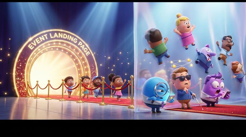
Your event landing page is gorgeous.
The hero image pops. The typography is chef's kiss. That add-to-calendar button? It matches your brand palette perfectly - the creative director signed off on it herself.
But here's the uncomfortable truth: that beautiful page is silently failing visitors who navigate differently.
We're talking keyboard users. Screen reader users. People with low vision. Folks with motor impairments who can't hit that tiny, elegantly-designed button. And they're bouncing before they ever save your event.
As designer and accessibility advocate Steve Krug once said: "Accessibility is not a feature. It's a social trend." But let's be honest - it's also a conversion issue. And right now, your stunning design might be costing you attendees.
💔 The Invisible UX Gap: Why Visual Polish ≠ Usable Design
Here's the deal: designers face a false choice every single day.
Brand consistency or accessibility compliance. Pick one.
Except... that's not actually how it works. And believing that myth is costing you real money.
According to recent accessibility research, 96.3% of websites have at least one detectable accessibility failure. The average homepage has 51 accessibility errors. Fifty-one!
And the business impact? It's brutal:
- 73% of disabled users abandon websites that are difficult to use
- The United States alone has over 84 million disabled internet users
- UK retailers lose approximately £120 billion annually due to inaccessible websites
These aren't edge cases. They're not "nice to consider someday." This is 15-20% of your potential audience hitting a wall - a wall you built with beautiful CSS and zero keyboard navigation.
Real Examples of Stunning Buttons That Fail
Let me paint a picture. You've designed an add-to-calendar button with:
- Light gray text on a slightly darker gray background (aesthetic, minimal, on-brand)
- No visible focus indicator (because those blue outlines are "ugly")
- A sleek 32x32 pixel touch target (because bigger felt "chunky")
- A hover state that only activates on mouse-over
Looks incredible in Figma. Fails every WCAG criterion that matters.
| Design Decision | Visual Result | Accessibility Failure |
|---|---|---|
| Low contrast colors | Sophisticated, minimal | Fails WCAG AA (needs 4.5:1 ratio) |
| No focus indicator | Clean, no "ugly" outlines | Invisible to keyboard users |
| 32px touch target | Elegant, compact | Below 44px minimum requirement |
| Mouse-only hover | Smooth interaction | Excludes keyboard/touch users |
🔍 The Anatomy of an Accessible Event Landing Page Button
So what does an accessible calendar button actually need? Let's break it down - without sacrificing your design sensibilites.
Focus Indicators That Don't Clash With Your Design System
Keyboard users need to see where they are on the page. That means visible focus states.
But here's the thing: focus indicators don't have to be those default blue browser outlines you hate. You can design custom focus rings that:
- Use your brand's accent color (as long as it meets contrast requirements)
- Apply
outline-offsetto create breathing room around the button - Match the visual language of your hover states
The key? Don't remove focus styles. Replace them with better ones.
Check out this deep dive on focus states keyboard users actually need for specific CSS techniques that look great and work for everyone.
Color Contrast That Works With Your Brand Palette
Yes, it's possible. I promise.
According to WebAIM's contrast guidelines, you need:
- 4.5:1 contrast ratio for normal text (under 18pt)
- 3:1 contrast ratio for large text (18pt+ or 14pt bold)
Those ratios sound restrictive until you realize: most brand palettes have some combination that works. You might need to use your darkest brand color instead of that mid-tone gray. Or bump the saturation slightly.
Pro tip: Pure red on white only achieves 4:1 contrast. Pure blue hits 8.6:1. Color choices matter more than you think.
Touch Targets and Spacing That Feel Intentional
The W3C's official guidance requires touch targets of at least 44x44 CSS pixels.
Why? Because fingers are bigger than mouse pointers. Because users on buses have shaky hands. Because someone with motor impairments shouldn't have to attempt the same tap three times.
But here's the design secret: larger touch targets don't mean larger visual buttons. You can:
- Add invisible padding around the clickable area
- Increase the hit zone without changing the visual footprint
- Use generous spacing to prevent accidental taps on adjacent elements
The button looks elegant. The touch target is accessible. Everyone wins.
Screen Reader Announcements That Make Sense
When a screen reader hits your calendar button, what does it say?
- ❌ "Button"
- ❌ "Calendar icon graphic"
- ❌ "Click here"
- ✅ "Add Summer Conference to your calendar"
Proper ARIA labels and semantic HTML turn confusion into clarity. And clarity converts.
📱 The Responsive Reality Check
That perfect desktop button? It's probably breaking on mobile.
I see this constantly. Designers test on their 27-inch monitors, ship the page, and never check how it renders on an iPhone SE. Meanwhile, 91.3% of screen reader users are on mobile devices.
Let that sink in.
The Tap Target Math Most Designers Ignore
On desktop, a 36px button with 8px padding might feel fine. On mobile, that same button becomes a frustration machine.
Here's the math:
- Average adult fingertip: ~10mm wide
- 10mm at standard mobile pixel density: ~40 CSS pixels
- WCAG minimum: 44x44 CSS pixels
- Your "elegant" button: 36px
You're literally asking users to hit a target smaller than their finger. And then wondering why mobile conversions are lower.
Testing Across Devices Without Losing Your Mind
Real accessibility testing means:
- Keyboard-only navigation - Can you reach and activate the button without a mouse?
- Screen reader testing - Does VoiceOver/NVDA announce the button correctly?
- Zoom testing - Does the page work at 200% magnification?
- Touch testing - Can you reliably tap the button on various phone sizes?
That's a lot of testing. For every calendar button. On every page. After every design update.
Which brings us to the part you've been waiting for.
🛠️ The Compliance Shortcut Designers Actually Want
Let me be real with you.
Hand-coding accessible calendar buttons is a maintenance nightmare. You're not just building the button - you're building:
- Proper ARIA attributes
- Keyboard event handlers
- Focus management
- Touch target sizing
- Responsive breakpoints
- Screen reader announcements
- .ics file generation
- Cross-calendar compatibility
And then maintaining all of it. Forever. While WCAG standards evolve and calendar apps change their requirements.
There's a reason our accessibility checklist your calendar button is failing exists - because most developers don't even know what they're missing until an audit (or a lawsuit) tells them.
How Add to Calendar PRO Solves This
Add to Calendar PRO bakes in WCAG compliance while letting you customize everything visual.
That's not marketing speak. That's the actual architecture:
- ✅ Focus states: Built-in, customizable to match your design system
- ✅ Color contrast: Automatically validated, with override options
- ✅ Touch targets: Meets 44px minimum by default
- ✅ Screen reader support: Proper ARIA labels out of the box
- ✅ Keyboard navigation: Full support, no extra code required
You get to obsess over the aesthetics. The accessibility compliance just... happens.
| DIY Approach | Add to Calendar PRO |
|---|---|
| Hours of accessibility research | Compliance baked in |
| Custom ARIA implementation | Automatic screen reader support |
| Manual focus state CSS | Customizable, accessible focus rings |
| Ongoing WCAG monitoring | Updates handled for you |
| Audit anxiety every launch | Ship with confidence |
As the saying goes: "Good design is obvious. Great design is transparent." The best accessibility is the kind your users never notice - because everything just works.
✨ Conclusion: Beautiful and Accessible Aren't Opposites - They're the Baseline
Your event landing page should convert everyone.
Not just the visitors who happen to use a mouse. Not just the ones with perfect vision. Not just the folks browsing on the latest MacBook Pro.
Everyone.
That gorgeous hero image? Keep it. That perfect typography? Absolutely. That add-to-calendar button that matches your brand?
Make it accessible too.
Because 84 million disabled internet users in the US alone aren't an edge case. They're your audience. And right now, 73% of them are bouncing from pages that could've converted them - if only someone had considered how they navigate.
You don't have to choose between brand consistency and accessibility compliance. You don't have to sacrifice aesthetics for usability. You don't have to hand-code every ARIA attribute and hope you didn't miss something.
You just have to stop treating accessibility as an afterthought - and start treating it as what it actually is:
The baseline for professional design.
Your event landing page is stunning. Now make it work for everyone who visits it.