Key Takeaways:
- Your pixel-perfect calendar button might be completely invisible to the 91.3% of screen reader users who browse on mobile devices
- The "44px touch target" isn't a myth - it's a WCAG 2.1 requirement that most designers unknowingly violate
- Color contrast that passes in Figma often fails in production due to compression and rendering differences
- Internationalization breaks more calendar buttons than you'd expect - German text expands 40% and flips your entire layout in RTL languages
- Building accessibility from scratch is expensive; choosing tools with compliance baked in saves audits, lawsuits, and your sanity
Here's an uncomfortable truth: that calendar button you spent three hours perfecting in Figma? It's probably invisible to millions of users.
Not "hard to see" invisible. Actually invisible. As in, screen readers announce it as "button" with zero context. Keyboard users can't reach it. And users with motor impairments tap the wrong thing every single time because your touch target is 32 pixels instead of 44.
But it looks gorgeous in your portfolio. 🎨
As Steve Jobs once said, "Design is not just what it looks like and feels like. Design is how it works." And for roughly 15% of the global population living with disabilities, your beautiful calendar button simply... doesn't work.
The gap between "looks accessible" and "is accessible" is where lawsuits live. Let's close it.
🔍 The Hidden Failures: What Screen Readers Actually See
You've added a calendar icon. You've picked your brand colors. You've even added a hover state.
But here's the deal: none of that matters if your button fails the screen reader test.
According to WebAIM's Screen Reader Survey, 91.3% of screen reader users now browse on mobile devices - up significantly from previous years. VoiceOver, TalkBack, and NVDA don't care about your gradient. They care about:
- ARIA labels that actually describe the action - "Add to Calendar" beats "Button" every time
- Focus states that are visually distinct - not just a subtle color shift that disappears into your brand palette
- Logical tab order - does your dropdown trap users in an endless loop?
- Announcement timing - does the screen reader know when options appear?
The Mystery Box Problem
When you skip proper ARIA implementation, your calendar button becomes what I call a "mystery box." The screen reader announces:
"Button."
That's it. No context. No hint about what happens when activated. Your user is literally guessing.
| What You Designed | What Screen Readers Announce |
|---|---|
| Sleek calendar icon with hover effect | "Button" |
| "Add to Calendar" with dropdown | "Add to Calendar, button" (if you're lucky) |
| Icon-only minimal button | "Image" or complete silence |
| Properly labeled button with ARIA | "Add event 'Marketing Summit 2025' to your calendar, button, collapsed" |
The difference between row 1 and row 4? About 30 minutes of proper implementation - or choosing a tool that handles it for you.
📱 Responsive Reality: Why Your Button Breaks on Real Devices
Let's talk about the 44px myth.
Except it's not a myth. WCAG 2.1 Success Criterion 2.5.5 explicitly requires interactive targets to be at least 44 by 44 CSS pixels. This isn't a suggestion - it's the enhanced (AAA) accessibility standard.
Why 44px specifically? Because:
- Fingers are imprecise input mechanisms (way bigger than mouse pointers)
- Users with hand tremors need larger targets
- People using mouth sticks or head pointers can't hit tiny buttons
- Even able-bodied users on bumpy trains miss small targets constantly
But There's a Catch
Your button might look 44px in Chrome DevTools. But the actual interactive hit area? That's a different story.
Here's what breaks on real devices:
- Padding vs. clickable area - Your button text is tiny, but you added padding for visual spacing. Is that padding actually clickable? Test it.
- Dropdown menus that trap keyboard users - Press Tab. Can you escape without pressing Escape? Many users don't know that shortcut.
- Calendar options that overflow on small screens - Your beautiful list of "Google Calendar, Apple Calendar, Outlook, Yahoo" wraps weirdly at 320px viewport width.
- The Chrome DevTools illusion - Simulating a phone screen is NOT the same as testing on actual VoiceOver or TalkBack.
"Testing on Chrome DevTools vs. testing on actual assistive technology is like testing your recipe by looking at photos of the ingredients." 😅
I've seen designers ship buttons that work perfectly in simulation and completely break when a real user with a real disability tries to add an event to their real calendar.
🌍 The Internationalization Trap: Buttons That Only Work in English
Your "Add to Calendar" button is 14 characters in English.
In German? "Zum Kalender hinzufügen" - that's 23 characters. A 40% expansion that absolutely destroys your carefully balanced layout.
In Finnish? Even worse.
And we haven't even talked about RTL languages yet.
What Actually Breaks
- Text overflow - Your fixed-width button now has text spilling outside or getting truncated
- RTL layout flipping - Arabic and Hebrew don't just flip text; they flip your entire mental model of where elements should be
- Date format confusion - Is 01/02/2025 January 2nd or February 1st? Depends on where your user lives.
- Icon-only buttons losing meaning - That calendar icon is universal, right? Wrong. Icon recognition varies significantly across cultures.
For a deeper dive into handling these challenges, check out our comprehensive guide to accessible calendar design which covers text expansion, RTL layouts, and date formatting in detail.
The Real-World Impact
| Language | "Add to Calendar" Translation | Character Expansion |
|---|---|---|
| English | Add to Calendar | Baseline |
| German | Zum Kalender hinzufügen | +40% |
| French | Ajouter au calendrier | +35% |
| Finnish | Lisää kalenteriin | +30% |
| Arabic | إضافة إلى التقويم | +RTL flip |
If your button has a fixed width, you've already failed half your international audience.
🎨 Color Contrast: Why Figma Lies to You
You checked your contrast ratio in Figma. It passed. You're done, right?
Not quite.
WebAIM's contrast guidelines specify:
- Level AA: 4.5:1 contrast for normal text, 3:1 for large text
- Level AAA: 7:1 for normal text, 4.5:1 for large text
- UI Components: 3:1 minimum for interactive elements
But here's what happens between Figma and production:
- Image compression shifts colors slightly
- Different monitors render colors differently
- Browser rendering engines interpret CSS colors with slight variations
- Your brand's "signature purple" might be 4.6:1 in design and 4.3:1 in Chrome
That 4.3:1? It fails AA compliance.
Pro tip: Always design with a buffer. Aim for 5:1 or higher so compression and rendering variations don't push you below the threshold.
✅ The Compliance Shortcut: Built-In Accessibility Without the Audit Bill
At this point, you might be thinking: "This is a lot. Do I really need to audit every single button?"
Honest answer? Yes. Unless you use tools that handle accessibility by default.
This is where Add to Calendar PRO becomes genuinely useful (not a sales pitch - just math).
Building an accessible add to calendar button from scratch means handling:
- Focus management that follows WCAG patterns
- Screen reader announcements that provide context
- Touch targets that meet the 44px requirement
- Color contrast that passes across browsers
- Keyboard navigation that doesn't trap users
- Internationalization that doesn't break layouts
- Responsive behavior that works on actual devices
Add to Calendar PRO handles all of this out of the box. The customization options respect A11y guardrails - meaning you can match your brand without accidentally breaking compliance.
Why "Accessible by Default" Beats "Accessible After Lawsuit"
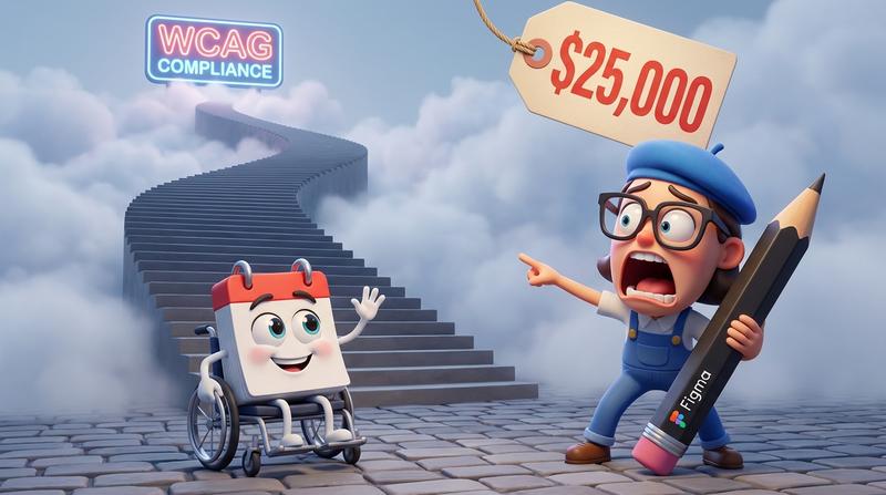
The average web accessibility lawsuit settlement? Around $25,000. The cost of fixing a non-compliant button after legal action? Way more when you factor in emergency dev time, legal fees, and reputation damage.
The cost of choosing an accessible solution from day one? Significantly less. And zero lawsuits.
Also worth noting: if you're embedding calendar buttons in emails, the accessibility challenges multiply. Many teams don't realize why email calendar links fail in the first place - email clients strip JavaScript, mangle CSS, and break traditional implementations in ways that compound accessibility issues.
🚀 Quick Wins: Audit Your Current Buttons Today
You don't need a full accessibility audit to start. Here's a five-minute checklist:
- Tab to your button - Can you reach it? Can you activate it? Can you escape the dropdown?
- Turn on VoiceOver/TalkBack - What does your button actually announce?
- Check your touch target - Is the clickable area (not just the visual size) at least 44x44px?
- Test your contrast - Use WebAIM's contrast checker with your actual production colors, not Figma values
- Resize to 320px width - Does your dropdown still work? Does text overflow?
If any of these fail, you have work to do. Or you could switch to a solution that passes by defualt.
The Bottom Line: Accessibility Isn't a Feature
It's the foundation.
As Tim Berners-Lee put it: "The power of the Web is in its universality. Access by everyone regardless of disability is an essential aspect."
Your calendar button isn't just a UI element. It's a gateway to events, appointments, webinars, and experiences. When that gateway is inaccessible, you're not just failing an audit - you're excluding real people from real opportunities.
The business case is clear:
- 15% of users have disabilities (that's a massive market segment)
- Accessible websites have better SEO (screen readers and search crawlers read similar things)
- Lawsuits are expensive; compliance is cheap
- Inclusive design improves UX for everyone (larger touch targets help able-bodied users too)
So here's the question: Is your calendar button actually accessible? Or does it just look accessible?
Time to find out. 🔍