
Your registration form isn't just a gateway; it's the first real conversation you have with a potential customer, attendee, or user. A seamless, intuitive form builds trust and sets the stage for a positive relationship. A clunky, confusing one can stop that relationship before it even starts. Getting this initial handshake right is critical for converting interest into action.
This article moves beyond generic advice. We will dissect eight standout registration form examples, revealing the specific strategies that drive their success. You won't just see what they look like; you'll understand why they work so well.
For each example, we'll break down the design, user flow, and underlying psychology. You’ll get actionable takeaways to help you design forms that not only capture essential information but also enhance user experience and boost completion rates. Whether you're organizing a webinar, launching a product, or planning a major conference, these insights will equip you to create a registration process that attendees actually enjoy. We'll explore diverse approaches, from minimalist single-page forms to dynamic multi-step experiences with conditional logic, providing a comprehensive toolkit for any scenario.
1. Progressive Multi-Step Registration Form
The progressive multi-step registration form stands as a pinnacle of user-centric design, breaking down what could be an overwhelming single-page form into smaller, manageable chunks. This approach combats user fatigue and reduces cognitive load by presenting fields in a logical, sequential order. Instead of facing a wall of input fields, users are guided through a step-by-step process, making the entire experience feel faster and less intimidating.
This method is particularly effective for complex registrations that require diverse information, such as setting up a new e-commerce store on Shopify or completing a detailed profile on LinkedIn. By grouping related fields into distinct steps, you create a clear path to completion, which can dramatically boost your form's conversion rate.
Strategic Breakdown
- Psychological Principle: This design leverages the "endowed progress effect," a principle suggesting that people are more motivated to complete a task if they feel they have already made progress. A visible progress bar is key to this strategy.
- Reduced Friction: By asking for simple, non-threatening information first (like an email address), you get the user invested. More detailed or personal questions can be reserved for later steps, once commitment has been established.
- Data Organization: This format simplifies data validation and error handling. You can validate information on a per-step basis, providing immediate feedback rather than waiting until the user submits the entire form.
The infographic below illustrates a common three-step flow for this type of registration form.
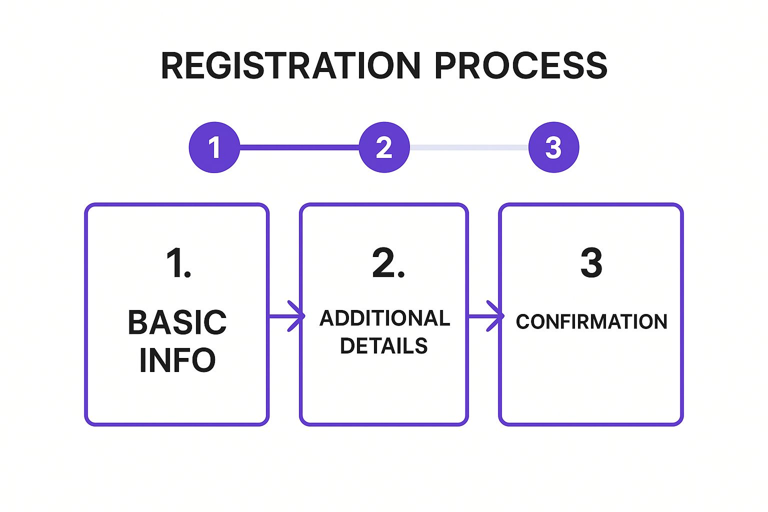
This visual flow underscores the importance of a logical sequence, moving from low-effort initial commitment to final confirmation.
Actionable Takeaways
- Show Progress Clearly: Always include a visual progress indicator (e.g., "Step 1 of 3," a percentage bar) to manage user expectations and maintain momentum.
- Focus Each Step: Dedicate each step to a single topic, such as account creation, profile details, or payment information.
- Enable Easy Navigation: Allow users to move back to previous steps to review or edit their information without losing their progress.
- Use Auto-Save: Automatically save the user's progress at each step. This prevents data loss if they accidentally close the tab, respecting their time and effort.
2. Single-Page Minimalist Registration Form
The single-page minimalist registration form is the epitome of efficiency, designed to get users from visitor to member with the least possible friction. This approach consolidates all necessary fields onto a single, uncluttered page, prioritizing speed and simplicity. By asking only for the absolute essentials, it removes barriers and respects the user's time, making it a powerful tool for rapid user acquisition.
This method is highly effective for services where the initial value proposition is clear and immediate, such as signing up for a social media account on Twitter or creating a Medium profile. The goal is to capture the user's interest and convert it into an account instantly, before hesitation or distraction can set in. It is one of the most widely used and effective registration form examples for driving high-volume signups.
Strategic Breakdown
- Psychological Principle: This design capitalizes on the "paradox of choice." By severely limiting the number of fields and decisions a user has to make, you eliminate analysis paralysis and make the path to completion feel effortless.
- Reduced Friction: Every additional field is a potential drop-off point. This form type ruthlessly cuts out anything non-essential (like asking for a last name or phone number) to streamline the process, focusing solely on creating the account.
- Immediate Conversion: Unlike multi-step forms that build investment over time, the minimalist approach aims for an immediate win. It’s perfect for platforms where users can explore and provide more details later, a strategy known as progressive profiling.
Actionable Takeaways
- Ask for Essentials Only: Limit your fields to the bare minimum needed to create an account, typically an email and a password. You can always gather more information later.
- Use Smart Defaults: Pre-fill information where possible. For example, if a username is required, you could suggest one based on the user's email to speed up the process.
- Make the CTA Clear: The call-to-action button should be descriptive and action-oriented. Use "Create Account" or "Sign Up Free" instead of a generic "Submit."
- Implement Social Sign-On: Offer options like "Sign up with Google" or "Continue with Facebook" to bypass the form altogether, providing the fastest possible registration path.
3. Social Media Integration Registration
Social Media Integration Registration streamlines the signup process by allowing users to create an account with their existing social media profiles, such as Google, Facebook, or LinkedIn. This one-click method bypasses the tedious task of manually filling out fields by automatically importing essential information like name, email, and profile picture, offering an almost frictionless entry point for new users.
This approach is highly effective for consumer-facing applications and platforms where speed and convenience are paramount. Platforms like Spotify and Canva leverage social logins to reduce abandonment rates, as users can sign up in seconds without creating and remembering a new set of credentials. This model is one of the most powerful registration form examples for maximizing conversion rates through sheer simplicity.
Strategic Breakdown
- Psychological Principle: This method capitalizes on the principle of least effort. Users are naturally inclined to choose the path of least resistance, and a single click is far easier than typing out personal details, creating a password, and verifying an email.
- Reduced Friction: By eliminating the need for manual data entry, you remove the biggest source of friction in the registration process. This is particularly valuable on mobile devices, where typing is more cumbersome.
- Data Accuracy: Social logins often provide more accurate and verified information, such as a real name and primary email address, compared to what users might enter manually into a traditional form.
This simple interface drastically lowers the barrier to entry, making it an ideal choice for services seeking rapid user acquisition.
Actionable Takeaways
- Offer a Traditional Option: Always provide a standard email and password registration method alongside social logins. Some users are wary of connecting social accounts or may not have one.
- Be Transparent with Data: Clearly state what information you will access from the user's social profile before they grant permission. This builds trust and addresses privacy concerns.
- Use Recognizable Branding: Employ the official, universally recognized buttons for each social media platform (e.g., the Google "G," the Facebook "f"). Familiarity breeds confidence.
- Consider Your Audience: Choose social login options that align with your user base. For a B2B SaaS platform, offering a "Sign in with LinkedIn" or Google Workspace option is more relevant than Facebook.
4. Event Registration Form with Payment Integration
An event registration form with payment integration is a crucial tool for any paid event, from workshops and conferences to webinars and courses. It seamlessly combines attendee data collection with a secure payment gateway, creating a one-stop shop for sign-ups. This unified approach eliminates the friction of redirecting users to a separate payment site, which can often lead to abandoned registrations.
This type of form is essential for streamlining event management, as seen on platforms like Eventbrite and Meetup.com for their paid events. By handling both information and financial transactions in a single flow, it simplifies the process for the user and provides organizers with a consolidated, real-time view of both attendees and revenue.
Strategic Breakdown
- Trust and Security: Integrating payment requires building a high level of trust. Displaying security badges (e.g., SSL certificates, payment provider logos) and offering a transparent checkout process are non-negotiable for convincing users to enter financial details.
- Reduced Cart Abandonment: By keeping the user on a single page or within a single, cohesive form, you minimize distractions and the potential for drop-off. A streamlined flow from attendee details to payment confirmation is key to maximizing conversions.
- Financial Management: This model automates invoicing, receipt generation, and revenue tracking. Features like tiered pricing (early bird, VIP) and discount codes can be managed directly within the form logic, simplifying complex ticketing structures.
When building an event registration form, consider integrating support for various common payment methods to streamline the user experience and cater to diverse user preferences.
Actionable Takeaways
- Offer Multiple Payment Options: Support credit cards, PayPal, and digital wallets like Apple Pay or Google Pay to accommodate user preferences and increase the likelihood of completion.
- Be Transparent About Costs: Clearly display the total price, including any taxes or fees, before asking for payment information. Hidden costs are a major cause of cart abandonment.
- Provide Instant Confirmation: Send an automated confirmation email immediately after a successful payment. This email should include the ticket, receipt, and essential event details.
- Prioritize a Clear Refund Policy: Make your cancellation and refund policy easy to find and understand. This builds trust and helps manage attendee expectations. For more insights, we recommend exploring these event registration best practices.
5. Conditional Logic Registration Form
The conditional logic registration form is an intelligent, dynamic tool that adapts in real-time to user input. It creates a personalized pathway by showing or hiding specific form fields based on the user's previous answers. This streamlined approach ensures that individuals are only presented with questions relevant to their unique situation, eliminating clutter and redundant steps.
This method transforms a static questionnaire into a responsive conversation. For instance, a university application form can use it to show different program-specific questions based on the applicant's chosen major, or an insurance quote form can adjust to display fields relevant only to a homeowner versus a renter. Platforms like HubSpot and Typeform have popularized this as one of the most effective registration form examples for improving data quality and user experience.
Strategic Breakdown
- Psychological Principle: This design taps into the "principle of relevance," ensuring users feel the form understands their needs. By removing irrelevant questions, you demonstrate respect for their time and attention, which builds trust and encourages completion.
- Reduced Friction: It drastically cuts down on the perceived length and complexity of the form. When a user selects "No" to attending a paid workshop, the payment fields simply disappear, preventing confusion and potential abandonment.
- Data Quality: Conditional logic leads to cleaner, more accurate data. Since users are only asked pertinent questions, the risk of them entering placeholder information or skipping essential fields for their specific journey is significantly lower.
Actionable Takeaways
- Map All Journeys: Before building, meticulously flowchart every possible user path. Identify all triggers (the answers) and their corresponding actions (the fields that appear or disappear).
- Keep Logic Intuitive: Avoid overly complex, multi-layered conditions that could confuse the user or break the form's flow. The relationship between an answer and the subsequent field should be obvious.
- Test Every Path: Thoroughly test each conditional branch to ensure it functions as expected. A broken path can halt the registration process entirely and frustrate the user.
- Provide Visual Feedback: When a new section appears, use a subtle animation or transition to draw the user's attention to it. This confirms the form is responding correctly to their input.
6. Gamified Registration Experience
The gamified registration experience transforms a typically mundane task into an interactive and enjoyable journey. This approach incorporates game-like elements such as points, badges, progress rewards, and interactive challenges directly into the signup flow. By tapping into intrinsic human desires for achievement and competition, it makes the process more engaging, memorable, and motivating for new users.
This method is especially powerful for applications where sustained user engagement is critical, such as language learning apps like Duolingo or fitness platforms like the Nike+ app. Instead of simply filling out fields, users feel like they are starting a game or embarking on a challenge from the very first interaction, which sets a positive tone for their entire experience with the brand. These types of registration form examples show how creativity can drive signups.
Strategic Breakdown
- Psychological Principle: Gamification leverages powerful psychological triggers, including the "Goal-Gradient Hypothesis," which states that people accelerate their efforts as they approach a reward. It also taps into the desire for accomplishment and social recognition.
- Reduced Perceived Effort: Interactive elements make the process feel less like work and more like play. This distraction technique can make users more willing to provide detailed information they might otherwise skip.
- Brand Personality: This format is an excellent way to express a fun, modern, and engaging brand identity right from the start. It immediately communicates that the user experience will be dynamic and rewarding. Incorporating this into your promotional strategy, as detailed in some guides on event marketing automation, can significantly boost initial user buy-in.
Actionable Takeaways
- Align Games with Your Brand: Ensure the gamified elements feel authentic to your brand's personality and the product's purpose. A fitness app might use activity-based challenges, while an educational platform could use a quiz.
- Keep the Core Path Clear: While games are engaging, the primary goal is still registration. Don't let the interactive elements overshadow or slow down the essential task of creating an account.
- Provide an Opt-Out: Always give users a way to skip the gamified parts. Some users may prefer a faster, more traditional signup, and forcing them through a game could cause friction.
- Reward Meaningful Progress: Tie rewards, like badges or points, to the completion of key registration steps. This reinforces positive behavior and encourages users to complete their profiles fully.
7. Mobile-First Registration Design
With mobile traffic dominating the digital landscape, a mobile-first registration design is no longer a recommendation but a necessity. This approach prioritizes the user experience on smaller screens, ensuring that every element is optimized for touch interaction and minimal typing. It involves creating a lean, uncluttered interface with large, thumb-friendly buttons, simplified input fields, and vertical layouts that are easy to scroll through with one hand.
This methodology is essential for apps and services where the primary point of entry is a smartphone, such as the streamlined signup flows for Instagram or the efficient phone verification process for WhatsApp. By designing for the most constrained environment first, you ensure a seamless experience that can then be scaled up for larger devices, rather than trying to condense a complex desktop form onto a small screen.
Strategic Breakdown
- Constraint-Driven Innovation: Designing for mobile forces you to be ruthless with prioritization. You must eliminate every non-essential field and interaction, which results in a more focused and efficient registration process for all users, regardless of their device.
- Leveraging Native Features: Mobile-first design takes advantage of device-specific capabilities. This includes using the camera for document scanning (like in Uber's driver signup), GPS for location auto-fill, and biometrics (Face ID or fingerprint) for secure, one-tap logins.
- Ergonomic Layouts: This approach considers the physical way users hold their phones. Key interactive elements like "Next" or "Submit" buttons are placed within easy-to-reach thumb zones, reducing physical strain and making navigation feel effortless.
Actionable Takeaways
- Use Correct Input Types: Implement HTML5 input types like
tel,email, andnumber. This brings up the appropriate keyboard on mobile devices, minimizing user frustration and speeding up data entry. - Design for Thumb Navigation: Place primary call-to-action buttons and navigation elements at the bottom or center of the screen where they are easily reachable.
- Minimize Typing: Employ auto-fill, social logins, and smart suggestions wherever possible. The less a user has to type on a small screen, the higher your completion rate will be.
- Test Across Screen Sizes: Rigorously test your form on a variety of mobile devices and screen resolutions to ensure a consistent and functional experience for everyone.
8. Progressive Profiling Registration System
The Progressive Profiling Registration System is a sophisticated, long-term strategy that turns the initial sign-up into the beginning of a conversation. Instead of demanding a large amount of information upfront, this approach starts with the bare minimum-often just an email address-and gradually collects more data over subsequent user interactions. This method builds comprehensive user profiles organically, minimizing initial friction and maximizing user acquisition.
This patient approach is a cornerstone of modern marketing automation and CRM platforms like HubSpot and Salesforce. It respects the user's time by asking for information only when it becomes contextually relevant, such as prompting for a job title before providing an industry-specific whitepaper. This transforms data collection from a one-time chore into an ongoing, value-driven exchange.
Strategic Breakdown
- Psychological Principle: This system capitalizes on the "foot-in-the-door" technique. By securing a small initial commitment (the sign-up), users are more likely to agree to larger requests (providing more profile data) later on.
- Reduced Friction & High Initial Conversion: The low barrier to entry makes it one of the most effective registration form examples for top-of-funnel lead generation. It removes the intimidation factor associated with long forms, encouraging more people to sign up.
- Contextual Data Enrichment: Information is gathered when it makes sense. For instance, LinkedIn prompts you to add skills after you've joined a relevant group, and Netflix asks for preferences as you browse content, making the request feel helpful rather than intrusive.
This method shifts the focus from a single registration event to building a relationship over the entire customer lifecycle.
Actionable Takeaways
- Start with the Absolute Minimum: Only ask for what is essential for the initial interaction to begin. For most services, this is just an email and password.
- Tie Data to Value: Never ask for information without offering a clear benefit in return. Frame requests as a way to personalize the user's experience, unlock new features, or provide more relevant content.
- Use Behavioral Triggers: Trigger data requests based on user actions, not arbitrary timers. For example, ask for company size when a user downloads a B2B case study. To explore this topic further, you can learn more about how this applies to online event registration on Add-to-Calendar-Pro.com.
- Track Incremental Completion: Monitor how many users provide additional information at each stage. This data helps you identify which prompts are effective and which are creating friction.
Registration Form Types Comparison Table
| Registration Method | Implementation Complexity 🔄 | Resource Requirements ⚡ | Expected Outcomes 📊 | Ideal Use Cases 💡 | Key Advantages ⭐ |
|---|---|---|---|---|---|
| Progressive Multi-Step Registration Form | High - multiple steps with conditional logic | Moderate - UX design, backend logic | Improved completion rates, reduced abandonment | Complex signups needing detailed info | Higher completion rates, better UX, step validation |
| Single-Page Minimalist Registration Form | Low - simple single-page form | Low - minimal fields and design | Fast signup, high conversion for simple needs | Quick registration with essential info only | Fastest signup, lower barrier, easy A/B testing |
| Social Media Integration Registration | Moderate - OAuth integration required | Moderate - third-party SDKs and APIs | Extremely fast signup with pre-filled data | Users with social accounts, reducing friction | One-click signup, pre-validated emails, rich profiles |
| Event Registration Form with Payment Integration | High - payment gateway and ticketing | High - payment security and compliance | End-to-end registration with secure payments | Paid events, workshops, conferences | Secure payments, automation, detailed reports |
| Conditional Logic Registration Form | High - dynamic fields and branching | Moderate to High - logic and testing | Personalized and relevant forms, better data quality | Complex forms needing tailored questions | Increased relevance, higher engagement, shorter forms |
| Gamified Registration Experience | High - interactive and animated elements | High - design and development effort | Increased engagement and profile completion | Brands targeting younger or entertainment users | Fun experience, memorable, boosts completion |
| Mobile-First Registration Design | Moderate to High - mobile-specific UX | Moderate - device features integration | Optimized for mobile, higher completion rates on phones | Mobile-centric users, apps needing device input | Excellent mobile UX, faster input, future-proof |
| Progressive Profiling Registration System | High - multiple stages and triggers | High - automation and cross-touchpoint | High initial conversion, gradual comprehensive profiling | Long-term user engagement and data enrichment | Reduced friction, higher quality data, relationship building |
From Examples to Execution: Building Your Perfect Registration Form
We have journeyed through a diverse landscape of powerful registration form examples, each offering a unique masterclass in user experience and data collection strategy. From the elegant simplicity of single-page minimalist forms to the intelligent, branching pathways of conditional logic, a clear theme emerges: the most effective registration form is not a one-size-fits-all template, but a purpose-built tool meticulously designed for a specific audience and objective.
The goal is to eliminate friction while capturing the essential information needed to create a valuable experience for your attendees. A successful form is a silent ambassador for your event or service, setting a professional and user-friendly tone from the very first interaction.
Synthesizing the Core Principles
Across all the examples, from progressive profiling to gamified experiences, several foundational principles are consistently at play. Mastering these concepts is the key to transforming your own forms from mere data-entry fields into powerful conversion assets.
- Clarity Above All: Every field, label, and instruction must be instantly understandable. Ambiguity is the enemy of completion rates.
- Momentum is Crucial: Use techniques like multi-step designs and progress bars to create a sense of forward movement, encouraging users to cross the finish line.
- Value Exchange is Key: Users are more willing to provide information if they perceive a clear benefit. Whether it's a personalized event schedule, exclusive content, or simply a seamless entry process, the value must be evident.
- Context is King: The complexity of your form should directly match the complexity of your offer. A simple webinar sign-up requires a different approach than a multi-day conference registration with payment integration and session selection.
Putting Insights into Action
The true value of studying these registration form examples lies in their practical application. It's time to move from analysis to execution. Start by asking critical questions about your own registration process:
- What is the single most important action I want a user to take? Center your entire design around achieving that goal.
- What is the absolute minimum information I need to collect? Challenge every field. Can you gather some data later through progressive profiling or post-event surveys?
- How can I make this process easier for my specific audience? Consider mobile-first design for on-the-go users or social sign-on for a tech-savvy crowd.
For event marketers, in particular, the registration process is the gateway to attendance. A frictionless form directly translates into higher sign-up numbers, better attendee data, and a stronger start to your event engagement. This is where a flexible and specialized tool becomes indispensable. Our service, Add to Calendar PRO, is built specifically to address this need, empowering you to create custom RSVP and registration forms that are perfectly tailored to any event. You can easily add custom fields, implement GDPR-compliant consent, and manage your attendee list, all while ensuring the form integrates flawlessly with our powerful 'Add to Calendar' buttons. By applying the principles from these examples, you can use our service to build a registration experience that not only looks professional but also actively works to maximize attendance and engagement for your events.
Ready to apply these advanced strategies to your own events? With Add to Calendar PRO, you can build custom, high-converting registration forms that integrate seamlessly with our industry-leading calendar buttons. Start optimizing your event sign-ups today by visiting Add to Calendar PRO and see how easy it is to turn insights into action.