
Forms are the unsung heroes of digital interaction. They are the critical handshake between you and your user, the gateway to new signups, event registrations, and crucial sales. Yet, so many web forms are clunky, confusing, and frustrating, causing potential customers and attendees to abandon them in droves. What if a few strategic tweaks could transform your forms from conversion killers into high-performing assets?
This article dives deep into the proven strategies that separate mediocre forms from masterful ones. We’ll explore the 7 essential best practices for form design that will not only improve user experience but significantly boost your completion rates. From simplifying layouts and providing clear, descriptive labels to implementing smart, accessible features like real-time validation, these actionable insights will help you build forms that people actually want to complete.
As experts in event marketing, we understand how critical a seamless registration process is for webinars, conferences, and promotions. The principles outlined here are the foundation of effective user engagement and maximizing conversions. You will learn how to refine your information architecture, design for a mobile-first world, and leverage smart defaults to reduce user friction. By the end of this guide, you'll have a practical framework for creating forms that are efficient, user-friendly, and optimized for success.
1. Keep Forms Short and Simple
One of the most impactful best practices for form design is rooted in a simple, yet powerful, principle: less is more. Keeping your forms short and simple means ruthlessly eliminating every field that isn't absolutely essential for the immediate goal. This approach directly tackles user friction and reduces cognitive load, the mental effort required to complete a task. The fewer fields a user has to consider, type into, and validate, the lower the barrier to completion.
This principle is not just a theory; it’s a proven conversion driver. When users encounter a long, intimidating form, their immediate reaction is often to abandon the task altogether. Each additional field acts as a small obstacle, and these obstacles accumulate, increasing the likelihood of user drop-off. By asking only for critical information, you respect the user's time and create a more positive, efficient experience.

Why Simplicity Wins
The data consistently supports the "shorter is better" philosophy. For example, Unbounce, a leading landing page platform, discovered that removing a single, optional phone number field increased their conversion rate by a staggering 79%. Similarly, Expedia boosted profits by millions after removing one "Company Name" field from their booking form. These cases highlight a critical insight: even fields that seem minor can have a major negative impact on your form's performance.
This is especially true for initial touchpoints like newsletter signups or event registrations. The goal is to get the user to commit. You can always gather more information later. If you want to see how top companies apply this to event signups, you can explore these excellent registration form examples for 2025 for inspiration.
"As a rule of thumb, only ask for information you absolutely need at that moment. Every field you add to a form will affect its conversion rate." - Luke Wroblewski, Author of Web Form Design
Actionable Tips for Implementation
- Conduct a Field Audit: Scrutinize every field on your current forms. Ask yourself: "Is this information essential to complete this specific transaction or registration?" If the answer is no, remove it.
- Embrace Progressive Profiling: Don't try to learn everything about a user at once. Collect the bare minimum initially (like an email address) and gather more data incrementally through subsequent interactions. This is a common strategy in B2B marketing.
- Clearly Mark Optional Fields: If you must include non-essential fields, label them clearly as "(optional)". This gives users a sense of control and allows them to bypass fields they are hesitant to complete, reducing friction.
- A/B Test Your Forms: Don't just guess which fields are causing problems. Create two versions of your form, one with fewer fields than the other, and test them to see which one performs better. Data should always guide your design decisions.
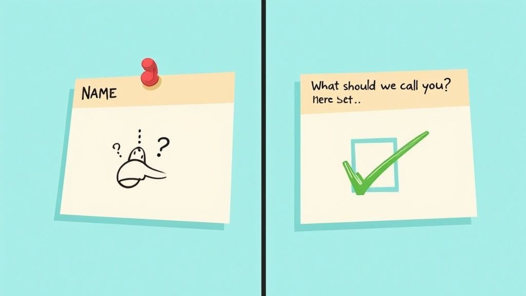
2. Use Clear and Descriptive Labels
A fundamental best practice for form design is to ensure every field is accompanied by a clear, visible, and descriptive label. Labels are not just text; they are the primary conversational guide for your users, telling them exactly what information is required. Ambiguous or missing labels are a direct cause of user frustration, leading to input errors and form abandonment. By using precise, jargon-free language, you create a seamless dialogue between the user and the interface.
This principle focuses on eliminating guesswork. When a user understands a field's purpose instantly, they can complete it quickly and accurately. Effective labeling provides constant context, especially when labels remain visible as users type. This simple consideration drastically improves usability and is a cornerstone of accessible and high-converting form design.
Why Clarity Wins
The impact of clear labeling is well-documented by usability experts. The Nielsen Norman Group has consistently shown that forms with clear, always-visible labels perform better in user testing than those that hide labels or use placeholder text as a substitute. For instance, the GOV.UK design system is celebrated for its commitment to plain English, ensuring that forms are accessible to a wide audience with varying literacy levels. This approach minimizes cognitive strain and builds trust.
Similarly, companies like Mailchimp often use conversational labels like 'What should we call you?' instead of the more rigid 'First Name'. This humanizes the experience and makes the form feel less like an interrogation. The goal is to make the user feel confident and supported at every step, and descriptive labels are the most direct way to achieve this.
"Don't make me think! Every question mark adds to my cognitive workload, and if it's too much work, I'm gone." - Steve Krug, Author of Don't Make Me Think
Actionable Tips for Implementation
- Place Labels Above the Input Field: This is the most common and effective placement. It ensures a clear visual connection between the label and its corresponding field, and it works well on both desktop and mobile devices.
- Avoid Using Placeholder Text as a Label: Placeholder text disappears once the user starts typing, forcing them to rely on memory. This is a major accessibility and usability issue. Use placeholder text only for providing an example or a hint, not as the primary label.
- Use Sentence Case: Write labels in sentence case (e.g., "First name") rather than title case ("First Name"). It's easier to read and feels more conversational and modern.
- Provide In-Context Help: For fields that might be confusing (like a "Coupon Code" or "VAT Number"), add a small tooltip or a short, descriptive sentence underneath the field to provide extra guidance.
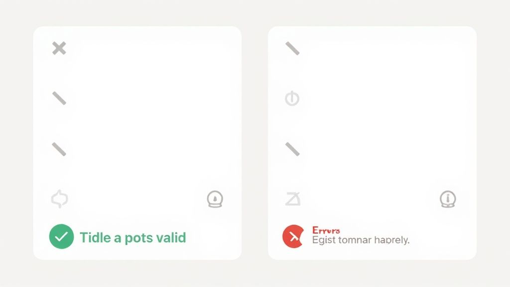
3. Implement Real-time Validation and Feedback
One of the most effective best practices for form design is to guide users as they go, not after they've finished. Real-time validation provides immediate feedback as users fill out fields, catching potential errors and offering helpful confirmations before they hit the submit button. This proactive approach transforms the form-filling process from a potential guessing game into a guided, conversational experience. It prevents the all-too-common frustration of submitting a form only to be met with a list of errors to fix.
This method significantly improves the user experience by reducing friction and building confidence. When a user sees a green checkmark appear after correctly formatting their email address or password, it provides positive reinforcement and confirms they are on the right track. This immediate feedback loop is crucial for maintaining momentum and preventing users from abandoning the form out of uncertainty or annoyance.
Why Immediate Feedback Works
Waiting until a user clicks "submit" to tell them they've made a mistake is like letting a student finish an entire exam before telling them they used the wrong color ink. It's inefficient and frustrating. Inline validation, popularized by experts like Luke Wroblewski and the Google Material Design team, addresses this by providing context-aware guidance precisely when and where it's needed.
For instance, Stripe's credit card form instantly validates the card number format, flags an incorrect CVC, and confirms the expiration date, making a high-stakes transaction feel secure and seamless. Similarly, Dropbox checks email availability in real-time during signup, preventing a user from completing the form only to find their desired email is already taken. This approach respects the user's effort and makes the entire process feel smarter and more responsive.
"Inline validation allows for a conversation with the user. You're helping them get through the form successfully. Post-submission validation is more like a final judgment, often a negative one." - Jared Spool, User Interface Engineering
Actionable Tips for Implementation
- Validate On "Blur," Not "Keypress": Avoid validating while the user is actively typing. Instead, trigger validation when they click or tab out of a field (the "on blur" event). This prevents premature and often incorrect error messages, like "Invalid email," when they have only typed "john.doe@g".
- Use Clear and Positive Reinforcement: Don't just show errors. Use visual cues like a green border or a checkmark to confirm when a field has been filled out correctly. This positive feedback builds user confidence and reduces anxiety.
- Provide Actionable Error Messages: Instead of a generic "Invalid Input," be specific. Use messages like, "Password must be at least 8 characters long," or "Please enter a valid email address." Clear instructions empower users to fix mistakes quickly.
- Combine Colors with Icons and Text: To ensure accessibility, don't rely on color alone to indicate success or failure. Pair red and green indicators with clear icons (like a checkmark or an 'x') and descriptive text to accommodate users with color vision deficiencies.
4. Design for Mobile-First Experience
In an era where mobile traffic consistently surpasses desktop, designing for the smallest screen first is no longer optional; it's a fundamental best practice for form design. Mobile-first design means prioritizing the user experience on smartphones and touch interfaces from the very beginning of the design process, then progressively enhancing the layout for larger screens like tablets and desktops. This approach directly addresses the unique constraints and behaviors of mobile users, such as smaller viewports, touch-based input, and potential network instability.
By starting with mobile, you are forced to focus on core functionality and content, resulting in a cleaner, more efficient form that benefits all users, regardless of their device. Companies that master this, like Instagram with its seamless signup process or Uber with its one-thumb booking flow, create experiences that feel intuitive and frictionless. Failing to prioritize mobile means alienating a massive segment of your audience and creating unnecessary barriers to completion.
Why Mobile-First Matters
The mobile context is fundamentally different. Users are often on the go, potentially distracted, and using imprecise touch controls. A form that is easy to fill out on a desktop with a mouse and keyboard can become a frustrating nightmare on a small touch screen. A mobile-first strategy acknowledges these challenges head-on, leading to designs that are inherently more accessible and user-friendly.
This principle, championed by thought leaders like Ethan Marcotte and Karen McGrane, ensures that the core experience is solid before adding complexities for larger screens. For event organizers, this is critical; attendees are frequently registering for webinars or confirming attendance while commuting or away from their desks. A clunky mobile registration form can be the single point of failure that costs you an attendee.
"Mobile-first is not a trend. It's a pragmatic design constraint that forces you to focus on what really matters, resulting in a better experience for everyone." - Karen McGrane, Content Strategist
Actionable Tips for Implementation
- Use Appropriate Input Types: Leverage HTML5 input types like
type="email",type="tel", andtype="number". This brings up the optimal keyboard on mobile devices (e.g., the numeric keypad for phone numbers), significantly reducing typing effort and errors. - Enlarge Touch Targets: Ensure all buttons, links, and form fields are large enough to be tapped accurately with a finger. Apple’s Human Interface Guidelines recommend a minimum target size of 44x44 pixels to prevent frustrating mistaps.
- Design for Thumb Reach: Place primary actions, like "Submit" or "Next," within easy reach of the user's thumb, typically at the bottom of the screen. This makes one-handed use much more comfortable and efficient.
- Test on Real Devices: Do not rely solely on browser emulators. Testing your forms on actual smartphones and tablets is the only way to truly understand the user experience, revealing issues with touch accuracy, performance, and layout rendering.
5. Logical Information Architecture and Flow
A well-designed form is more than just a collection of fields; it’s a conversation. One of the most critical best practices for form design is to structure that conversation with a logical and intuitive information architecture. This means organizing form fields in a sequence that mirrors the user's natural thought process, creating a seamless and predictable journey from start to finish. A logical flow reduces cognitive load, preventing the user from feeling confused or overwhelmed.
When information is presented in a disorderly manner, users have to stop and think, "What are they asking for here?" This mental friction can be enough to cause abandonment. By grouping related information and ordering it in a way that makes sense, you guide the user effortlessly through the process. The form feels less like an interrogation and more like a helpful, guided interaction, building trust and momentum toward completion.
Why a Logical Flow is Essential
Arranging form fields logically is fundamental to user experience. Consider the standard e-commerce checkout process: it almost universally follows the sequence of contact info, then shipping address, and finally payment details. This structure is effective because it aligns with how people naturally organize the task in their minds. Asking for payment information before knowing where to ship the item would feel jarring and illogical.
This principle extends to all types of forms, from complex applications to simple event registrations. For example, TurboTax excels at this by breaking down the daunting task of filing taxes into small, manageable, and logically ordered sections. This conversational approach transforms a complex process into a series of simple questions, demonstrating the power of thoughtful information architecture in reducing user anxiety and increasing completion rates.
"Good design is about making things understandable and usable. In forms, that starts with a logical order. If the flow doesn't make sense to the user, the form has already failed." - Don Norman, Author of The Design of Everyday Things
Actionable Tips for Implementation
- Group Related Fields: Use visual cues like whitespace, section headings, or borders to group related information together. For instance, "Contact Information," "Shipping Address," and "Payment Details" should be distinct visual blocks.
- Start with the Easy Questions: Begin your form with simple, non-threatening fields like name and email address. Save more sensitive or complex information, such as a credit card number or personal ID, for the end of the form, once the user has already invested time and feels more committed.
- Follow a Conversational Pattern: Imagine you were asking for this information in a face-to-face conversation. What would you ask first? Your form's flow should mimic that natural dialogue.
- Conduct User Research: Use techniques like card sorting to understand your users' mental models. Ask them to group and order potential form fields in a way that makes sense to them. This provides direct insight into creating the most intuitive flow. This same logic applies to entire pages; you can learn more about how this structure enhances your event landing page design and best practices to boost conversions.
6. Accessibility-First Design
One of the most crucial best practices for form design is to adopt an accessibility-first mindset. This approach involves designing forms that are usable by everyone, including people with disabilities who may rely on assistive technologies like screen readers or keyboard-only navigation. Far from being a niche concern, accessible design benefits all users by promoting clearer, more logical, and more robust interfaces.
Building accessibility into your forms from the start is not just about compliance; it's about creating an inclusive digital space and expanding your potential audience. When a form is inaccessible, it creates a dead end for a significant portion of the population, leading to user frustration, abandonment, and a negative brand perception. Conversely, an accessible form is a hallmark of quality and user respect.
Why Accessibility Wins
An accessible form is a better form for every user. For example, clear labels linked to their inputs help screen reader users understand what information is required, but they also help sighted users who might be distracted or in a hurry. Similarly, high-contrast text is essential for users with low vision, but it also improves readability for everyone, especially on mobile devices or in bright sunlight.
Exemplary organizations like GOV.UK have made accessibility a core principle of their design system. Their forms meet high standards (WCAG 2.1 AA), resulting in a user experience that is famously clear, simple, and effective for millions of citizens with diverse needs. This commitment demonstrates that accessibility is not a limitation but a catalyst for superior design. Microsoft's Inclusive Design toolkit further champions this, showing how solving for one group can extend the benefits to many others.
"The power of the Web is in its universality. Access by everyone regardless of disability is an essential aspect." - Tim Berners-Lee, Inventor of the World Wide Web
Actionable Tips for Implementation
- Use Semantic HTML: Structure your forms with the correct HTML elements. Use
<label>for every form input and connect it with theforattribute. Group related fields with<fieldset>and provide a summary with<legend>. - Ensure Keyboard Navigability: A user must be able to navigate through your entire form, including all fields, buttons, and links, using only the Tab key. Ensure a logical order and make the active element visually distinct with a clear focus indicator.
- Check Color Contrast: Text and important interface elements must have a contrast ratio of at least 4.5:1 against their background to be readable for users with visual impairments. Use a contrast checker tool to verify your color palette.
- Test with Screen Readers: Don't just assume your form is accessible. Test it using actual screen readers like NVDA (free), JAWS, or VoiceOver (built into Apple devices) to understand the real experience of users who rely on them.
7. Smart Defaults and Auto-completion
One of the most effective best practices for form design is to do the work for the user whenever possible. Smart defaults and auto-completion involve pre-filling fields with intelligent suggestions, using previously entered data, or leveraging APIs to complete information automatically. This technique dramatically reduces the physical and cognitive effort required from the user, making the form-filling process faster, smoother, and less prone to error.
This approach respects the user's time by anticipating their needs and minimizing repetitive data entry. When a user sees a form that already knows their shipping address or can suggest their city as they type, it creates a seamless and almost magical experience. This efficiency is a key driver in reducing form abandonment, especially on mobile devices where typing can be cumbersome.
Why It Accelerates Completion
The impact of smart defaults is easy to see. Google's address autocomplete, powered by the Places API, can reduce keystrokes by over 70% and cut down on address entry errors. Similarly, Amazon's one-click purchasing, which relies on saved information, has become the gold standard for frictionless checkout experiences. These features transform a tedious task into a simple confirmation click.
This is especially crucial in multi-step processes like event registration or e-commerce checkouts. By pre-filling known information like a name or email, you empower users to move through the funnel with minimal friction. To see how these principles can be applied effectively, you can explore detailed guides on how to improve your online event registration for more insights.
"The best input is no input. Remove the need for users to type whenever you can by providing good defaults, location services, or native platform features." - Google Material Design Guidelines
Actionable Tips for Implementation
- Leverage Browser Autofill: Use standard HTML
autocompleteattributes (e.g.,autocomplete="name",autocomplete="email",autocomplete="shipping street-address") on your form fields. This allows browsers like Chrome, Safari, and Firefox to populate saved user information automatically. - Use Geolocation for Addresses: For fields like "Country," "State," or "City," use the user's IP address or browser's geolocation API (with permission) to pre-select the most likely option. This saves users from scrolling through long dropdown menus.
- Provide Sensible Defaults: For questions with common answers, pre-select the most popular choice. For instance, in a shipping form, you could default the "Billing Address" to be the same as the "Shipping Address," with an easy option to change it.
- Always Allow Edits: Never lock a pre-filled field. Users must have the final say and the ability to easily edit or clear any information that has been auto-populated for them. Transparency and user control are paramount.
7 Key Best Practices Comparison
| Practice | Implementation Complexity 🔄 | Resource Requirements ⚡ | Expected Outcomes 📊 | Ideal Use Cases | Key Advantages ⭐ / 💡 |
|---|---|---|---|---|---|
| Keep Forms Short and Simple | Low to Medium | Low | Higher completion rates, faster completion | Simple, quick form submissions | ⭐ Up to 160% completion improvement 💡 Use progressive profiling |
| Use Clear and Descriptive Labels | Low | Low to Medium | Reduced confusion and errors, better accessibility | Forms needing clarity and accessibility | ⭐ Improved accessibility 💡 Test labels with target users |
| Real-time Validation and Feedback | Medium to High | Medium to High | Immediate error correction, higher success rates | Forms with complex or critical input fields | ⭐ Higher completion rates 💡 Provide specific error messages |
| Design for Mobile-First Experience | Medium to High | Medium | Better UX on mobile, higher mobile conversions | Mobile dominant user base | ⭐ Future-proof design 💡 Use appropriate input types |
| Logical Information Architecture and Flow | Medium | Medium | Reduced cognitive load, lower abandonment, better data | Multi-step or complex forms | ⭐ Reduced user confusion 💡 Group related fields logically |
| Accessibility-First Design | Medium to High | Medium to High | Compliance, wider user base, improved usability | All forms, especially public/government | ⭐ Legal compliance 💡 Use semantic HTML and test with screen readers |
| Smart Defaults and Auto-completion | Medium | Medium to High | Faster completion, reduced errors, higher satisfaction | Returning users, address or preference-heavy forms | ⭐ Significantly reduced time 💡 Always allow edits to defaults |
Building Better Forms, One Field at a Time
Designing a form might seem like a straightforward task, but as we've explored, it's a discipline that blends psychology, user experience design, and technical precision. The journey from a blank page to a high-converting form is built on a series of deliberate, user-centric choices. Mastering the art of form design isn't about finding a single secret trick; it's about the cumulative impact of applying multiple best practices in harmony.
The principles covered in this guide, from keeping forms short and simple to implementing smart defaults, are not isolated suggestions. They are interconnected pillars that support a seamless user experience. A clear, descriptive label (Principle 2) is even more effective when paired with real-time validation (Principle 3). A logical information flow (Principle 5) feels most intuitive within a mobile-first layout (Principle 4). Each practice reinforces the others, creating a cohesive and frictionless journey for your user.
Recapping the Core Principles of Form Design
Let's distill our key takeaways into actionable reminders. A truly effective form accomplishes its goal without frustrating the user, and that balance is achieved through careful attention to detail.
- Clarity is King: Your primary goal is to eliminate confusion. This means using explicit labels, providing helpful microcopy, and ensuring every field has a clear purpose. A user should never have to guess what you’re asking for.
- Respect the User's Time: Brevity and efficiency are paramount. Only ask for essential information. Leverage tools like auto-completion and smart defaults to minimize typing and cognitive load, demonstrating that you value your audience's effort.
- Build for Everyone: Accessibility is not an optional feature. Designing with WCAG guidelines in mind, from proper color contrast to keyboard navigability, ensures your forms are usable by the widest possible audience, including those with disabilities.
- Provide Immediate and Helpful Feedback: Don't make users wait until submission to discover an error. Inline, real-time validation guides them through the process, correcting mistakes as they happen and preventing the frustration of a full-page reload.
From Theory to Action: Your Next Steps
The difference between a good form and a great one lies in implementation and iteration. Reading about the best practices for form design is the first step; putting them into practice is what drives results. We encourage you to start with a simple audit of your most critical form, whether it’s a contact form, a registration page, or a checkout process.
Ask yourself these questions:
- Can any fields be removed, combined, or pre-filled?
- Is the form fully functional and easy to use on a small mobile screen?
- Are error messages specific, constructive, and displayed in the right place?
- Is the form accessible to users who rely on screen readers or keyboard navigation?
For event marketers, conference organizers, and small business owners, the registration form is often the first direct interaction a potential attendee has with your event. A clunky, confusing, or inaccessible form can directly impact your attendance numbers and revenue. It sets the tone for the entire event experience. This is precisely why we've embedded these core principles directly into our service, allowing users to create optimized RSVP and registration forms that convert.
Ultimately, a well-designed form is an exercise in empathy. It communicates respect for the user, builds trust in your brand, and serves as a silent, efficient engine for achieving your business goals. By applying these strategies, you can transform your forms from necessary hurdles into valuable assets that enhance your user's journey. Start small, test your changes, and build the user-centric forms your audience deserves.
Ready to create beautiful, high-converting event registration forms without the hassle? With Add to Calendar PRO, you can build custom forms based on these best practices, manage RSVPs, and ensure GDPR compliance, all in one platform. Explore Add to Calendar PRO and see how effortless a professional registration experience can be.