Think of an event landing page as a dedicated webpage with a single, laser-focused goal: turning a visitor into an attendee. It's the central hub for all your event details and marketing, giving potential guests everything they need to get excited and, most importantly, register for your event.
Why Your Event Landing Page Is a Powerful Sales Tool
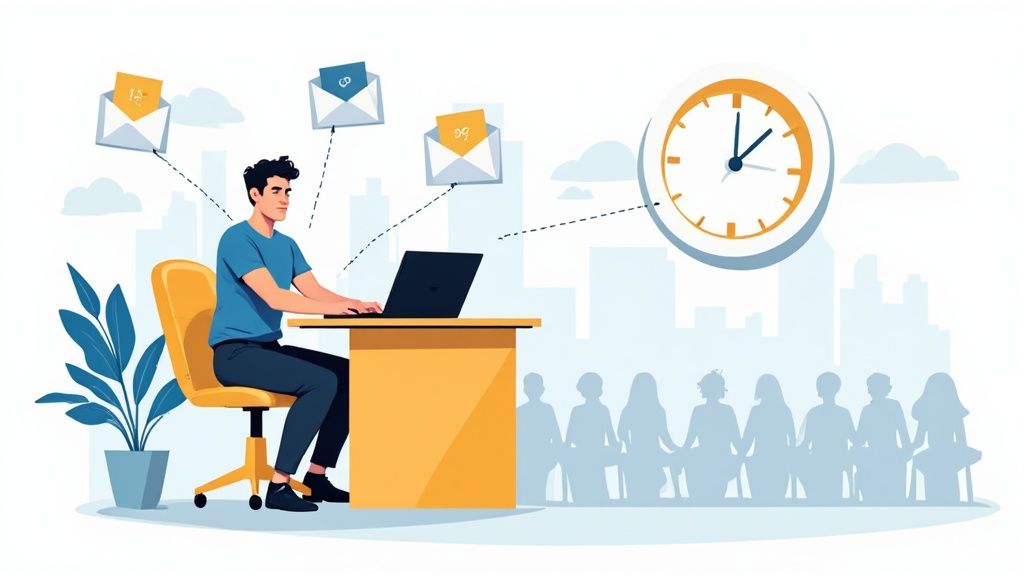
Your event landing page is so much more than a digital flyer; it's your most dedicated salesperson, working 24/7. This single page is the destination for all your hard work - from social media campaigns and email blasts to paid ads. How well it performs directly impacts your bottom line, from ticket sales to overall attendance.
As the Social Media Manager for Add to Calendar PRO, I’ve seen firsthand how a well-built page can make or break an event. A clear, compelling page builds excitement and trust. A confusing one? It just creates friction and sends potential attendees clicking away.
The Conversion Hub of Your Event
Every single element on your landing page should guide visitors toward one action: signing up. This sharp focus is precisely what makes it so effective. Unlike a full website with distracting navigation menus and competing information, a landing page creates a specific, controlled journey for your visitor.
And the data backs this up. A deep dive into over 41,000 pages found that while the median conversion rate across all industries is a respectable 6.6%, the events industry blows that away with a 12.3% median conversion rate. That’s more than one in ten visitors taking action! It just goes to show how powerful a dedicated page is for driving event registrations. You can dig into more of these numbers in the full landing page statistics report.
Your landing page isn't just an information source; it's a persuasion tool. It needs to anticipate and answer every question and overcome any hesitation a visitor might have, often before they even realize they have it.
Core Elements for a Winning Page
So, how do you turn a simple page into a conversion powerhouse? You start with a solid blueprint of essential components. These are the non-negotiable building blocks that work in harmony to inform, persuade, and ultimately convert your audience.
Here’s a quick rundown of what every high-converting event page needs. These are the fundamentals that lay the groundwork for success.
Core Elements of a High-Converting Event Landing Page
| Element | Purpose & Best Practice |
|---|---|
| Compelling Headline | Grab attention instantly and communicate the event's core value. Make it clear why they should care. |
| Essential Event Details | The "what, when, and where." Present this information clearly and up-front to eliminate any confusion. |
| Engaging Visuals | Use high-quality images or videos that capture the event's vibe and what attendees can expect. |
| Persuasive Copy | Tell a story. Detail the agenda, highlight the benefits, and explain why this event is unmissable. |
| Strong Call-to-Action (CTA) | A prominent, action-oriented button (or two) that makes signing up ridiculously easy. Think "Reserve My Spot" not "Submit." |
| Social Proof | Build credibility with testimonials, speaker bios, attendee counts, and sponsor logos. Show people that others trust you. |
Getting these elements right is the key to turning casual browsers into registered attendees. It’s how you set the stage for a packed house and a memorable event long before the doors even open.
Crafting Your Strategic Foundation
Jumping straight into designing your event landing page without a solid plan is a classic mistake. It’s like building a house without a blueprint. Before you even think about picking a font or writing a single headline, you need to lay the groundwork. This initial planning is what separates a page that just looks nice from one that actually drives registrations.
First things first, you have to nail down your event’s unique value proposition (UVP). This isn't just a catchy tagline; it's the core promise you're making. What transformation or tangible benefit will attendees get? Is it exclusive networking? Cutting-edge knowledge? Or just a really memorable experience? Your UVP needs to be crystal clear and compelling because it becomes the backbone of all your messaging.
Understand Who You’re Talking To
Once you know what you're offering, you need to know exactly who you're talking to. Don't just settle for basic demographics. You need to build out detailed attendee personas. Really dig into their professional roles, the daily challenges they face, and what truly motivates them.
- Goals: What are they hoping to achieve by showing up?
- Pain Points: What problems can your event solve for them, right now?
- Hesitations: What might stop them from registering? Is it the cost? The time commitment? Fear of the unknown?
When you understand these details, you can write copy that speaks to them on a personal level. It lets you address their needs and squash their objections before they even have a chance to take hold. I’ve seen it time and time again: a page built for a specific persona will always outperform a generic one.
A well-defined strategy acts as a filter for every single decision you make. When choosing an image, writing copy, or designing a button, you can just ask yourself: "Does this support my core message and speak directly to my ideal attendee?"
This thinking is especially critical for the registration process itself. You absolutely have to make it as frictionless as possible. Here’s a simple visual of what a clean registration flow should look like.
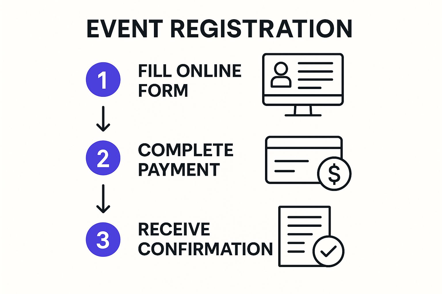
The key takeaway here is simplicity. Each step has to flow logically into the next, gently guiding the user without causing any confusion or frustration.
Set One Clear Conversion Goal
Finally, every landing page must have one primary conversion goal. It’s tempting to ask visitors to follow you on social media, subscribe to your newsletter, and register for the event, but that just dilutes your main objective. You need to decide on the single most important action you want them to take.
For most events, this goal will be one of two things:
- Ticket Sales: The user completes a purchase.
- Lead Generation: The user submits a form to register for a free event, like a webinar.
Every headline, image, testimonial, and call-to-action button on the page must be strategically aligned to steer visitors toward that single goal. This laser-focused approach eliminates distractions and makes the next step obvious, which dramatically increases your chances of conversion. With this strategic blueprint in hand, you’re finally ready to start building.
Designing a Page for Maximum Conversions

Alright, you've got your strategy nailed down. Now for the fun part: turning those ideas into a visual experience that actually gets people to sign up. This is where the magic happens, where you translate passive interest into active registration. It all starts with a headline that stops visitors dead in their tracks.
Your headline is your first - and honestly, your best - shot at grabbing someone's attention. It needs to scream your event's biggest benefit right away. Instead of just slapping the event name up there, think about the outcome.
Which sounds better? "Annual Marketing Summit 2024" or "Learn to Triple Your Leads in 30 Days"? It's a no-brainer. One is a label; the other is a promise.
Once you’ve hooked them with a great headline, your page copy needs to tell a compelling story. Don't just list facts. Detail the agenda, introduce your speakers and their credentials, and sprinkle in some social proof like testimonials or past attendee numbers to build trust. Every word should pull the visitor closer to clicking that button.
Crafting an Irresistible Call to Action
Let's be blunt: the single most critical element on your entire event landing page is the call-to-action (CTA). This isn't just a button; it's the front door to your event. It absolutely must be impossible to miss. Use a color that pops against the rest of the page and write copy that creates a sense of urgency and value.
Ditch generic words like "Submit" or "Register." They're boring and uninspired. Instead, use language that reinforces what they're getting:
- Reserve My Spot
- Get My Ticket
- Claim My Free Pass
- Join the Webinar
These action-oriented phrases create a sense of ownership, making the click feel more personal and rewarding. And yes, the old advice still holds true: place your main CTA "above the fold" where people can see it without scrolling. It's a best practice for a reason.
Building Trust with Social Proof and Visuals
Social proof is your secret weapon for knocking down a visitor's skepticism. When people see that other people have attended and loved your events, their hesitation to sign up plummets.
A powerful testimonial from a recognized name in your industry can be more persuasive than paragraphs of your own copy. It provides third-party validation that your event delivers on its promises.
You should weave in different kinds of social proof to build a rock-solid case for your event:
- Video testimonials from happy attendees from previous years.
- Logos of well-known companies that have attended or sponsored.
- Direct quotes that highlight specific, tangible benefits people gained.
- Headshots and bios of your expert speakers to showcase their authority.
A successful event landing page often includes a mix of these trust signals to make the decision to register an easy one.
Designing for Every User
In this day and age, a mobile-first design isn't just a nice-to-have - it's essential. A huge chunk of your traffic will come from smartphones. If your page is a pain to navigate on a small screen, you'll lose them in a heartbeat. Make sure your fonts are readable, buttons are easy to tap, and the registration form is dead simple to fill out on a phone.
Page load speed is another massive deal. A slow page will frustrate users and torpedo your conversion rates before they even get to read your amazing headline. This relentless focus on a smooth user journey is what separates the good pages from the great ones.
It's no accident that event and entertainment landing pages boast a stellar average conversion rate of 12.6%. Part of that success comes from being meticulously optimized for a frictionless experience.
Ultimately, a winning design is about more than just looking pretty; it’s about psychology and guidance. By combining a clear visual hierarchy with a seamless registration process, you can dramatically cut down on people leaving your page and send your attendance numbers through the roof.
Get More People to Actually Show Up with an Add to Calendar Button
Getting someone to register for your event is a huge win. But let's be honest, it's only half the battle. The real goal is getting that person to actually show up.
This is a classic stumble for so many event organizers. We get caught up celebrating the sign-up and completely forget about that crucial gap between registration day and event day.
That gap is where the humble "Add to Calendar" button becomes your secret weapon for boosting attendance. It's a simple, surprisingly powerful feature that turns a fleeting intention into a firm, scheduled commitment.
From Vague Intention to a Real Appointment
Think about it. When someone registers, their interest is at its peak. But then life happens. Emails get buried, notifications are swiped away, and even the most anticipated event can slip through the cracks without a solid reminder.
This is exactly the problem we built our service, Add to Calendar PRO, to solve.
By placing an Add to Calendar button on your thank-you page or in your confirmation email, you give attendees a one-click way to save the event directly to their personal calendar - be it Google, Outlook, or Apple. It’s seamless. It takes a single second.
This tiny action fundamentally changes the dynamic. Your event is no longer just another line item in an old confirmation email; it’s a blocked-off, non-negotiable part of their schedule.
A registration is just an expression of interest. A calendar entry is a plan of action. The Add to Calendar button is the bridge between the two, and it dramatically slashes no-show rates.
How to Do It Right
To get the most mileage out of this feature, placement and timing are everything. You have to strike while the iron is hot - when the user's excitement is at its highest.
From my experience, these are the two most effective spots to place your Add to Calendar button:
- On the Thank-You Page: The moment a user registers, their screen should pop with a confirmation. This is the perfect time to present a big, bold button that says something like "Add to My Calendar." They just committed, so make this next step an absolute no-brainer.
- In the Confirmation Email: This one is non-negotiable. Your confirmation email is the official record of their registration. Including a clear Add to Calendar link ensures they can add it to their schedule whenever they open that email, whether it's immediately or a week from now.
What's more, our service lets you configure custom reminders. This means you can automatically set up a notification for one day or one hour before the event, keeping it top-of-mind when it matters most.
You can even bake these calendar functions directly into your registration flow to make the experience completely seamless for your attendees.
Protecting Your Event's ROI
Every single person who registers but doesn't show up is a lost opportunity. That's lost networking, lost engagement, and ultimately, a lower return on your event investment. A high no-show rate is just plain discouraging and can kill the energy of the whole event.
Using an Add to Calendar button is one of the simplest, most effective ways to protect that investment. You're helping attendees remember why they were excited in the first place, which massively increases the chances they'll walk through the door (virtual or otherwise). It’s a tiny technical step with a huge impact on your final attendance numbers.
Driving Traffic and Optimizing for Performance
Getting your event landing page live is the starting line, not the finish. A beautiful page that no one sees is like a party with no guests. Now, the real work begins: driving high-quality traffic and constantly tweaking things to turn those visitors into registered attendees.
This post-launch phase is all about getting your page in front of the right people and maximizing its effectiveness. Without a solid plan to bring interested folks to your page, even the most amazing design is going to fall flat.
Driving High-Quality Traffic
Let's be clear: not all traffic is created equal. Your goal is to attract visitors who are genuinely excited about what your event offers.
A great place to start is your own email list. These are people who already know and trust your brand, making them a warm and receptive audience. But don't stop there. To really fill your event, you need to think bigger and explore different strategies to improve website visibility. This might mean running targeted social media ads, collaborating with industry influencers, or creating content that frames your event as an absolute must-attend.
A common mistake I see is focusing solely on traffic volume. It’s far more effective to attract 100 highly relevant visitors than 1,000 who have no interest in your event. Quality over quantity always wins.
For a deep dive into building out your promotional strategy, our guide on creating a solid event marketing plan is a fantastic next step. It ties directly into how you'll fuel your landing page with the right kind of traffic.
The Power of A/B Testing
Once people start arriving at your page, you need to figure out what’s working and what isn't. This is where A/B testing, also known as split testing, becomes your best friend. It’s the simple process of creating two versions of your page (A and B) with one key difference to see which one performs better.
My advice? Don't try to test everything at once. You'll just muddy the waters. Start with the elements that have the biggest impact:
- Headlines: Does a headline focused on a key benefit convert better than a straightforward, descriptive one?
- Call-to-Action (CTA) Button: Try testing different colors, text ("Reserve My Spot" vs. "Get My Ticket"), and even placement on the page.
- Images: Does a photo of last year's engaged crowd outperform a polished graphic of your keynote speaker?
By making small, incremental changes and measuring the results, you can make data-driven decisions that will steadily lift your conversion rate. It's a game of inches, but it adds up.
Traffic Source Conversion Rate Comparison
Not all traffic sources will perform the same. Some channels naturally bring in more motivated visitors. Understanding these differences helps you allocate your marketing budget more effectively.
| Traffic Source | Average Conversion Rate | Notes for Event Marketers |
|---|---|---|
| Email Marketing | 5-15% | Your warmest audience. Perfect for early-bird offers and building momentum. |
| Referral Traffic | 3-10% | High-quality leads from partners or influencers. Trust is already established. |
| Organic Search | 2-5% | Visitors with strong intent, but requires SEO effort. Great for long-term growth. |
| Paid Social | 1-3% | Excellent for targeting specific demographics and interests. Requires careful ad tuning. |
| Paid Search | 2-4% | Captures users actively searching for events like yours. Can be competitive. |
This table gives you a baseline, but remember to track your own numbers. Your specific audience and event will have its own unique conversion patterns.
Analyzing Performance and Making Improvements
You can't improve what you don't measure. It’s that simple.
Free tools like Google Analytics give you a treasure trove of insights into how people are interacting with your page. You don't need to be a data scientist, just keep an eye on a few key metrics to understand what's happening.
Pay close attention to your bounce rate (the percentage of visitors who leave after viewing only one page) and the average time on page. If people are bailing immediately, it could mean your headline isn't grabbing them or the page is loading too slowly. Seeing a high drop-off rate on your registration form? You might have too many fields or a confusing layout.
By looking at this data, you can spot the friction points in the user experience and make targeted improvements. This continuous cycle of driving traffic, testing, and analyzing is what turns a good landing page into a high-converting powerhouse.
Answering Your Biggest Landing Page Questions
When you're in the trenches building an event landing page, the same questions pop up time and time again. I've been there. Getting straight answers can be the difference between a page that converts like crazy and one that just...sits there. So, let's dig into some of the most common sticking points and get you some practical advice.
"How Long Should My Page Be?"
This is probably the number one question I get. Forget word count. The real answer is: your page needs to be exactly as long as it takes to convince someone to sign up.
Think about the "ask." For a simple, free webinar, you can probably get away with a shorter, punchier page. But if you're selling tickets to a $1,500 multi-day conference, you've got a lot more convincing to do. You'll need space for speaker bios, a detailed agenda, venue information, and plenty of social proof to make people feel good about that investment.
The rule of thumb is simple: the bigger the "ask" (time, money, commitment), the more information and persuasion you need to provide. Don't be afraid of a long page if every section serves a purpose.
"How Many Form Fields Is Too Many?"
Ah, the classic tug-of-war. You want all the data, but every single field you add is another reason for someone to give up and leave. It's a real conversion killer.
For most events, all you truly need to get started is a Name and an Email Address. That's it. Keep it simple.
If you absolutely must collect more info, don't ask for it all at once. Use a multi-step form. Grab their name and email on step one - boom, you've got the lead. Then, on the next screen, you can ask for the "nice-to-have" details like company name or job title. It feels like much less of a chore for the user and you've already secured the most important contact info.
"When Should I Start Promoting?"
Timing is everything. Go too early, and people forget. Go too late, and you miss out on potential attendees. You need to hit that sweet spot to build momentum. The moment you've locked in the core details - the date, your core value proposition, and maybe a speaker or two - it's time to go live.
Here’s a rough guide based on my experience:
- Major Conferences (multi-day, high-ticket): Start your push 6-8 months out. This gives attendees enough lead time to get budget approval from their bosses and sort out travel.
- Local Workshops or Seminars: Aim for 2-3 months in advance. It’s the perfect window to build buzz without losing urgency.
- Webinars or Virtual Events: The magic number is 3-4 weeks. Any earlier, and you risk a high no-show rate because people forget they even registered.
Starting early isn't just about selling tickets; it's about building an audience. You can grow an email list of interested people, run successful early-bird campaigns, and create a steady stream of conversation that builds right up to your event day.
Ready to build an event landing page that not only captures registrations but ensures people show up? Add to Calendar PRO makes it easy to integrate a simple, one-click Add to Calendar button, turning registrations into committed attendees. Learn more and get started at https://add-to-calendar-pro.com.