You spent three sprints perfecting every border-radius, every transition curve, every hover state on your event page. Then someone on the team dropped in a third-party calendar button.
And just like that - your brand shattered. Your Lighthouse score tanked. And somehow, the vendor wants to charge you more to make it look like it belongs.
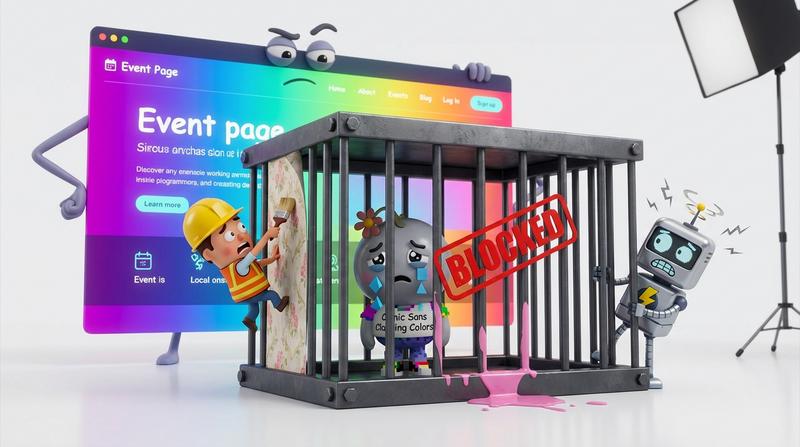
Sound familiar?
This article is about closing that gap. No compromise on aesthetics. No compromise on accessibility. And definitely no per-click "white-label tax" that punishes you for actually getting traffic.
📌 Key Takeaways
- Generic third-party calendar buttons routinely fail WCAG focus states, ARIA labeling, and touch target requirements.
- White-label fees create a perverse incentive: the more successful your events, the more you pay just to keep your brand intact.
- A truly branded calendar button needs visual fidelity (dark/light mode, RTL, custom colors) and bulletproof accessibility - simultaneously.
- Add to Calendar PRO's Custom Style system gives you full CSS control with W3C WAI-compliant input handling baked in - at a fixed price.
- You can ship once and pass every audit across every client, every theme, and every device.
💔 Why "Good Enough" Breaks Everything
Here's the deal: most calendar buttons you encounter in the wild are cosmetically lazy and structurally broken.
They ship with hardcoded colors that clash with your design system. They use <div> elements styled to look like buttons but fail keyboard navigation entirely. Their touch targets are 30px on a good day. And their ARIA labels? Either missing or so generic they tell a screen reader user absolutely nothing useful.
This isn't hypothetical. Federal courts saw 3,117 website accessibility lawsuits in 2025 alone - a 27% jump from the year before. Website accessibility cases now represent 36% of all ADA Title III federal filings. That tiny calendar button sitting in the corner of your event page? It's an attack surface.
But the pain doesn't stop at compliance.
There's a financial trap, too. Many calendar tool vendors offer "white-label" styling as a premium tier. Want to remove their logo? Pay more. Want custom colors? Pay more. Want it to not look like a foreign object jammed into your carefully crafted UI? You guessed it.
And the kicker - these fees often scale with usage. The more events you run, the more clicks you get, the more you pay. It's a model that penalizes marketing success instead of rewarding it.
"Design is not just what it looks like and feels like. Design is how it works." - Steve Jobs
A branded calendar button that breaks under audit doesn't work. Period.
🎨 What a Real Branded Calendar Invitation Actually Needs
Let's break this down into two buckets - because that's how most teams think about it (even though, spoiler, they shouldn't be separate).
Visual Fidelity
- Dark/light mode support that isn't an afterthought. Your button needs to respond to
prefers-color-schemeor your app's theme toggle - not ship with a single baked-in palette. - Custom colors and typography that pull from your design tokens, not from some vendor's default stylesheet.
- RTL layout support for the 2.3+ billion people who read right-to-left. If your calendar button breaks in Arabic or Hebrew, you've excluded a massive chunk of the planet.
- Consistent sizing and spacing that respects your grid system.
A11y Non-Negotiables
- Keyboard navigation that makes logical sense - Tab to focus, Enter/Space to activate, Escape to dismiss.
- Screen reader labels that actually describe the action ("Add Summer Kickoff to your calendar" beats "Button" every single time).
- Touch targets of at least 44×44 CSS pixels. WCAG 2.5.5 sets this as the Level AAA standard, and it aligns with both Apple's Human Interface Guidelines and Google's Material Design specs. Even the Level AA criterion (WCAG 2.5.8) demands a minimum of 24×24px - which many generic buttons still fail.
- Color contrast ratios that survive both your light and dark themes.
Here's the thing most teams get wrong: these two lists feel like opposing forces. You want creative freedom? Accessibility constrains you. You want strict compliance? Your designer screams.
But they're not opposites. They're complementary constraints. Great design has always worked within constraints. The branded calendar button challenge is no different.
If you're not sure where your current setup falls, run through this WCAG checklist most calendar buttons fail. You might be suprised.
🔍 The Audit Checklist Designers Skip
Let's get specific. Here's what a proper audit looks like for a calendar button - and where most implementations silently fail:
| Audit Criterion | What It Checks | Common Failure Mode |
|---|---|---|
| WCAG 2.4.7 - Focus Visible | Focus indicator is clearly visible on keyboard navigation | Button uses outline: none with no replacement style |
| WCAG 4.1.2 - Name, Role, Value | ARIA label describes the action meaningfully | Label reads "Button" or is completely absent |
| WCAG 1.4.3 - Contrast (Minimum) | 4.5:1 for normal text, 3:1 for large text | Passes in light mode, fails in dark mode (or vice versa) |
| WCAG 2.5.5 - Target Size | Clickable area is at least 44×44 CSS pixels | Icon is 24px with no padding to expand hit area |
| WCAG 1.3.4 - Orientation | Content doesn't lock to one orientation | Dropdown menu overflows on landscape mobile |
| RTL Layout | Button and dropdown render correctly in RTL contexts | Text and icons mirror improperly or overlap |
Notice a pattern?
Most of these issues are invisible on a desktop Chrome audit with a mouse. They surface when someone:
- Tabs through your page with a keyboard
- Uses VoiceOver or NVDA on a mobile device
- Switches to dark mode at 2 AM
- Loads your page in Arabic or Urdu
- Taps with a thumb on a 5-inch screen
"Passes on desktop" is a dangerously low bar. And if your third-party calendar button vendor doesn't account for all of these states, you're inhereting their debt every time you embed their widget.
"The details are not the details. They make the design." - Charles Eames
Focus states, ARIA labels, contrast ratios across themes - these are the design.
🛠️ Branded Calendar Invitations Without the White-Label Tax
So what does a solution actually look like? Let's paint the picture.
You need a tool that gives you:
- Full CSS control - not a "pick from 3 themes" dropdown, but actual access to style every element. Colors, fonts, border-radius, shadows, spacing. Your design tokens. Your system.
- Built-in dark/light mode support - so you configure both themes once and ship.
- RTL support that just works, without you having to hack CSS transforms.
- W3C WAI-compliant input handling out of the box - proper semantic HTML, keyboard navigation, screen reader labels, and touch targets that meet the 44px threshold.
- Fixed pricing that doesn't scale with your success.
This is exactly where Add to Calendar PRO fits.
Its Custom Style system (both Light and Dark variants) gives front-end developers the kind of granular control they'd normally have to build from scratch - except the accessibility layer is already baked in. You don't have to choose between looking on-brand and passing Axe or Lighthouse audits. It ships both.
And critically - there's no white-label fee. No per-click billing. No "premium tier to remove our branding" trap. You style it once, deploy it everywhere, and the cost stays flat whether you're running 10 events or 10,000.
For teams managing multiple clients or brands, this is espesially powerful. You build one compliant, branded implementation per client and reuse it. No per-interaction billing models eating into margins. No re-auditing every quarter because the vendor pushed an update that broke your focus states.
If you want to see how this plays out in practice - from accessible link generation to brand-matched styling - check out how calendar link generators that pass every accessibility audit while matching your brand actually work under the hood.
✅ Beautiful and Bulletproof Isn't a Luxury
Let's be real.
Your users don't care about WCAG criterion numbers. They care about whether the button works when they tap it with their thumb. Whether their screen reader tells them what's about to happen. Whether it looks like it belongs on your page and not like some widget from 2014.
Beautiful and bulletproof isn't a luxury line item you negotiate for in a vendor contract. It's the baseline. Your users already expect it. Your legal team increasingly demands it. And with 3,117 federal accessibility lawsuits filed in 2025 alone, the courts are paying attention too.
The irony? The "free" or cheap generic button you're patching every quarter - adjusting its colors after each vendor update, manually adding ARIA labels they keep overwriting, filing support tickets about broken focus states - that solution is costing you more in dev hours, audit remediation, and brand inconsistency than a proper tool ever would.
So stop paying the white-label tax.
Stop patching someone else's accessibility debt.
Build a branded calendar button that passes every audit - because the right tool makes that the default, not the exception. 🚀