Key Takeaways:
- A pixel-perfect event landing page means nothing if the social share preview looks broken, cropped, or empty.
- Open Graph (OG) tags control what people see on LinkedIn, Facebook, WhatsApp, and Slack - and most front-end devs don't own them.
- Your beautifully accessible Add to Calendar button won't get clicked if the share preview kills traffic before anyone reaches the page.
- There's a clear checklist for fixing OG images, titles, and descriptions without breaking your design system.
- Add to Calendar PRO ensures the calendar-save step of the chain never fails - even when everything upstream is chaos.
You spent 14 hours kerning that headline. You hand-tuned the focus states on every interactive element. Your Add to Calendar button passes WCAG AA and looks gorgeous in dark mode.
Then your marketing lead shares the event page on LinkedIn.
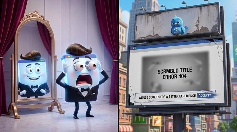
No image. A truncated title that cuts off mid-word. A description pulled from your cookie banner. 💔
That's the gut punch we're dissecting today. Because the invisible meta layer underneath your beautiful UI is silently sabotaging your event's reach - and traditional accessibility audits won't catch it.
🔍 Section 1: Why the Share Preview Matters More Than You Think
Here's the deal: your event landing page doesn't make its first impression on your website.
It makes its first impression inside a LinkedIn feed. A WhatsApp thread. A Slack channel. A tweet. Wherever someone pastes that URL before they ever hit "RSVP."
And real user behavior backs this up:
- People share events before they register. They send the link to a friend, a coworker, a partner - "Hey, should we go to this?"
- The share preview IS the pitch. If it looks broken, the link dies in the chat. Nobody clicks through.
- A share-ready event landing page with properly configured OG images can generate 100% more engagement and 114% more impressions compared to one without.
So your button's border-radius might be flawless. Your color tokens might be perfect. But if the social preview looks like a 404 page, none of that matters.
The gap between "looks great in browser" and "looks broken on Twitter" is where events quietly fail.
"You never get a second chance to make a first impression." - Will Rogers
And your first impression isn't the landing page. It's the card preview in someone's feed.
🧩 Section 2: What Actually Controls Your Social Preview
Let's skip the jargon-heavy explanation. Here's what's happening under the hood when someone pastes your URL into a social platform:
The platform sends a bot to your page. That bot ignores your beautiful CSS, your animations, your JavaScript. It looks for three specific meta tags in your <head>:
| OG Tag | What It Controls | Optimal Length (2025) | What Happens If It's Missing |
|---|---|---|---|
og:title | The bold headline in the preview card | Under 60 characters (source) | Platform scrapes your <title> tag - often ugly |
og:description | The supporting text below the headline | 55-65 characters for mobile | Platform grabs random page text (hello, cookie banner) |
og:image | The visual preview image | 1200 x 630px at 1.91:1 ratio (source) | No image shown, or a tiny favicon. Devastating. |
Here's where it gets tricky for front-end folks:
- Facebook caches OG tags aggressively. You fix the tag, but the old broken preview persists until you manually clear it via the Facebook Sharing Debugger.
- LinkedIn truncates titles at roughly 60 characters. Your beautiful event name "✨ The Annual Creative Leadership Summit & Networking Experience 2025" becomes "✨ The Annual Creative Leadership Summit & Networ..."
- Twitter/X uses its own Twitter Cards system but falls back to OG tags when those aren't present.
- WhatsApp enforces a strict 300KB limit on preview images. Your lovingly crafted 2MB hero image? Silently ignored.
Missing or misconfigured OG tags don't throw errors. They don't break your build. They just... quietly kill your event's reach. And nobody notices until someone screenshots the broken preview in a Slack thread and asks "uh, is this right?"
😓 Section 3: The Design and UX Tension Nobody Talks About
This is where it gets personal for front-end developers and UI/UX designers.
You've done the hard work. Your Add to Calendar button:
- ✅ Passes WCAG AA contrast ratios
- ✅ Has proper ARIA labeling
- ✅ Meets 44px minimum touch target sizing
- ✅ Handles focus states beautifully in both light and dark mode
- ✅ Survives every Lighthouse audit you throw at it
(If it doesn't pass all of those, you should probably check this accessibility checklist your calendar button is failing before reading further.)
But here's the tension:
Accessibility audits catch focus states. They don't catch broken OG images.
Your automated testing pipeline won't flag a missing og:image. Axe won't report it. Lighthouse won't complain. Your Figma handoff document doesn't include a section for "social share preview QA."
And organizationally? Front-end devs typically own the button UI, the component library, the interaction layer. But they often don't own the meta tags. That's "SEO's job." Or "marketing's job." Or nobody's job.
The result: a landing page that's pixel-perfect in every browser, bulletproof for every assistive technology - and looks like absolute garbage the moment someone shares it.
This is the invisible layer. And it's the one that actually drives traffic to your page in the first place.
⛓️ Section 4: How Your Calendar Button Experience Connects to the Preview Problem
Let's trace the chain from share to calendar save:
- Someone shares your event URL → Social preview appears in a feed/chat
- Preview looks compelling → Recipient clicks through to your landing page
- Landing page impresses → Visitor hits your Add to Calendar button
- Calendar save succeeds → Event sits in their calendar, driving actual attendance
Now watch where the chain snaps:
- 🔴 Broken preview at Step 1? Nobody clicks. Steps 2-4 never happen.
- 🔴 Ugly or confusing preview? Click-through drops. Fewer people reach the button.
- 🔴 Landing page is great but the button fails? They showed up, got excited, then... nothing. Dead end.
The commitment gap between registration and attendance is already a massive problem - 30-50% of registrants never show up. Every broken link in this chain makes it worse.
But there's a catch: you can't control everything in this chain. Social platforms render previews however they want. Users share links in unpredictable contexts.
What you can control is making sure the parts you own never fail.
Add to Calendar PRO handles the calendar-side of this chain cleanly. Its fully customizable style system supports light and dark mode out of the box, RTL layouts, and W3C WAI-compliant input handling - so the button matches your design system and meets accessibility standards simultaneously. The calendar save step just works. On every device, every platform, every time.
That means if you fix the preview problem (Steps 1-2), Add to Calendar PRO ensures Steps 3-4 never break. At least that part of the chain stays solid.
🛠️ Section 5: Fixing the Preview Without Breaking Your Design System
Alright, let's get practical. Here's your checklist for making social previews as polished as your UI:
OG Image Specifications
- Size: 1200 x 630 pixels (1.91:1 aspect ratio) - this is the universal standard that works across Facebook, LinkedIn, Twitter, WhatsApp, and Slack (source)
- Safe zone: Keep critical content (text, logos) within the central 80% of the image - platforms crop edges differently
- File size: Under 300KB if you want WhatsApp previews to work. Under 5MB as an absolute max.
- Format: JPG or PNG. No SVGs, no WebP (some crawlers don't support them).
Title & Description Rules
og:title: 60 characters max. Period. Not 61. Not "well, LinkedIn shows 70 on desktop." Just keep it under 60. (source)og:description: 55-65 characters for safe mobile rendering.- Write them like ad copy, not like page titles. Front-load the important words.
🌗 Dark Mode Considerations for Preview Images
This one's for the designers who care (and I know you care):
- Social platforms increasingly render link cards in dark mode based on user system prefernces
- Avoid pure white (
#FFFFFF) backgrounds - they'll blow out like a flashlight in a dark feed - Avoid pure black (
#000000) backgrounds - they'll blend into the dark mode UI and look frameless - Use your brand colors with enough contrast to hold up in both modes
- Test your OG image by viewing it on a dark background AND a light background before shipping
Testing Tools (Use All Three)
| Tool | Platform | What It Does | Cache Clearing? |
|---|---|---|---|
| Facebook Sharing Debugger | Facebook/Meta | Validates OG tags, shows exact preview, clears cached previews | ✅ Yes ("Scrape Again") |
| LinkedIn Post Inspector | Validates and previews LinkedIn-specific card rendering | ✅ Yes | |
| Twitter Card Validator | Twitter/X | Shows Twitter Card preview based on Twitter Card tags or OG fallbacks | ❌ Preview only |
Pro tip: Run all three before your event campaign goes live. Not after someone screenshots the broken preview in your team Slack. 😬
Quick Implementation Checklist
- ☐ Add
og:title(under 60 chars) to your<head> - ☐ Add
og:description(under 65 chars) to your<head> - ☐ Add
og:imagepointing to a 1200x630 image under 300KB - ☐ Add
og:urlwith the canonical URL - ☐ Test in Facebook Sharing Debugger
- ☐ Test in LinkedIn Post Inspector
- ☐ Test in Twitter Card Validator
- ☐ View your OG image on both light and dark backgrounds
- ☐ Verify the button and calendar-save flow works end-to-end
- ☐ Ship it 🚀
🎯 Conclusion: Fix the Invisible Layer
"Design is not just what it looks like and feels like. Design is how it works." - Steve Jobs
And right now, your event landing page probably works beautifully in the browser - but breaks the moment it hits a social feed.
The invisible meta layer isn't glamorous. Nobody gets Dribbble likes for a well-crafted og:image. But it's the layer that actually drives people to your page, to your button, to your calendar save, and ultimately to your event.
The good news? It's fixable in an afternoon. Run the checklist above. Test with the debugger tools. Make your OG image as intentional as your button design.
And for the calendar-save side of the equation - the button itself, the accessibility compliance, the cross-platform reliablity - Add to Calendar PRO's customizable style system handles that part out of the box. Light mode, dark mode, RTL support, WCAG compliance, ARIA labeling - all baked in so you don't have to rebuild it from scratch.
A beautiful landing page deserves a beautiful share preview. Fix the invisble layer before your next campaign goes live.
Your users will never know you did it. But they'll click. And that's the whole point.