Your event's success hinges on one thing more than any other: the event registration landing page. This isn't just a sign-up form. It's your event's digital welcome mat, its first impression, and the single most important engine you have for driving attendance.
Why Your Landing Page Defines Event Success
As the Social Media Manager for Add to Calendar PRO, I’ve seen it time and time again: a thoughtfully designed page can turn a casual browser into a committed attendee, filling seats and creating real buzz. Your landing page is your most critical conversion tool, and its entire purpose is to get visitors to do one thing: register.
Think about it. All of your hard work - every social media post, every email campaign - points to this one page.
Unlike your main website, which might have a dozen different goals, this page has a singular, focused mission. It’s your 24/7 sales rep, tirelessly answering questions, building excitement, and clearing a smooth path for people to sign up.
The Core Job of Your Registration Page
A great landing page doesn't just list a bunch of details; it sells the value of your event and builds trust from the first click. A polished, professional page instantly tells visitors that your event is credible and worth their time. This is especially true for paid events, where people are investing not just their time but their hard-earned money.
To really work, the page needs to nail a few key tasks:
- Grab Attention Immediately: The second someone lands on the page, the headline and main image need to scream, "You're in the right place!" and instantly communicate the event's biggest benefit.
- Communicate Essential Value: It has to quickly answer that all-important question every visitor is asking: "What's in it for me?" This means shining a spotlight on your speakers, can't-miss agenda items, and networking opportunities.
- Eliminate Every Ounce of Friction: The sign-up process has to be ridiculously simple. A long, clunky, or confusing form is the fastest way to lose someone who was just about to register.
- Build Trust and Credibility: Things like testimonials from past attendees or logos of your sponsors provide powerful social proof. They reassure visitors and make them feel good about their decision to sign up.
A well-crafted event registration landing page acts as a central hub for all promotional activities. It ensures that every click from an email, ad, or social post leads to a consistent, persuasive, and action-oriented experience.
Ultimately, this page is the final bridge connecting your marketing efforts to your attendance numbers. If you focus on creating a clear, compelling, and user-friendly experience, you’re setting the stage for a packed house. Every single element, from the words you choose to the color of your call-to-action button, plays a vital role in turning casual visitors into confirmed attendees.
The Anatomy of a Landing Page That Actually Converts
There’s definitely an art to building an event registration landing page that works, but it’s not all guesswork. The best ones - the pages that consistently turn curious visitors into confirmed attendees - all share some common DNA. They're all built with one single, obsessive goal: getting that registration.
Let's break down the essential pieces that make it all click.
The whole thing starts the second someone lands on your page. That headline is your first impression, and you might not get another. It needs to immediately answer the visitor's silent question: "What's in it for me?"
Forget generic titles like "Marketing Conference 2024." Go for something that screams value, like "Unlock the Future of Marketing: Join Industry Leaders in 2024." You're instantly framing the event around what they’ll gain.
Nailing the Core Details
Okay, you've grabbed their attention. Now, lay out the essential info with crystal clarity. Ambiguity is the absolute enemy of conversion. You need to make the "what, when, and where" impossible to miss.
Your page must clearly show:
- Event Date and Time: The full date, plus specific start and end times. If it's a multi-day event, show a clear schedule.
- Location or Platform: For an in-person event, list the venue name and full address. If it's virtual, say which platform you're using (Zoom, Hopin, etc.).
- A Detailed Agenda: A quick, scannable agenda lets people see the value you've packed in, from keynote speakers to the breakout sessions they can't miss.
Getting this foundational stuff right removes any friction. It helps visitors figure out immediately if the event is a fit for their schedule and interests. We’ve seen it time and again: pages that lay this out cleanly just have fewer people bouncing.
Driving Action and Building Trust
Now for the fun part: the visuals, the call-to-action (CTA), and the social proof. These are the elements that build excitement and nudge people over the finish line.
Engaging visuals, like great photos from last year's event or a punchy, high-energy video, communicate the vibe way better than a block of text ever could.
Your call-to-action (CTA) is the bridge from "I'm interested" to "I'm in." It needs to be bold, obvious, and action-focused. Use direct language like "Save My Spot" or "Register for Free" - anything but a limp, passive "Submit." I like to place a CTA near the top of the page and another one right after the agenda or speaker bios. That way, it's always right there when the moment of decision strikes.
Turning page views into sign-ups is one of the toughest nuts to crack for event marketers. The average conversion rate for an event registration page hovers at a painful 5%. That means only five out of every 100 visitors actually finish the process. It just goes to show how every single element matters in building confidence and removing roadblocks. You can dig into more of these landing page statistics to see how you stack up.
Want a little trick to push people at that critical moment? Add some "micro-proof" right next to your CTA button. A simple line like "Join 1,200+ marketing professionals" adds a powerful dose of social validation. It taps into that fear of missing out and reassures them that they're making a smart move, helping you push way past that 5% benchmark.
Designing a Frictionless Registration Experience
The best design is the kind you don't even notice. It just works. The whole registration process should feel completely effortless for your attendees. A slow, confusing, or clunky page is the fastest way to lose someone who was literally seconds away from signing up.
The goal here is simple: eliminate friction at every possible turn.
This all starts with a mobile-first approach. It's not just a buzzword; a huge chunk of your audience will land on your page from their phone. Your design has to look and function perfectly on that small screen. Think big, easy-to-tap buttons, text you can actually read without pinching to zoom, and a form that's a breeze to fill out on the go.
Keep Your Registration Form Simple
The point of your registration form is to get a commitment, not to build a complete dossier on every attendee. I've seen it a thousand times: every single field you add is another reason for someone to give up and leave.
For most events, especially free ones, all you really need is a name and an email address. That’s it.
If you think you need more information, ask yourself: is it absolutely critical for the initial registration? Could you gather things like company name or job title in a follow-up email or a post-registration survey instead? I bet you can.
- Cut down your fields: Stick to the bare essentials. Seriously.
- Use smart defaults: Pre-fill information whenever you can.
- Enable autofill: Make sure browser autofill works flawlessly to speed things up.
Adopting this minimalist mindset shows you respect your visitor’s time. It turns signing up from a chore into a quick, painless task. For a deeper dive, check out some general ecommerce conversion rate optimisation tips - many of the core principles for reducing friction are universal.
Build Confidence with Trust Signals
Even with the world's simplest form, people need to feel secure before handing over their info. This is where trust signals come into play. They're small but mighty elements that reassure users their data is safe with you.
A slow-loading page is a total conversion killer. A tiny one-second delay in page load time can cause a 7% reduction in conversions. Optimizing your images and scripts isn't just a technical to-do list item - it’s a crucial part of creating a good user experience that actually encourages sign-ups.
Weave these signals into your design to build instant credibility:
- Security Badges: Displaying familiar logos like Norton or McAfee can go a long way in easing security concerns.
- Privacy Policy Link: A clear, easy-to-find link to your privacy policy shows you’re transparent about how you handle data.
- Contact Information: Providing an email or phone number proves you’re a real, legitimate organization people can reach.
These elements work together to create a smooth path from "interested" to "registered." By focusing on speed, simplicity, and trust, you remove the roadblocks that cause people to drop off.
Of course, getting them to register is only half the battle. The next step is making sure they actually show up. Our service helps with that by letting you create an RSVP link that adds the event to their calendar in a single click.
Driving the Right Audience to Your Page
You've built a beautiful, high-converting event registration landing page. That's a huge win, but it's really only half the journey. An amazing page is completely useless if no one ever sees it. Now, the real work begins: promotion. It's time to strategically drive the right people to your page and turn all that potential into actual sign-ups.
This isn't about just blasting a link everywhere you can think of. It's about a more surgical approach. You need to find the channels where your target audience already hangs out and craft a message that guides them seamlessly from that first curious click to the final registration confirmation.
The Unmatched Power of Email Marketing
When it comes to getting people to register for an event, one channel consistently blows all others out of the water: email marketing. It's direct, it's personal, and it lets you speak to an audience that has already given you permission to be in their inbox.
That existing relationship creates a foundation of trust that other channels just can't match.
The data backs this up, big time. While the events and entertainment industry as a whole has a healthy median conversion rate of 12.3%, email marketing takes things to a whole new level. Event campaigns sent via email convert at an incredible 19.3%.
To put that in perspective, paid search hovers around 10.9% and paid social media sits at 12%. Tapping into your email list means you're reaching a pre-qualified, engaged group of people, which is exactly why it delivers such knockout results. You can dig into more of these fascinating landing page performance insights on Backlinko.com.
Paid Search vs. Paid Social Media
While email is the undisputed champion for your existing audience, paid channels are your best bet for reaching new people and expanding your event's visibility. Both paid search (think Google Ads) and paid social media (like ads on Facebook or LinkedIn) have their own unique strengths.
Let's break them down:
- Paid Search (Google Ads): This is all about capturing intent. You're getting in front of people who are actively looking for events just like yours. The trick is to bid on the specific keywords your ideal attendee would type into Google, like "digital marketing conference NYC" or "free webinar on UX design."
- Paid Social (Facebook/LinkedIn Ads): This channel is more about discovery. You can target users based on their interests, job titles, or demographics. It's fantastic for building awareness and reaching people who might not even know they need your event until they see your compelling ad in their feed.
The secret to a successful paid campaign isn't just about targeting - it's about message consistency. Your ad copy and visuals must perfectly mirror the headline and imagery on your event registration page. This creates a smooth, frictionless journey that reassures visitors they've landed in the right place, making them far more likely to convert.
Don't just take my word for it. Look at how a simple promo video can dramatically move the needle on key metrics.
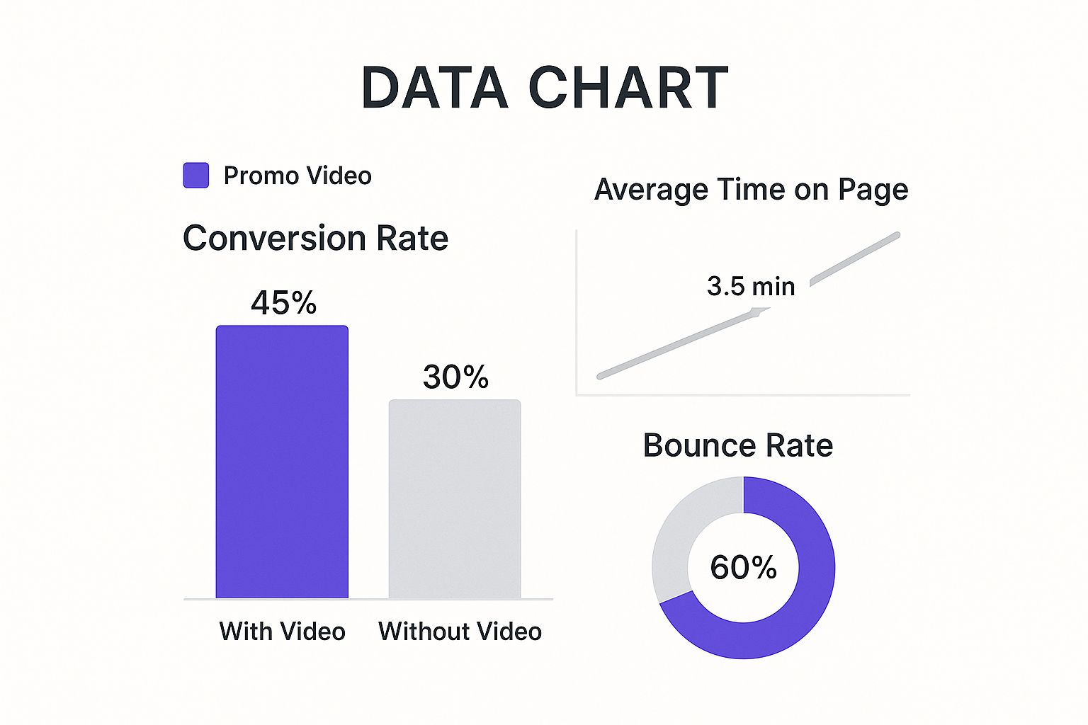
The data here is crystal clear: adding a video can boost conversions by a staggering 15%. That's a testament to its power to engage and persuade potential attendees in a way that static text and images just can't.
Speaking of traffic sources, knowing what to expect from each channel is crucial for setting realistic goals and allocating your budget effectively.
Event Landing Page Traffic Channel Conversion Rates
Here’s a look at how different traffic sources typically perform when it comes to event registrations. This can help you decide where to double down and where to experiment.
| Traffic Channel | Median Conversion Rate | Strategic Insight |
|---|---|---|
| Email Marketing | 19.3% | Your highest ROI channel. Nurture your list and use it for every event launch. |
| Paid Social Media | 12.0% | Excellent for audience discovery and brand awareness. Use strong visuals and clear targeting. |
| Paid Search | 10.9% | Best for capturing high-intent traffic. Focus on long-tail, specific keywords. |
| Organic Search | 9.8% | A long-term play. Requires solid SEO on your event page and supporting content. |
| Referral Traffic | 8.7% | Great for partner and affiliate marketing. Build relationships with industry influencers. |
| Direct Traffic | 7.5% | Often driven by offline marketing or strong brand recall. A good measure of brand health. |
As you can see, not all traffic is created equal. While organic and referral traffic are valuable, nothing quite beats the focused, high-intent audience you can reach through a well-executed email or paid media campaign. Using a mix of these channels is often the best strategy for a sold-out event.
Mastering Promotion Timing and Post-Registration Engagement
Here’s something a lot of event organizers miss: your work isn’t done the moment the event registration landing page goes live. Far from it. That’s just the starting pistol. The real race is won by timing your promotion perfectly to drive sign-ups and fill every seat.
To really nail this, you have to understand how people behave. While it’s always a good idea to start promoting early, a surprisingly huge number of people wait until the last possible second to commit. This pattern means you can't just set it and forget it; you need a strategy that covers the early birds and the procrastinators.
The Power of the Final Push
It feels a bit backward, but so many of your potential attendees are last-minute decision-makers. The data doesn't lie. Kicking off your promotion at least four weeks early can boost sign-ups by 12%, which is great for catching the keen planners.
But get this: a staggering 59% of registrations flood in during the final week. And even crazier, 17% happen on the actual day of the event. If you want to dig into the numbers, Landingi.com has some fascinating stats on event registration patterns.
What does this tell us? You need a sustained promotional blitz right up until showtime. Don't ease off the gas in the final days - that’s when you should be flooring it. Your landing page and marketing channels have to be ready for that final, massive wave of interest. For more ideas on getting your timing right, check out our guide on how to promote an event online.
Beyond the Thank You Page
Just as important is what happens after someone clicks that "Register" button. A generic "Thanks for registering!" page is a massive, massive missed opportunity. This is your first touchpoint with a confirmed attendee, and you need to use that moment to build excitement and lock in their commitment.
Think of your confirmation page not as the finish line for registration, but as the starting line for their event experience.
Your post-registration experience is your secret weapon against no-shows. An engaged attendee is far more likely to be an attendee who actually shows up. Use this initial excitement to make your event a can't-miss priority in their schedule.
You can completely transform your confirmation page with a few simple, actionable elements:
- One-Click Calendar Integration: This is non-negotiable and easily the most effective thing you can do. Make it dead simple for them to get your event on their calendar. With our service, Add to Calendar PRO, you can pop in a button that handles all the complicated stuff, making sure your event saves correctly across Google, Outlook, Apple Calendar, and more.
- Encourage Social Sharing: Arm your new registrants with pre-written social media posts or simple "Share with a colleague" links. You’d be surprised how many people will do it, turning them into instant advocates for your event.
- Provide Clear Next Steps: Don’t leave them at a dead end. Give them something to do right now. Suggest they follow your event hashtag, join a dedicated Slack or LinkedIn group for attendees, or download a resource related to the event topic.
By creating an engaging post-registration journey, you keep the momentum going strong. You’re not just processing a transaction; you’re starting a relationship. This keeps your event top-of-mind and dramatically cuts down your no-show rate.
Common Landing Page Questions Answered
Even the most buttoned-up event plan has a few loose threads. When it comes to building your event registration landing page, questions are just part of the process. Having helped thousands of event organizers work through these same head-scratchers, we've compiled the most common ones right here.
Think of this as your personal cheat sheet for those final, make-or-break decisions.
What Is the Single Most Important Element on My Page?
Tough question. Every piece of the puzzle matters, but if I had to pick just one, it's the Call-to-Action (CTA). This is where intent turns into action. It’s the final handshake that seals the deal and gets you a registration.
Your CTA needs to be more than just a button; it needs to be an invitation. Ditch the generic "Submit" and use action-packed language like "Save My Spot" or "Register for Free." Then, make it pop. Use a color that stands out from the rest of your page and place it right where someone's excitement is at its peak - maybe just after they’ve read the killer agenda or seen the speaker lineup.
How Long Should My Registration Form Be?
As short as humanly possible. Seriously. Every single field you add is another little piece of friction, another reason for someone to close the tab and move on. The mission is to make signing up feel effortless.
For most free events, a name and email are all you really need to get started. If you're itching for more data to segment your audience, ask yourself: is this information a must-have right now, or can I get it later with a post-registration survey? Less is almost always more here.
Building a seamless registration flow is one of the easiest wins for boosting conversions. You're respecting your visitor's time and knocking down the walls that cause so many people to drop off. A simple form plus clear instructions is a powerful combo.
If you want to go deeper on this, we've laid out the whole playbook in our guide covering 8 event registration best practices for 2025.
How Can I Build Trust and Credibility?
Trust is everything, especially when you're asking for someone's time or money. You need to show them your event is the real deal, and the best way to do that is with social proof.
Here are a few tactics that work every time:
- Showcase testimonials from past attendees. Real words from real people are incredibly powerful.
- Display logos of your sponsors or partners. Their credibility rubs off on you.
- Feature speaker photos and bios. This highlights the expertise and value you're offering.
Another great trick is to show momentum. A simple line like, "Join 500+ professionals who have already signed up!" creates a sense of community and urgency. Don't forget the small stuff, either - security seals and a clear privacy policy link show you're professional and take their data seriously.
At Add to Calendar PRO, we take over where registration ends. Our focus is on slashing no-show rates by making sure your event gets a permanent spot on your attendees' calendars. With a single click, they’re locked in. Find out how we can boost your attendance at https://add-to-calendar-pro.com.