Think of an event landing page as a dedicated salesperson. It’s a standalone webpage with one single, focused mission: getting people to register for your event. This isn't just another page on your website; it's a streamlined experience, free of distractions, designed to turn a curious visitor into a confirmed attendee.
What Every Great Event Landing Page Needs
To really boost registrations, you need to move past the basic templates. A high-converting event page isn't just a digital flyer; it's a persuasive narrative that convinces someone to give you their most valuable asset: their time. It's all about guiding a person from "What's this?" to "I need to be there!" without any friction.
The Make-or-Break Headline
Let's be honest, your headline is the first thing people see, and it might be the only thing they read. It has to immediately scream value. A generic title like "Q3 Marketing Webinar" is a guaranteed snooze-fest.
Instead, frame it around a tangible result. Try something like, "Master Google Ads in 60 Minutes: Triple Your Leads Next Quarter." See the difference?
A killer headline is always:
- Benefit-Driven: It’s all about what they get out of it.
- Simple and Direct: Cut the jargon. Speak their language.
- Energetic: Use strong, active verbs that create excitement.
The Crucial Event Details (Up Front!)
Once you've hooked them with the headline, give them the core information right away. Don't make anyone dig for the who, what, when, where, and why. These details should be impossible to miss, sitting right under that main headline.
Your landing page's main job is to answer a visitor's immediate questions with zero ambiguity. If someone has to hunt for the date or time, you've introduced friction - and friction kills conversions.
Clarity builds instant trust. It helps potential attendees quickly check if the event fits their schedule and solves a problem they actually have.
For virtual events, this is even more critical. Be explicit about the platform (e.g., Zoom, Google Meet) and, most importantly, the time zone. This tiny detail can be the difference between a happy attendee and a frustrated no-show. Presenting this info in a clean, scannable format makes the decision to register feel effortless.
Crafting Content That Connects and Persuades

Okay, you've got the who, what, where, and when. Now it's time to give your events landing page a personality. This is where you move past the logistics and start telling a story that actually connects with the people you want to see in the room.
Think less about just listing features and more about translating them into real-world benefits. Your copy needs to speak directly to your audience's pain points and aspirations. For example, instead of saying you have a "session on SEO analytics," reframe it as a "workshop to uncover hidden traffic sources and boost your ROI." See the difference? One is a feature; the other is a solution.
Show, Don't Just Tell
Your words are only half the battle. To truly bring your event to life, you need compelling visuals. High-quality images and videos are your secret weapon for conveying the vibe of your event and making an instant emotional connection.
Here are a few things that work really well:
- Engaging Photos: Use snapshots from past events. Show the crowd's energy, the speakers in action, and the quality of the venue.
- Speaker Headshots: Putting a professional, friendly face to a name builds a ton of credibility. Place high-quality headshots right next to each speaker's bio.
- Short Video Clips: A killer sizzle reel or a short, impactful clip from a keynote speaker can build major excitement and give people a taste of what's to come.
This kind of visual storytelling helps visitors imagine themselves there, making the decision to hit that "register" button feel like a no-brainer.
Social proof is your most powerful persuasion tool. When visitors see that others - especially their peers or respected companies - are attending, it creates a powerful sense of FOMO (Fear Of Missing Out).
Slapping the logos of companies that are attending onto your page is a game-changer. So are testimonials from past attendees. Every piece of social proof is like a trusted friend vouching for you, which is critical when you're trying to push people from "thinking about it" to "signing up."
Getting this right can make a huge difference, especially when you consider that the median conversion rate for landing pages is around 6.6%. You need every advantage you can get. You can find more landing page benchmarks and insights on Unbounce.
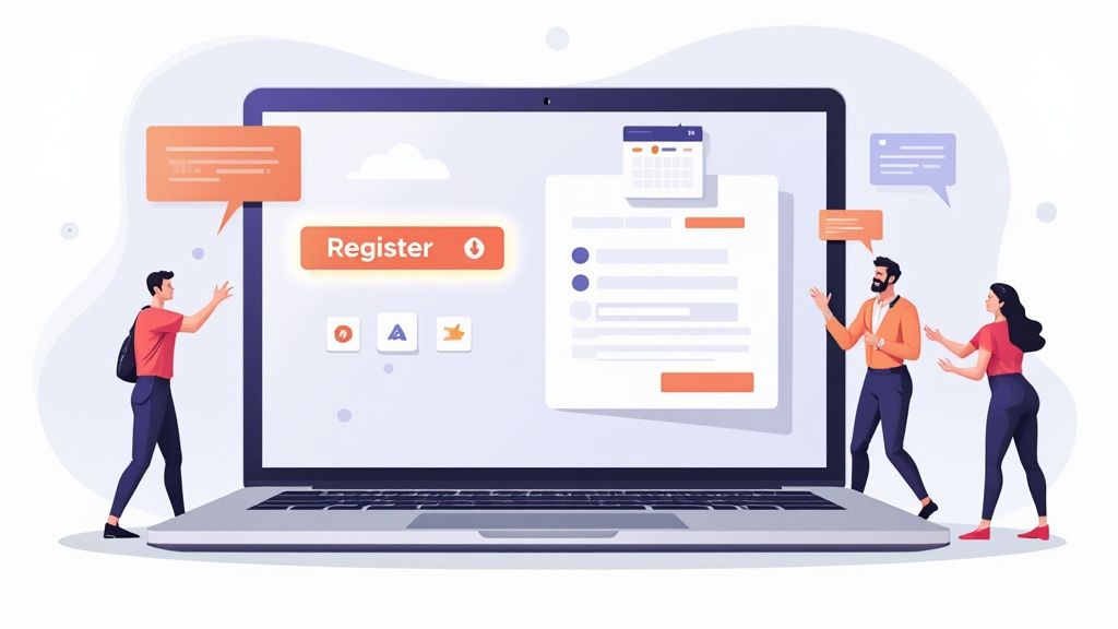
Designing a Frictionless Registration Form
Think of your registration form as the final handshake on your events landing page. It’s the moment a visitor decides to commit, but it's also where you're most likely to lose them. A clunky, complicated form is a surefire way to kill conversions. Your job is to make this step feel completely effortless.
Every single field you add introduces a little more friction. Before adding another box, ask yourself: do I really need their phone number, company size, and job title right this second? Often, a simple name and email address are all you need to get started. The less you ask for, the more people will complete the process.
Keep It Simple and Mobile-Friendly
Let's face it: most of your potential attendees will probably land on your page from their phone. That means your form needs to be built for thumbs, not a mouse and keyboard.
- Stick to a Single-Column Layout: A single, vertical column is a breeze to scroll through on a small screen. It eliminates the annoying need to pinch, zoom, or pan horizontally.
- Use Clear Field Labels: Simple, direct labels like "First Name" and "Work Email" placed above the input field are best. Don't rely on placeholder text inside the field, as it vanishes the moment someone starts typing, forcing them to guess what they were supposed to enter.
- Embrace Large Tap Targets: Make sure your buttons and form fields are big enough to be tapped easily with a thumb. Nothing is more frustrating than fumbling with tiny, hard-to-hit targets.
The goal is to remove every possible obstacle. A person shouldn't have to think about how to fill out your form - it should feel automatic.
Paying attention to these small details is what elevates a good landing page to a great one. I've seen businesses that obsess over optimization push their conversion rates as high as 55%, which is a world away from the typical 2-5% average. You can read more about how page optimization affects conversions over at Analytify.io.
Securing Attendance After They Register
Getting someone to click that "Register" button feels like a victory, but let's be honest, it's only half the battle. The real win is getting them to actually show up. This is where the post-registration experience comes in, and it's your first, best chance to turn a simple sign-up into a committed attendee.
Your thank-you page is the perfect place to start. Don't just settle for a generic "Thanks for registering!" message. Think of this page as an engagement hub - a place to keep their excitement high and lock in their commitment right away.
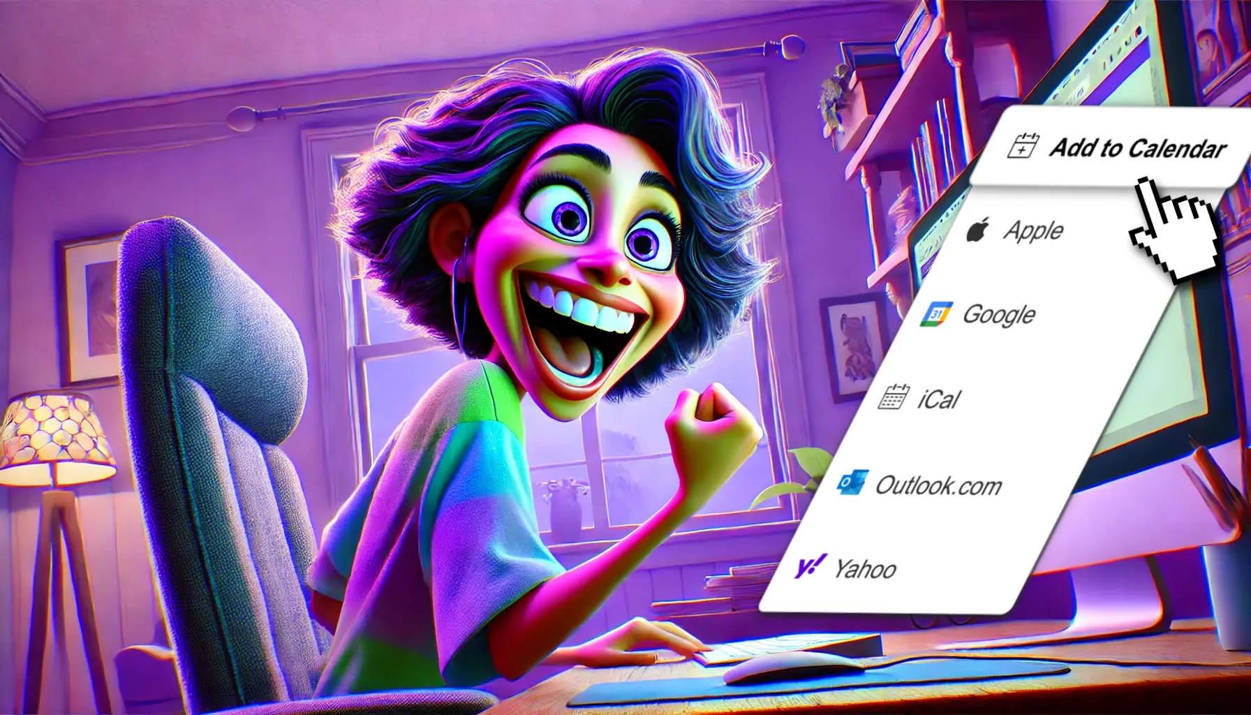
From Registration to Reality
When your event lands on someone's personal calendar, it becomes a real, tangible plan. It's a psychological shift from "I might go" to "I'm going." This simple action can slash your no-show rate because it carves out a dedicated spot in their busy schedule.
A registration is an intention, but a calendar entry is a plan. Securing that spot in your attendee's schedule is the single most important step you can take post-registration to ensure they attend.
With a tool like our service, adding a clean and effective "Add to Calendar" button to your confirmation page is incredibly simple. But don't stop there. This is also a golden opportunity to start building a community before the event even begins.
A well-designed thank-you page can do so much more than just confirm a registration. Here’s a breakdown of the key elements you should include to keep your new registrants engaged and excited.
Key Elements for Your Post-Registration Page
| Element | Purpose | Example |
|---|---|---|
| Clear Confirmation | Reassure them that their registration was successful. | "You're in! A confirmation email is on its way to your inbox." |
| Add to Calendar Button | Make it effortless for them to add the event to their calendar. | A prominent button for Google Calendar, Outlook, Apple Calendar, etc. |
| Social Sharing Prompts | Encourage them to spread the word, leveraging their network for you. | "Tell your network you're attending! Click to share on LinkedIn or X." |
| Pre-Event Content | Keep them engaged and provide immediate value. | "While you wait, check out our interview with keynote speaker, Jane Doe." |
| Community Invitation | Bring them into your community to start the conversation early. | "Join the discussion in our private Slack channel for attendees!" |
By transforming your thank-you page into an interactive hub, you're not just confirming a registration; you're starting a relationship and making attendees feel like part of something special from the very beginning.
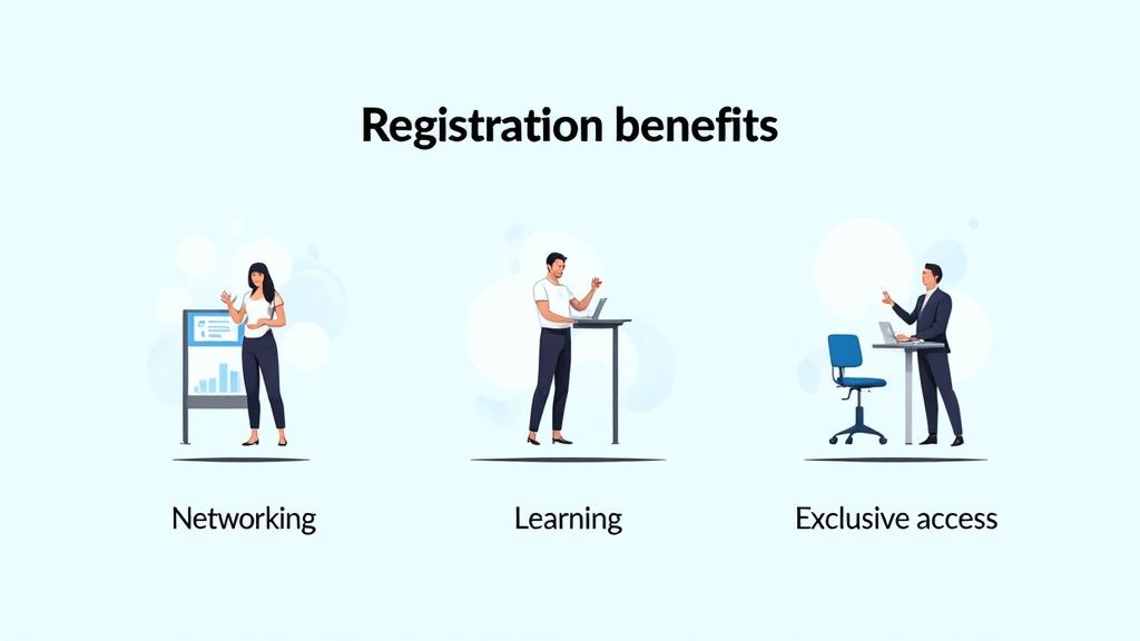
This image shows just how much these small, positive interactions matter for the overall event experience.
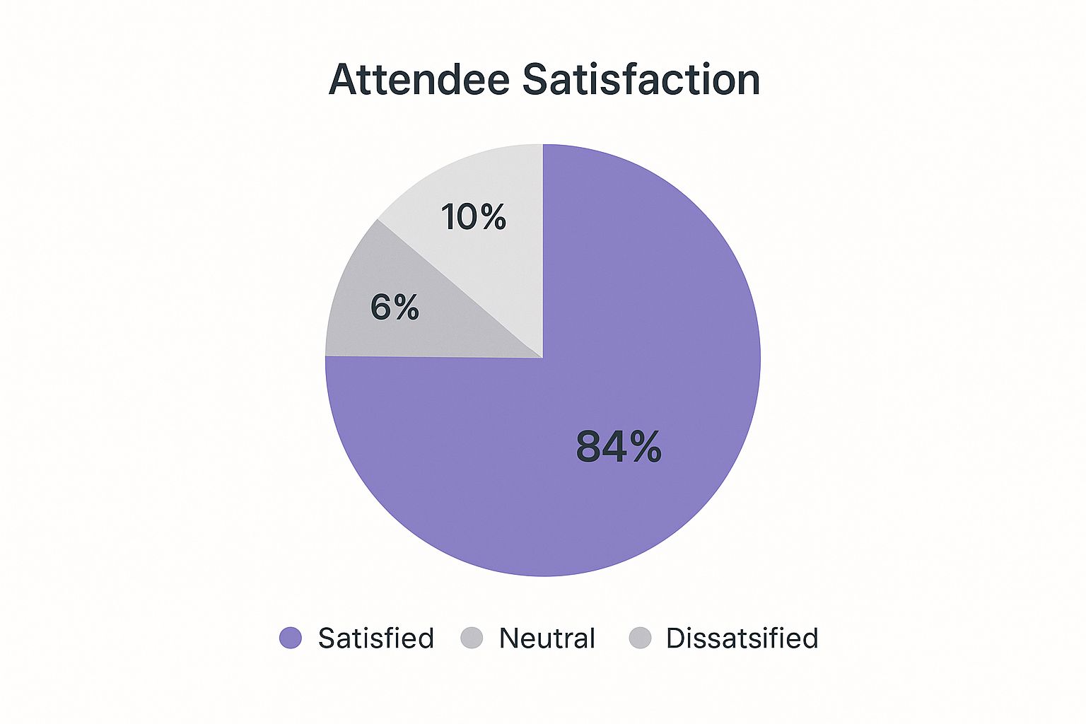
The data speaks for itself: an overwhelming 84% of attendees report being satisfied. This highlights how thoughtful touchpoints, like an easy 'Add to Calendar' option, contribute to their overall perception of your event.
Of course, the engagement doesn't stop here. Consistent follow-up is key. You can learn more about keeping that excitement high by crafting effective email event reminders.
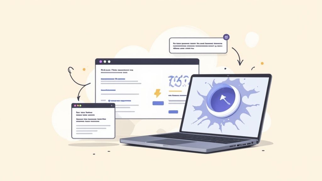
Optimizing Page Speed and Technical SEO
You could have the most amazing copy and a jaw-dropping design for your event page, but if it loads at a snail's pace or is invisible to Google, none of that matters. Getting the technical stuff right isn't just a box to check - it’s the bedrock of your page's success.
Page speed, especially, is a deal-breaker. A one-second delay might not sound like much, but it can absolutely crush your registration numbers. People expect things to be instant online. A slow-loading page feels broken or untrustworthy, and most visitors will hit the back button before they even see what you have to offer.
The Need for Speed
A sluggish page is a conversion killer. Seriously, think about your own online behavior. How long do you really wait for a site to load before you bounce?
The data backs this up. Landing pages that load in just one second see conversion rates up to 2.5 times higher than pages that take five seconds. Compare that to a ten-second load time, and the difference jumps to five times higher. If you're curious about the numbers, Wordstream has a ton of data on this.
To get your page moving quickly, focus on the big wins:
- Compress Your Images: This is the most common culprit. Huge, unoptimized images will drag your page speed down. Use a tool to shrink file sizes without making them look pixelated.
- Enable Browser Caching: This tells a visitor's browser to store parts of your page (like your logo or style files). When they come back, the page loads almost instantly because their browser already has those pieces saved.
- Go Mobile-First: Your page has to work flawlessly on a phone. It’s non-negotiable. Google gives priority to mobile-friendly pages, and let's be honest, a clunky mobile experience will send potential attendees running.
Making Your Page Search Engine Friendly
Once your page is fast, you need to make sure search engines can actually find it. This is where a little on-page SEO goes a long way. It's all about structuring your content so that Google and other search engines know exactly what your event is about.
Think of on-page SEO as giving search engines a clear roadmap to your event. A well-structured page with descriptive headers and meta tags is easier for Google to index and rank for relevant searches.
Don't overlook your title tag and meta description. These are the first things people see in the search results, and they're your first chance to convince someone to click. Weave your main keywords into your H1, H2, and H3 headings to create a clear hierarchy that both users and search engines can follow.
For a deeper dive, we've put together a whole guide on landing page SEO tips with more specific advice.
Answering Your Top Landing Page Questions
No matter how many event pages you've built, a few questions always seem to surface. Let's walk through some of the most common ones we hear from marketers, so you can sidestep the usual pitfalls and get your page converting better from day one.
How Many Form Fields is Too Many?
When it comes to your registration form, less is always more. We've seen pages tank because they asked for too much information upfront. You're aiming for the sweet spot, which is typically 3-5 essential fields. Think Name, Email, and maybe Company or Job Title if it’s critical for your event.
Every single field you add creates a little more hesitation. That hesitation adds up, and it can seriously drag down your conversion rate. Your main goal right now is just to get their commitment. You can always gather more intel later with a post-registration survey or a follow-up email. The rule of thumb we always follow is: if it's not absolutely essential for them to register, don't ask for it here.
What's the Single Most Important Thing on the Page?
If we had to pick just one thing, it's your Call-to-Action (CTA). Hands down. Every other element on the page - the killer copy, the great speaker lineup, the slick design - is all leading up to this one moment. A vague or hard-to-find CTA will completely sabotage all that hard work.
Your button - the one that says 'Save My Spot' or 'Register for Free' - has to do its job. It needs to be:
- Impossible to miss: Use a color that pops right off the page and contrasts with your background.
- Action-packed: The text should be a clear, compelling command.
- Easy to find: Make sure it’s visible without scrolling and repeat it further down the page so they don't have to hunt for it.
Your Call-to-Action isn't just a button; it's the climax of your landing page's story. It should feel like the most natural and obvious next step for the visitor to take.
Do I Really Need a New Landing Page for Every Single Event?
Yes. One hundred percent, yes. Creating a unique page for each event lets you speak directly to that specific audience about that specific topic. A hyper-focused page that aligns perfectly with your email or ad copy will always outperform a generic 'upcoming events' page. It's just a more cohesive and persuasive experience for the user.
Besides the conversion lift, this approach is a game-changer for your analytics. With separate pages, you can track precisely which channels are driving sign-ups for each event. This data is pure gold - it tells you exactly where to put your marketing budget for the best return.
How Do I Make People Trust My Landing Page?
Trust is everything, especially when you're asking for someone's information. The quickest way to build it is with social proof. Seeing the logos of well-known companies who are attending (or have attended in the past) immediately signals that your event is legitimate and valuable.
Here are a few other trust-builders we always try to include:
- Real testimonials: Pull quotes from past attendees. Including their photo, name, and title makes them far more believable.
- Speaker credibility: Show off your speakers' headshots and list their key accomplishments. This proves you've got experts on board.
- A clear privacy policy: Linking to your privacy policy near the form shows you're transparent and you take data seriously.
Never underestimate the power of a professional, polished design. Small mistakes like typos or broken images can make you look amateurish and erode trust in an instant. A clean, error-free page makes people feel confident they're in the right place.
Ready to turn those registrations into confirmed attendees? The best way is to get your event on their calendar instantly. Our service makes it easy to add a simple, effective "Add to Calendar" button to your confirmation page, drastically reducing no-shows. Learn more about making your event unmissable.