
Key Takeaways:
- 91.3% of screen reader users access the web on mobile devices - your inaccessible button is failing more people than you think
- Custom focus states can match your brand perfectly while passing WCAG audits (the outline-offset trick is your new best friend)
- 44px minimum touch targets aren't arbitrary - they're based on actual human thumb physics
- "It works for me" might be the most expensive phrase in UI design, with accessibility lawsuits targeting 77% of e-commerce sites
- Add to Calendar PRO handles ARIA labels, keyboard navigation, and responsive scaling automatically - so you can focus on what you do best
Introduction: The Invisible User You're Designing Against
Your calendar button looks stunning. The gradient is chef's kiss. The micro-interaction on hover? Perfection.
But here's the thing - a keyboard user just tabbed through your entire page and your beautiful button completely disappeared. No focus ring. No indication it even exists. They're gone, and so is your conversion.
"It works for me" might be the most dangerous phrase in UI design.
Because here's the reality: according to WebAIM's Screen Reader Survey, 91.3% of screen reader users access content on mobile devices. That's not a niche edge case. That's the majority of an entire user population you might be designing against without even realizing it.
And the legal stakes? They're climbing. In 2024, 25% of all ADA lawsuits explicitly cited accessibility widgets as barriers - tools that were supposed to help were actually making things worse. E-commerce sites represented 77% of these lawsuits.
So let's talk about that calendar button you're so proud of. And why it might be silently failing half your users.
The Keyboard Navigation Black Hole: Where Custom Buttons Go to Die
You've built a custom button component. It's gorgeous. It does exactly what you want visually.
But can someone navigate to it without a mouse?
This is where custom buttons go to die.
Default Focus Indicators vs. Branded Designs - The False Tradeoff
Most designers see browser default focus rings as ugly blue outlines that clash with their carefully crafted aesthetic. So they do the unthinkable:
*:focus {
  outline: none;
}
And just like that, keyboard users are blind.
But here's what nobody told you in design school - this is a false tradeoff. You don't have to choose between "ugly default" and "invisible focus."
Tab Order Chaos When JavaScript Hijacks the DOM
Ever dynamically injected a button into the page? Maybe you render your calendar button after some API call completes. Where does it land in the tab order?
If you haven't explicitly managed tabindex, probably nowhere logical.
Keyboard users navigate sequentially. When your JavaScript-rendered button appears in the middle of the DOM but makes no sense in the tab sequence, you've created a navigation maze.
Screen Reader Announcements That Say Nothing Useful
Picture this announcement:
"Button. Clickable."
That's what screen readers often say when they encounter a custom button without proper ARIA labels. Useful, right?
Your button should announce what it does, not just what it is.
| ❌ Bad Pattern | ✅ Good Pattern |
|---|---|
<div onclick="..."> | <button aria-label="Add event to calendar"> |
| No focus indicator | Custom focus ring with 3:1 contrast |
| Dynamic injection without tabindex management | Proper focus management after render |
| Generic "button" announcement | Descriptive ARIA labels |
Touch Targets: The 44px Rule Everyone Ignores
Your designer created a sleek 32px button. It looks elegant. Refined. Sophisticated.
It also fails approximately half your mobile users.
Why Your Sleek Button Fails Real Humans
Apple's Human Interface Guidelines and Google's Material Design both specify minimum touch targets for a reason - human thumbs aren't precision instruments.
The numbers:
- Apple recommends: 44x44 points minimum
- Google recommends: 48x48dp minimum
- Your designer's button: 32px because "it looks cleaner"
The Thumb Zone Reality Check
Hold your phone naturally. Notice where your thumb naturally rests? That's the "easy reach" zone. Now try tapping something in the top corner with one hand.
Small touch targets in awkward positions create a double penalty. Users miss. They mis-tap. They get frustrated. They leave.
As Steve Jobs famously said:
"Design is not just what it looks like and feels like. Design is how it works."
A button that users can't reliably tap doesn't work. Period.
Color Contrast: Beyond the Basics
You ran your colors through a contrast checker. You passed WCAG AA. You're done, right?
Not quite.
The Hover State Trap
Your default button state passes contrast requirements beautifully. But what happens on hover?
Many designers create hover states that look great but drop below the 4.5:1 contrast ratio for text. That subtle color shift you love? It might be making your button illegible for users with low vision.
Dark Mode as Accessibility Feature, Not Just Aesthetic
Dark mode isn't just trendy - for many users with light sensitivity or certain visual impairments, it's a necessity.
But here's where it gets tricky: your light mode contrast calculations don't automatically translate. That blue button that passed on white backgrounds might fail spectacularly on dark gray.
You need to test both modes. Separately. With real contrast checkers.
Focus States That Actually Look Good
Here's proof that compliance and beauty coexist.
The Outline-Offset Trick Designers Love
As outlined in comprehensive CSS accessibility guides, the outline-offset property creates visual separation between your element and its focus ring. This means you can:
- Match your brand colors exactly
- Create visual breathing room
- Maintain the required 3:1 contrast against backgrounds
button:focus-visible {
  outline: 3px solid var(--brand-color);
  outline-offset: 3px;
}
The UK government website uses high-contrast black outlines with yellow borders. Aesop uses minimalist black or white outlines depending on background. These aren't ugly - they're intentional design choices.
Custom Focus Rings That Match Your Brand
Using CSS custom properties, you can create a consistent focus system across your entire design:
:root {
  --focus-color: #your-brand-color;
  --focus-offset: 3px;
  --focus-width: 2px;
}
This approach lets you adjust values globally without specificity battles. Your design system stays intact. Your accessibility stays compliant.
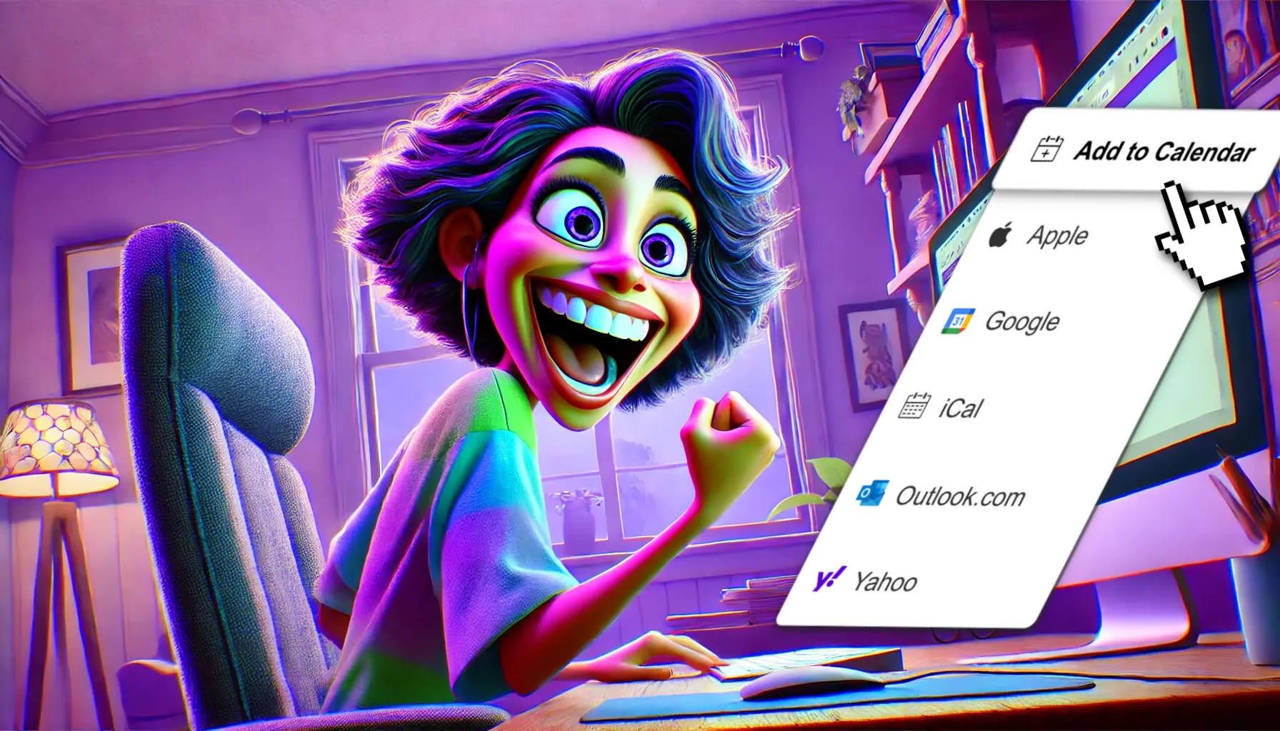
🛠️ How Add to Calendar PRO Handles This Out-of-the-Box
Look - you could build all of this yourself. You could spend weeks perfecting focus states, managing ARIA labels, testing across screen readers, and handling the maintenance nightmare of hand-coding accessible buttons.
Or you could just... not.
Add to Calendar PRO ships with:
- Built-in ARIA labels and roles - Screen readers announce exactly what your button does
- Keyboard navigation that just works - Proper tab order, Enter/Space activation, the whole deal
- Customizable styling that passes audits automatically - Brand it however you want, the accessibility stays intact
The styling is fully customizable. You can match your brand perfectly. But the underlying accessibility architecture? That's handled. Tested. Maintained.
You get to focus on making things beautiful. The boring-but-critical accessibility infrastructure is already done.
Responsive Scaling Without Breaking
Accessibility isn't just about screen readers. It's about respecting user preferences across every device and context.
Touch Targets That Adapt
A button that's perfectly sized on desktop might be too small on mobile. Add to Calendar PRO's components automatically scale touch targets based on device context - meeting both Apple and Google guidelines without you writing a single media query.
Font Sizing That Respects User Preferences
Some users increase their default font size for readability. If your button uses fixed pixel values, it ignores their preferences entirely.
Properly built components respect rem units and user font settings. Because accessibility isn't just about disabilities - it's about respecting every user's choices.
Want accessible calendar buttons that pass WCAG audits without starting from scratch? That's literally what we built this for.
Conclusion: Accessibility Isn't a Constraint - It's a Design Brief
Here's the truth nobody wants to hear: your button should work for everyone or it doesn't really work.
That focus state your designer forgot? It's not a nice-to-have. It's the difference between "inclusive product" and "lawsuit waiting to happen."
The good news? You don't have to sacrifice aesthetics. The outline-offset trick creates gorgeous focus states. Custom ARIA labels make screen readers sing. Proper touch targets just mean better UX for everyone - not just users with disabilities.
As Tim Berners-Lee put it:
"The power of the Web is in its universality. Access by everyone regardless of disability is an essential aspect."
The false choice between beauty and accessibility was always a myth. The best designers have known this for years. Now you do too.
So go fix that focus state. Your keyboard users are waiting. 🚀