
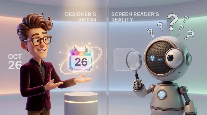
You've spent hours perfecting your UI. Every pixel aligned. Every color carefully chosen. Then you drop in a calendar button and... it looks like it crawled out of 2008. Or worse - it works beautifully but completely fails your users who rely on screen readers.
Here's the uncomfortable truth: most developers treat accessibility like a checkbox. And most designers treat functionality like someone else's problem.
Both approaches are wrong. And both cost you users.
📋 Key Takeaways
- The "pretty vs. accessible" debate is a false choice - you can absolutely have both with the right approach
- Color contrast ratios of 4.5:1 aren't suggestions - they're legal requirements under WCAG Level AA
- 48px touch targets are the minimum for accessible mobile interactions (Google's standard, not ours)
- 91.3% of screen reader users now access content on mobile devices - your buttons need to work for them
- Internationalization breaks "pixel-perfect" designs - unless you plan for text expansion and RTL layouts
- Building accessible calendar buttons from scratch is a maintenance nightmare - there's a smarter path
The Hidden Tension Between Beautiful UI and Inclusive Design
Let's be honest. You want to share calendar events with your audience. But somewhere between "let's add a button" and "ship it," things fall apart.
Maybe the button looks broken on mobile. Maybe it fails screen readers entirely. Maybe it works but looks so generic it clashes with your carefully crafted design system.
Most devs eventually face this choice: pretty OR accessible.
But that's a false choice. And making it costs you more than you realize.
According to WebAIM's Screen Reader User Survey #10, 91.3% of screen reader users now access content on mobile devices. That's not a niche audience - that's nearly everyone who needs accessibility accommodations.
Ignore them, and you're not just being exclusionary. You're leaving money on the table.
"Design is not just what it looks like and feels like. Design is how it works." - Steve Jobs
🎨 The Design Side of Share Calendar Buttons: What Actually Works
Let's start with what makes a calendar button visually successful. Because yes - it matters. A button nobody wants to click is a button that fails, no matter how accessible it is.
Button Sizing, Touch Targets, and Responsive Scaling
Here's where many designers trip up. They create a gorgeous 32px button that looks perfect on their Figma canvas. Then users with larger fingers (or anyone on a cramped mobile screen) can't tap it reliably.
Research from DesignMonks confirms what accessibility experts have known for years:
| Platform | Minimum Touch Target | Recommended Size |
|---|---|---|
| Google (Android) | 48x48 dp | 48x48 dp standard |
| Apple (iOS) | 44x44 points | 44x44 points minimum |
| WCAG Accessibility | 42px (9x9mm) | 50px (10x10mm) comfortable |
That 48px minimum isn't a suggestion - it's the baseline for reducing tap errors. And here's the kicker: the visual size can be smaller than the touch target. A 24px icon can have a 48px tap zone.
But most "quick solution" calendar buttons don't account for this. They give you what they give you. Take it or leave it.
Color Contrast Isn't Just Nice-to-Have - It's WCAG Law
You've probably heard about color contrast ratios. But do you actually check them?
WebAIM's comprehensive contrast guide spells it out clearly:
- Level AA (legal requirement): 4.5:1 for normal text, 3:1 for large text
- Level AAA (enhanced): 7:1 for normal text, 4.5:1 for large text
Level AA isn't optional. It's the requirement within common laws and accessibility standards. That gorgeous light-gray-on-white button? It might look "clean" - but it's potentially non-compliant.
And no - you can't round a 4.4:1 ratio up to meet the requirement. Close doesn't count.
Typography Choices That Don't Break on Localized Text
Your button says "Add to Calendar" in English. Clean. Fits perfectly.
Now translate it to German: "Zum Kalender hinzufügen."
Oops. Text expansion just destroyed your layout.
We'll dig deeper into internationalization later - but the design takeaway is this: if you're designing for a global audience, your containers need breathing room.
♿ A11y Deep Dive: Where Most Calendar Sharing Falls Apart
Accessibility isn't one thing - it's layers of considerations that compound. Miss one layer, and you've broken the experience for an entire segment of users.
Focus States That Designers Hate (But Users Need)
That ugly blue outline when someone tabs to your button? Designers often remove it. "It looks bad," they say.
But here's the deal: that focus indicator is how keyboard users know where they are on the page. Remove it without providing a custom alternative, and you've made your interface unusable for anyone not using a mouse.
The fix isn't to remove focus states. It's to design better focus states that match your visual language while remaining clearly visible.
ARIA Labels and Semantic HTML for Calendar Actions
A button that just says "Add" means nothing to a screen reader user without context. What are they adding? To where?
Proper ARIA labeling transforms:
- ❌ "Add" (confusing)
- ✅ "Add Summer Conference 2024 to your calendar" (clear and actionable)
Semantic HTML matters too. A
Keyboard Navigation - The Forgotten Interaction
Can users Tab to your calendar button? Can they activate it with Enter or Space? Can they navigate dropdown options with arrow keys?
If you're nodding uncertainly... you probably haven't tested it.
WebAIM's survey found that 85.9% of screen reader users named "better websites" as the key improvement needed. They're not asking for special treatment - they're asking for websites that work.
Screen Reader Announcements for Dropdown Menus
Calendar buttons often include dropdowns - "Add to Google Calendar," "Add to Outlook," "Download .ics file."
But does your dropdown announce itself when it opens? Do screen readers know there are options to choose from? Can users hear which option is currently focused?
Most custom implementations fail here spectacularly.
📱 Mobile-First Isn't Optional Anymore
With 91.3% of screen reader users accessing content on mobile, your calendar button's mobile experience isn't secondary. It's primary.
Touch Target Sizing (48px Minimum Isn't a Suggestion)
We covered this above, but it bears repeating: undersized touch targets cause real problems. Mis-taps. Frustration. Abandoned actions.
And the problem compounds when you have multiple calendar options close together. Without adequate spacing (12-48px between targets), users hit the wrong option constantly.
Responsive Patterns That Don't Squish Icons Into Oblivion
Your beautifully detailed calendar icon at desktop size? It becomes an unrecognizable blob at mobile widths unless you plan for it.
Smart responsive patterns include:
- Icon-only buttons at smaller breakpoints (with proper ARIA labels!)
- Simplified visual treatments that maintain recognizability
- Flexible containers that reflow rather than compress
How Share Calendar Buttons Behave in Thumb Zones
Users hold phones differently. The "thumb zone" - the area easily reachable with one-handed use - matters more than most designers realize.
A calendar button buried in the top-left corner of a mobile layout? Awkward to reach. One positioned in the natural thumb arc? Effortless.
Small detail. Big impact on conversion.
🌍 Internationalization: The Silent Design Killer
You've nailed accessibility. Your button looks great. Then you launch internationally and watch it all fall apart.
Date Formats That Confuse Everyone
Is 03/04/2024 March 4th or April 3rd?
Depends on where your user lives. And getting it wrong isn't just confusing - it can mean people showing up on the wrong day entirely.
If you're building calendar email links that actually work, date format handling needs to be automatic, not afterthought.
RTL Layouts and Button Mirroring
Arabic. Hebrew. Persian. These languages read right-to-left - and proper RTL support means more than flipping text direction.
Icons should mirror. Layouts should flip. The entire visual hierarchy reverses.
Most calendar button solutions simply... don't handle this. They look broken for RTL users, or they require significant custom CSS to fix.
Text Expansion Breaking Your Pixel-Perfect Container
English is relatively compact. Other languages? Not so much.
| Language | Text Expansion (vs. English) |
|---|---|
| German | +30% |
| Finnish | +30-40% |
| Russian | +20% |
| Arabic | +25% |
That "pixel-perfect" button container you designed? It needs to handle 40% more text without breaking. Or you need a strategy for graceful truncation.
"Perfection is achieved, not when there is nothing more to add, but when there is nothing left to take away." - Antoine de Saint-Exupéry
In this case, taking away rigid constraints and adding flexibility is the path to perfection.
🛠️ The Shortcut: Why Building From Scratch Is a Trap
At this point, you might be thinking: "Okay, I'll just build all of this myself."
I get it. Control is appealing.
But here's what actually happens:
- You spend weeks getting it "right"
- Browser updates break something
- A new accessibility requirement emerges
- Someone reports a bug on a device you don't own
- You spend more weeks patching
- Repeat forever
Maintaining A11y compliance across updates is exhausting. And honestly? It's not what you should be spending your time on.
As we've explored in Finally, a working Add to Calendar Button, building from scratch fails 90% of the time due to edge cases you never anticipated.
Add to Calendar PRO Handles the Hard Stuff Out-of-the-Box
Here's where things get simpler.
Add to Calendar PRO handles contrast ratios, focus states, responsive scaling, touch targets, keyboard navigation, screen reader announcements, RTL support, and internationalization - all out-of-the-box.
You don't rebuild the accessibility layer every time you want to customize the look. You work on top of a foundation that's already compliant.
| DIY Approach | Add to Calendar PRO |
|---|---|
| Build everything from scratch | Pre-built accessible foundation |
| Test across all devices yourself | Cross-device testing handled |
| Maintain WCAG compliance manually | Compliance built-in |
| Handle RTL/i18n edge cases | Internationalization ready |
| Debug screen reader issues | Screen reader optimized |
| Ongoing maintenance burden | Updates handled for you |
The customization you want. The compliance you need. Without the maintenance nightmare.
And if you need to keep events updated in users' calendars, that complexity is handled too.
Beautiful and Accessible Aren't Enemies
Let's bring this home.
The tension between beautiful design and inclusive accessibility? It's real - but it's solvable. You don't have to choose between a button that looks good and a button that works for everyone.
What you need is:
- Intentional design that considers touch targets, contrast, and responsiveness from the start
- Proper accessibility implementation with semantic HTML, ARIA labels, and keyboard support
- Internationalization planning that accounts for text expansion and RTL layouts
- A foundation you can trust so you're not reinventing the wheel (and breaking it)
Share calendar functionality that works for everyone isn't a bonus feature. It's just good UX.
And good UX - the kind that actually converts, that actually serves all your users, that actually makes you proud of what you've built?
That's worth getting right. 🎯