A great event landing page is a laser-focused, standalone webpage built for one reason and one reason only: to turn a curious visitor into a registered attendee. It’s not your homepage, and it's not a catch-all for your entire company. Think of it as a dedicated digital stage for your event, providing all the critical info and steering people toward a single, clear action - like grabbing a ticket.
Your Blueprint for a High-Converting Event Page
Before you even think about picking a font or a color palette, you need a plan. A truly successful event landing page is born from strategy, not just pretty design. This foundational work is what makes every headline, image, and button work together toward that one unified goal: driving registrations and building buzz. If you skip this part, you're essentially just throwing things at the wall and hoping something sticks.
First things first, you need to lock down your one primary goal. Is this page all about selling tickets for a multi-day conference? Is it for capturing sign-ups for a free webinar? Or maybe it's just about generating leads for a bigger event down the road? Trying to accomplish everything at once just muddies the waters and leaves visitors confused.
Know Your Audience and Your Offer
With your goal set, it's time to get inside the heads of the people you're trying to reach. Creating simple audience personas is a huge help here, as it forces you to think about who you're actually talking to. Are they busy executives who need to see the ROI in the first five seconds? Or are they creatives looking for a jolt of inspiration? Your answer will shape everything - from the tone of your copy to the visuals you choose and the specific benefits you highlight.
This naturally leads to crafting your Unique Value Proposition (UVP). Your UVP is just a clear, punchy statement that answers the most important question every potential attendee has: "Why should I go to this event instead of all the others?" It needs to be compelling and impossible to miss.
A well-planned landing page does more than just look good; it's a conversion machine that delivers real results. The planning phase is where you translate your event's core value into a focused digital experience that gets people to act.
This next infographic really drives home how much an optimized design can move the needle, turning casual interest into solid commitment.
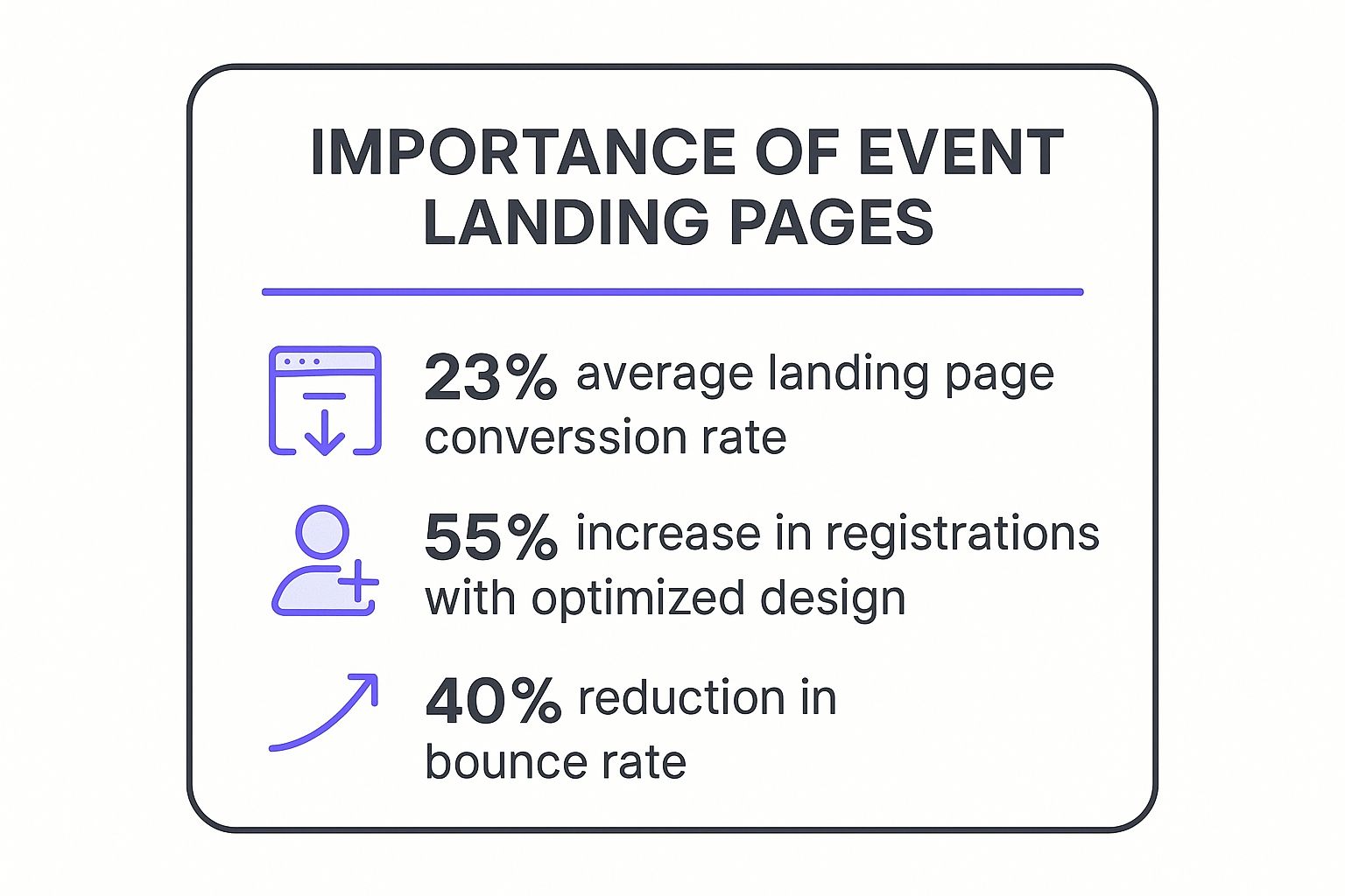
Those numbers don't lie. Strategic design isn't just about aesthetics; it directly impacts your registration numbers and keeps people from bouncing off your page. For a deeper dive into all the essential components, you can check out our detailed guide right here: https://add-to-calendar-pro.com/articles/event-landing-page
The good news is that the events industry has a leg up. The average landing page conversion rate for events is a solid 12.6%, which blows the e-commerce average of 4.2% out of the water. This tells us that people are already primed and looking to engage with what you're offering. To make the most of this, your page has to be a top performer.
To make sure your page is truly firing on all cylinders, it's worth brushing up on effective conversion rate optimization strategies that can help you fine-tune your approach and really maximize those sign-ups.
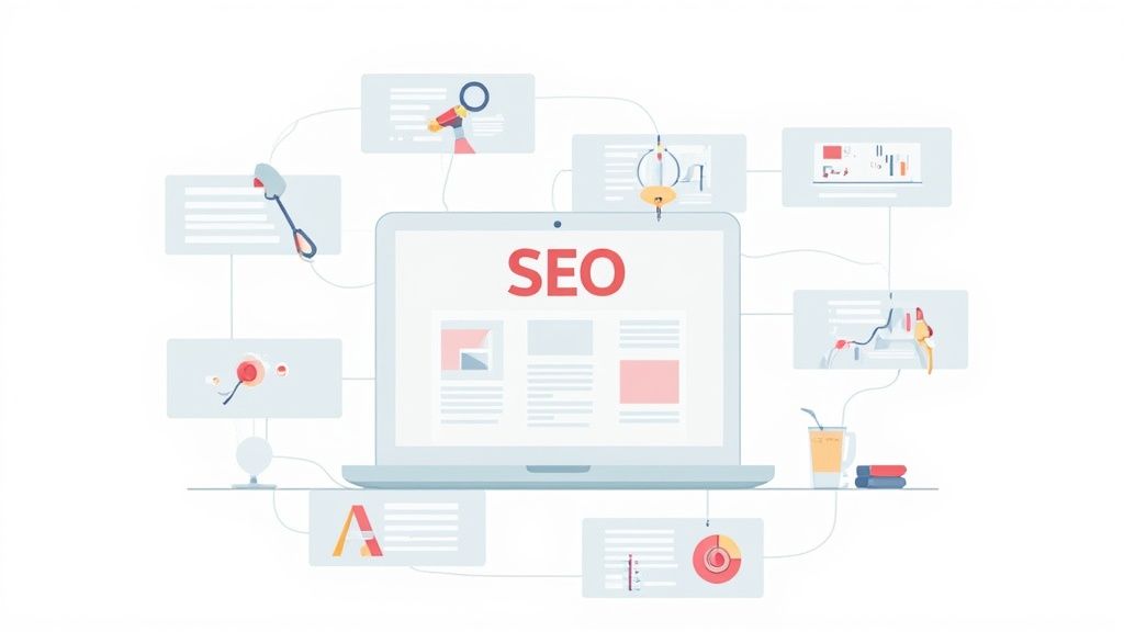
Core Components of an Event Landing Page
So, what does that look like in practice? Every high-performing event page shares a few key elements. We've broken them down into this quick-reference table to give you a clear checklist.
| Component | Purpose | Key Tip |
|---|---|---|
| Compelling Headline | Grab attention instantly and communicate the event's main benefit. | Focus on the outcome for the attendee, not just the event's name. |
| Clear UVP | Answer "Why this event?" in a concise, powerful statement. | Place it high on the page, right below the main headline. |
| Key Event Details | Provide the "What, When, Where" (Date, Time, Location/Platform). | Use bold text and icons to make this information scannable. |
| Strong Call-to-Action (CTA) | Tell visitors exactly what to do next (e.g., "Register Now"). | Use action-oriented language and a contrasting button color. |
| Social Proof | Build trust with testimonials, past attendee numbers, or logos. | Video testimonials are incredibly powerful if you have them. |
| Speaker/Agenda Info | Showcase the value and content of the event. | Use professional headshots and brief, punchy bios. |
| Engaging Visuals | Use high-quality images or videos from past events to create atmosphere. | Avoid generic stock photos. Authenticity sells. |
Nailing these core components gives you a powerful framework. From there, you can test and tweak to find what resonates best with your specific audience.
Designing for Engagement and Action
Great design is more than just making things look pretty. When it comes to event landing pages, design is your silent salesperson. It’s what guides a visitor’s eye, builds trust, and makes it incredibly easy for them to say ‘yes’ to your event.
Every choice, from the layout to the font, directly impacts whether someone signs up or clicks away. It all starts with a clean, uncluttered layout that ruthlessly eliminates distractions.
The whole point is to keep the focus squarely on your main goal, whether that’s selling tickets or getting webinar sign-ups. One of the most powerful things to do is simply remove the main website navigation menu. It might feel a bit radical at first, but it prevents people from getting curious and wandering off before they’ve had a chance to convert.
Every single element on your page - from the headline and images to the tiniest bit of copy - should work together to push the visitor toward one specific action. A cluttered or confusing page is a guaranteed recipe for high bounce rates and lost sign-ups.
This isn’t just an opinion; the data backs it up. An analysis of thousands of pages revealed that those with a single, clear call-to-action (CTA) hit an average conversion rate of 13.5%. Pages with multiple CTAs? Their performance drops to between 10.5% and 11.9%. If you're curious, you can explore more about these findings and what they mean for your own pages.
Create an Immersive Visual Experience
Your visuals are probably your best tool for sparking genuine excitement. It’s best to skip the generic stock photos, as we can all spot them a mile away.
Instead, use high-quality, authentic photos or even a short highlight reel from your last event. This gives potential attendees a real feel for the atmosphere and helps them picture themselves right there in the middle of the action.
A great photo can instantly communicate the energy of your event, whether it's a high-powered business conference or a vibrant creative festival. Authenticity is what sells. A real photo of attendees connecting and learning tells a much more powerful story than any stock image ever could.
Prioritize Readability and Brand Alignment
Of course, your design also needs to make your content easy to digest. Choose a color palette that matches your event’s brand and vibe, but always make sure there’s enough contrast for the text to be easily readable. Don't make people squint.
Your font choices matter, too. Stick with clean, legible typefaces that look just as good on a tiny mobile screen as they do on a big desktop monitor.
Here are a few practical design tips to always come back to:
- Embrace White Space: Don't feel the need to cram every inch of the page with content. Giving your elements room to breathe (what designers call white space or negative space) actually helps guide the eye, reduces mental overload, and makes your most important stuff pop.
- Build a Visual Hierarchy: Use size, color, and placement to signal what's most important. Your headline should be the biggest, boldest thing on the page. Your CTA button should be the next thing they see. Everything else is secondary.
- Nail Mobile Responsiveness: It’s no secret that most of your audience will find your page on their phone. You absolutely have to test your design on different screen sizes to make sure the experience is smooth for everyone. No excuses.
When you blend a focused layout with compelling visuals and rock-solid readability, your design stops being just decoration. It becomes a tireless marketing partner, working behind the scenes to persuade and convert.
Writing Copy That Sells Out Your Event
The words you choose for your event landing page have the power to turn a casual browser into a committed attendee. Great design guides the eye, but it's the copy that really convinces the mind. It’s the difference between someone thinking, "That looks interesting," and "I need to be there."
It all starts with a magnetic headline. Your headline isn't just a title; it's your one shot to instantly communicate the single biggest benefit of attending. Forget generic stuff like "Marketing Conference 2025." Try something with a punch, like "The Conference That Tripled Last Year's Attendee ROI." Focus on the outcome.
Crafting a Compelling Narrative
Once you've hooked them, your event description needs to deliver. This is where you move beyond a simple list of features and start painting a picture of the experience. Don't just list speakers; describe the game-changing insights they're going to share. Don't just mention networking; talk about the connections people will actually walk away with.
This isn't just fluff. For nearly half of large-scale event planners, total registrations are the ultimate measure of success. Your copy is the engine that drives those numbers.
Here’s how to structure your event’s story:
- Focus on Transformation: What will attendees know, feel, or be able to do after your event that they couldn't before? Spell it out.
- Use Sensory Language: Describe the "buzz" of the crowd, the "aha!" moments during keynotes, or the sheer "energy" of the venue. Make them feel it.
- Answer the "Why": Why this event? Why right now? Your copy has to create a sense of urgency. Attending should feel like an unmissable opportunity.
This approach shifts the focus from what your event is to what it does for the attendee - a much more powerful sales pitch.
Leveraging Social Proof and a Clear CTA
Nothing builds trust faster than social proof. It's the digital version of seeing a long line outside a restaurant. It just signals that something good is happening.
We’ve seen firsthand how a few well-placed testimonials can do more heavy lifting than paragraphs of descriptive copy. When a past attendee raves about their experience, it provides authentic, third-party validation that you simply can't create yourself.
Weave these elements right into your story:
- Testimonials: Use direct quotes from past attendees. If you have video testimonials, even better. They're gold.
- Sponsor Logos: Featuring logos of well-known sponsors or partners adds instant credibility.
- Speaker Photos: Professional headshots of your key speakers show you’ve attracted top talent and that this is a serious event.
Finally, every single word on the page should point toward your call-to-action (CTA). Your button text needs to feel like the next logical step, not a jarring demand. Use clear, action-oriented phrases like "Reserve Your Spot" or "Get Your Ticket." This isn’t a place to be clever; it’s a place for crystal clarity. Make the action feel easy and irresistible.
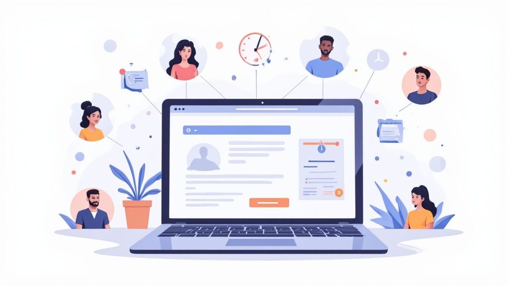
A stunning landing page with killer copy is a great start, but it's the tech humming away in the background that really drives people to show up. Integrating the right tools can smooth out the entire user journey, from the moment they decide to register right up until your event kicks off. It's a direct line to better attendance.
First things first, let's talk about your ticketing or registration platform. A clunky, multi-step sign-up process is a guaranteed way to lose people. You want a frictionless experience where registering feels almost automatic. The best way to do this is with a platform you can embed right onto your page, so users never have to leave to seal the deal.
The Power of an "Add to Calendar" Button
Once someone hits that "Register" button, your job isn't done. Now you have to make sure they actually show up on event day. This is where one of the simplest yet most powerful tools comes into play: an "Add to Calendar" button.
Dropping this onto your confirmation message or thank-you page is a brilliant strategy for fighting no-shows. When an attendee clicks that button, your event transforms from a half-forgotten email confirmation into a solid appointment in their daily schedule. Our service is built from the ground up to make this step a breeze for both you and your attendees.
Here's a look at how our service lets users add an event to their favorite calendar with just a single click.
It’s a simple addition, but it acts as a persistent, personal reminder that has a real impact on attendance rates. Of course, this is just one piece of the puzzle. For a more complete reminder strategy, you can dig into our https://add-to-calendar-pro.com/articles/email-event-reminder-guide-to-boost-attendance.
Choosing the Right Tools for Your Event
Beyond ticketing and calendar buttons, think about what makes your specific event tick. To generate real buzz and get people excited to sign up, you might want to integrate more interactive tools. For example, if you're planning a wedding, looking at interactive wedding entertainment ideas can give you unique features to highlight on your page that make people want to be there.
Your tech stack should be a direct reflection of your event's goals. Whether it's a simple webinar or a complex conference, the right tools reduce friction for your attendees and give you incredibly valuable data.
And that brings us to a final point: don't forget your analytics. Integrating tools like Google Analytics or other event-specific analytics platforms is non-negotiable. They are your window into understanding what's working and what's not.
You'll be able to see:
- Where your visitors are coming from: Are they finding you through social media, email campaigns, or organic search?
- How they behave on the page: Where do they click? At what point do they give up and leave?
- Which CTAs are most effective: Sometimes a simple A/B test on button text or placement can yield surprising lifts in conversions.
This data is gold. It helps you optimize your current landing page on the fly and gives you a playbook for making your next one even more successful. When you combine a smooth registration process, powerful reminder tools, and sharp analytics, you build a system that doesn't just attract eyeballs - it gets people in the door.
Getting the Right People to Your Page
Let’s be honest. You can build the most beautiful, persuasive event landing page in the world, but it’s completely useless if nobody sees it. Now that your page is live, the real work begins: getting it in front of the right audience. It's not just about getting a flood of clicks; it's about attracting people who are genuinely excited to show up.
Where your traffic comes from matters. A lot. We've seen countless campaigns fizzle out because they focused on the wrong channels, while others succeeded by being smart and strategic about their promotion.
Zero in on High-Converting Channels
The data doesn't lie. How someone finds your event page is a huge predictor of whether they'll register. Time and again, email campaigns come out on top, boasting a median conversion rate of 19.3%. That’s followed by paid social ads at 12% and paid search at 10.9%. Way down at the bottom? Display ads, with a meager 4.1%. You can dig into more of these conversion benchmarks yourself.
The story here is crystal clear: your warmest leads are the people who already know you. Your existing audience trusts you, so they’re far more likely to be interested in what you have to say.
Start your promotion by targeting the people who are already listening. An email campaign to your subscriber list is often the single most effective action you can take to drive initial registrations and build momentum.
Once you've tapped into that core audience, it’s time to cast a wider net with paid advertising. But don't just throw money at the wall to see what sticks. Be smart about it.
- Paid Social Ads: Fire up LinkedIn, Facebook, or Instagram ads to laser-target users. You can dial in your audience based on job titles, interests, or demographics that perfectly match your ideal attendee.
- Paid Search Ads: Think about what your potential attendees are typing into Google. Bid on keywords like "digital marketing conference" or "local craft workshop" to show up right when they're looking for an event like yours.
- Retargeting Campaigns: This one is non-negotiable. Set up retargeting to show your ads to people who visited your event page but didn't sign up. It’s a gentle nudge that says, "Hey, remember this?" and it's shockingly effective at bringing people back to finish what they started.
When you mix these targeted traffic strategies, you’re not just hoping for the best - you’re creating a solid plan to get your page seen by the right people. It's this strategic approach that's at the heart of learning how to increase event attendance and avoiding an empty room.
A killer page plus a smart traffic plan? That's the one-two punch for a sold-out event.
Of course, even with the best-laid plans, questions are going to pop up while you're in the trenches building your event landing page. We see the same ones crop up again and again.
Here are some quick, no-fluff answers to the most common sticking points. Think of this as your cheat sheet for those final tweaks that can turn a good page into a great one.
How Long Should My Event Landing Page Be?
This is the classic "it depends" question, but the answer is actually pretty straightforward. The length of your page should be directly proportional to the complexity and cost of your event.
For something simple like a free webinar or a casual local meetup, keep it short and sweet. Hit them with a powerful headline, the essential details, and a can't-miss call-to-action. Anything more is just noise that gets in the way of a sign-up.
But if you're promoting a multi-day conference with a hefty price tag? You'll need to go long. People are making a serious investment, both in time and money, and they need a ton of information to feel good about that decision. Your page needs to be packed with detailed schedules, speaker bios that build credibility, venue info, and plenty of social proof like testimonials or sponsor logos.
The golden rule is this: your page must be long enough to answer every single question a potential attendee has, but not one word longer. It's all about delivering value and clarity, not hitting an arbitrary word count.
Should I Use a Video on My Page?
Absolutely, but with a huge caveat: the video has to be good. A polished, professional highlight reel from last year's event or a quick, engaging message from a keynote speaker can work wonders for your conversion rate.
Video is a powerhouse for a few key reasons:
- It creates genuine excitement. You can show the energy and vibe of your event in a way static photos just can't match.
- It builds trust. Seeing real people and hearing from actual speakers makes the whole thing feel more tangible and authentic.
- It grabs attention. A well-made video can stop a visitor in their tracks and convince them to stick around long enough to register.
Here’s the flip side: a shaky, poorly-lit, or unprofessional video will do more harm than good. It screams "amateur hour" and can tank your credibility. If you don't have the budget or skills to create something polished, stick to high-quality photos.
Where Should I Put an Add to Calendar Button?
This is a great question. This is a small detail that has a massive impact. The absolute best place for an 'Add to Calendar' button is on the post-registration or thank-you page.
Think about it. Once someone has committed and hit that "register" or "buy" button, their journey isn't over. Getting them to immediately add the event to their personal calendar is the perfect next move. It turns a simple email confirmation into a concrete appointment in their schedule, which drastically cuts down on no-shows.
At Add to Calendar PRO, we've seen firsthand how this simple step directly boosts attendance rates. Our service makes it incredibly easy to drop this feature into your thank-you page, ensuring your event gets the prime real estate it deserves on your attendees' calendars.