So, you're planning an event. You know you need a dedicated website - it's the central hub for everything from marketing and registration to keeping attendees in the loop. This guide is your practical plan for building an event website that doesn't just look professional but actually gets people to sign up.
We're going to skip the generic advice and get right into the real decisions you'll be making, starting with picking the right platform and crafting content that grabs attention. Having seen countless event promotions in our work, we can tell you a well-built website can make or break an event's success. Think of this as your roadmap to turning curious visitors into excited attendees.
Why Your Event Website Is Non-Negotiable
Let's be clear: an effective event website is absolutely essential. Event organizers know that in-person events are still their most powerful marketing channel (78% of them, in fact), even as virtual and hybrid formats make up 40% of all events.
But here's the rub: 21% of event professionals say their biggest challenge is getting the right people to attend. A thoughtfully designed website is your single best tool to solve that problem. Your site is so much more than an information page; it’s the digital front door to your event. It's where first impressions are formed and where potential attendees decide if your event is worth their time and money.
Your website isn’t just a tool; it's the core of your event's identity. A great site builds trust, creates excitement, and makes the path to registration effortless for every visitor.
This simple infographic breaks down the core process into three main stages.
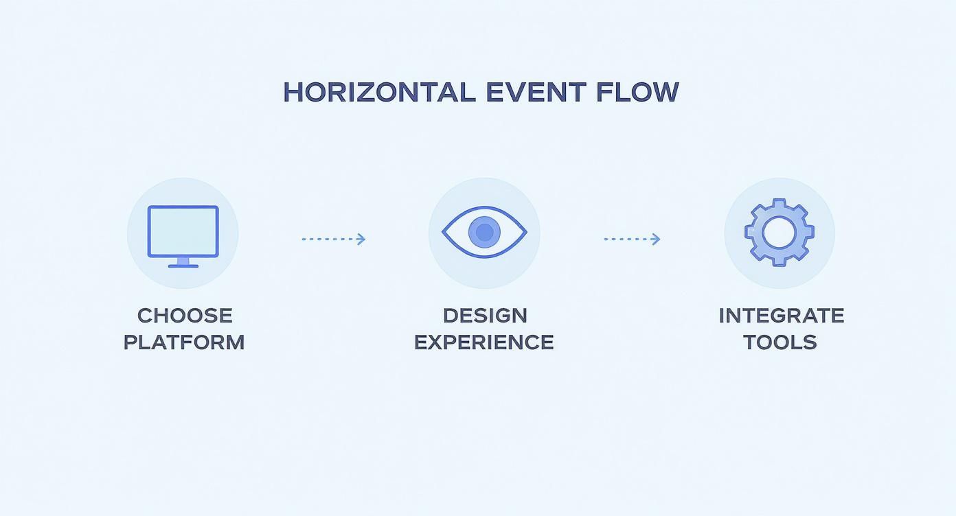
The flow is simple but powerful: start with a solid foundation (your platform), create a compelling user journey (your design), and then add the features that make it all work (your tools).
The Must-Have Elements for Your Site
Before we dive into the "how," let's cover the "what." A successful event website isn't just a pretty page; it's a functional machine designed to convert. Here are the non-negotiable features every event site needs.
| Feature | Why It's Critical for Success | Example Implementation |
|---|---|---|
| Clear Value Prop | Answers "Why should I attend?" within seconds. If visitors can't see the benefit, they'll leave. | A bold headline: "The Only Marketing Summit Designed for SaaS Founders to 2x Their MRR." |
| Key Event Details | Date, time, location (or virtual link), and agenda must be impossible to miss. Confusion is the enemy of registration. | A dedicated "When & Where" block at the top of the page, right below the main hero section. |
| Easy Registration | The RSVP or "Buy Tickets" button should be the most prominent call-to-action on the page. Don't make people hunt for it. | A bright, contrasting button in the navigation bar and repeated after each major section. |
| Speaker/Artist Bios | Showcases the talent and expertise attendees will get access to. This builds credibility and excitement. | Professional headshots with short, punchy bios highlighting their biggest accomplishments. |
| Social Proof | Testimonials, logos of past attendees/sponsors, and photos from previous events build trust with new visitors. | A "What Past Attendees Say" section with pull quotes and photos. |
| Add to Calendar | Makes it easy for registered attendees to block off the time, drastically reducing no-shows. | A button from our service on the confirmation page and in the confirmation email. |
Nailing these elements creates a seamless experience that guides visitors from interest to action.
From Landing Page to Full Website
While a full-blown website is the ultimate goal, you don't always have to build everything at once. Sometimes, a single, focused page is all you need to get started.
An event landing page is a fantastic tool for gauging interest, capturing early-bird sign-ups, and building an email list before you've finalized every detail. It allows you to start marketing now.
For a deeper dive into this first step, check out our guide on how to create a powerful event landing page that gets real results. This approach helps you build momentum from day one.
Choosing the Right Platform and Domain
Before you even think about colors, fonts, or what to write on your homepage, you have to sort out the foundation. This comes down to two big decisions: picking your website platform and snagging a memorable domain name. Getting this right from the start makes everything else - from design and setup to long-term maintenance - so much smoother.
Think of the platform as the engine for your site. The best one for you really depends on your event's complexity, your budget, and how comfortable you are with tech. There's no single "best" answer, so let's walk through the main options.
Evaluating Your Platform Options
If you're putting on a simple one-day workshop or a local community meetup, a user-friendly website builder is probably your best bet. Platforms like Squarespace or Wix have drag-and-drop editors that let you create an event website in no time, without needing to know any code. They handle all the behind-the-scenes stuff like hosting and security, so you can just focus on your content.
Wix, for example, has a ton of templates designed specifically for events, which gives you a huge head start.
These pre-built layouts come with sections for schedules, speaker bios, and registration buttons already in place. It seriously cuts down on the design time.
But what if you're organizing a huge, multi-day conference with complicated ticketing, different tracks, and a long list of sponsors? You'll need something with more muscle. Here, you've got a couple of solid choices:
- All-in-One Event Management Platforms: Tools like Bizzabo or Cvent are built for this. They bundle website creation with powerful tools for managing registration, attendee networking, and analytics. The downside? They can be pricey and you might have less creative freedom over the design.
- WordPress: This is the go-to for total control. With endless themes and plugins, you can make your site do pretty much anything you want. It does have a steeper learning curve, and you'll have to sort out your own hosting, but the customization possibilities are second to none.
The platform you choose sets the stage for your entire attendee experience. For smaller events, go for ease of use. For bigger, more complex ones, prioritize powerful features.
Working with a tight budget? No problem. You can still get a professional-looking site off the ground without breaking the bank. In fact, we put together a whole guide on how to build a free event website with RSVP functionality to help you get started.
Selecting a Powerful Domain Name
Once you've picked a platform, it’s time to claim your spot on the web with a domain name. This is your site's address, and it needs to be short, easy to remember, and directly related to your event. It’s a huge part of your brand and the very first thing people will type to find you.
Your domain is like your event's digital handshake. A clunky, hard-to-spell name makes a weak first impression, while a clean, professional one builds instant trust.
Here are a few practical tips for picking and registering your domain:
- Keep It Simple and On-Brand: The best-case scenario is your event's exact name. If "InnovateConference.com" is taken, try a slight variation like "InnovateConf.com" or add the year, such as "Innovate2025.com."
- Make It Easy to Type and Say: Stay away from hyphens, numbers, or weird slang. You want a name people can easily share in conversation without having to spell it out.
- Go for a .com Extension: Sure, other options like .net, .org, or even .events exist, but .com is still the gold standard. It’s what most people recognize and trust, so it should always be your first choice.
Nailing down your platform and domain is a crucial first step that affects everything down the line. Take a little time to think through your needs now - it will set your event up for success from the get-go.
Designing an Intuitive Attendee Experience
Alright, you've got your platform and your domain name sorted. Now comes the fun part: designing what your attendees will actually see and interact with. This is all about the user experience (UX) - that journey someone takes from the second they land on your homepage to the moment they hit "Register."
Get this wrong, and a clunky, confusing site will have people bouncing faster than you can say "404." But get it right, and a smooth, intuitive design builds trust and practically walks them to the ticket purchase.
The very first thing anyone sees is your hero section. Think of it as the giant banner at the top of your homepage. It has one job: to instantly answer "What is this?" and "Why should I care?" Nail this with a powerful headline, a compelling image or short video, and the event date and location, front and center. Most importantly, that "Register Now" or "Get Your Tickets" button needs to be big, bold, and impossible to miss.
You only get one shot to grab their attention. Don't make them dig for the important stuff.
Building a Logical Navigation Structure
A good navigation menu is like a clear map for your website. It helps visitors find exactly what they're looking for without getting frustrated and leaving. When you build out your event site, please, stick to simple, descriptive page titles. Nobody has time for clever or vague labels.
Here are the non-negotiables for your main menu:
- Agenda/Schedule: Show people what’s happening and when. Break it down by day, time, and topic so it's a breeze to scan.
- Speakers: This is a huge credibility-builder. Introduce your speakers with professional headshots and short, punchy bios.
- Venue/Location: Give them the address, an embedded map, and any helpful details on parking or public transit. For a virtual event, this is where you clearly explain how to access the stream.
- Sponsors: A little love goes a long way. Acknowledge the partners making your event happen.
- Register: The big one. This button should always be visible in your main navigation, no matter where they are on the site.
This straightforward structure means that whether someone wants to check the schedule or learn about a speaker, they're never more than a click or two away.
Embracing a Mobile-First Design
Let's be real: your attendees are on the move. There's a very good chance their first encounter with your event will be on a smartphone. This means your website absolutely must look and work flawlessly on a small screen. A mobile-first design approach isn't just a nice extra; it's a dealbreaker.
Seriously, test everything on your phone. Is the text readable without squinting? Are the buttons big enough for a thumb to tap easily? Can you fill out the registration form without frustrating pinching and zooming? If the mobile experience is a headache, you're losing ticket sales before potential attendees even make it to a desktop.
A website that works perfectly on a phone feels professional and trustworthy. A site that breaks on mobile feels amateur, eroding the confidence you need to convince someone to register.
This mobile-centric view is more important than ever. The virtual event market is set to explode, projected to hit $236.69 billion by 2025, largely because it's cost-effective and can reach a wider audience. With 80% of virtual attendees joining for educational content, they expect a seamless digital experience right from that first click on your site. If you're curious, you can dig into more data on the latest event industry statistics to see just how big this shift is.
Crafting a Visually Appealing Layout
Finally, let’s talk about the look and feel. Your design is your event’s personality. A corporate tech conference is going to have a completely different vibe than a creative arts festival, and the website should reflect that.
Here are a few practical tips to lock in a strong visual identity:
- Use High-Quality Imagery: Grainy, pixelated photos scream "unprofessional." Invest in good photography or use high-quality stock images that capture your event's atmosphere.
- Maintain Brand Consistency: Stick to your brand's colors and fonts across every single page. It reinforces your event's identity and makes the whole experience feel cohesive and intentional.
- Write Clear, Concise Copy: People scan websites; they don't read them like a novel. Break up your text with headings, use short paragraphs, and get straight to the point. Always focus on the benefits for the attendee, not just a list of your event's features.
When you pull together a strong visual design with an intuitive, mobile-friendly structure, you create a smooth runway that guides visitors right where you want them: the registration button.
Integrating Tools for Registration and Engagement
A slick-looking event website is a great start, but without the right tools plugged in, it’s just a digital brochure. It looks nice, but it won't sell tickets or get people to show up. To turn your site into a real operational hub, you need to integrate the tools that will handle everything from registration to post-event engagement.
This is where the magic happens - connecting the systems that make your event run like a well-oiled machine.
Nailing Your Registration and Ticketing
Your first, and arguably most important, integration is the registration process. This is the single biggest conversion point on your entire website. If attendees find it confusing, clunky, or untrustworthy, they’ll simply leave. Game over.
You’ve got a couple of solid options here. Many website builders like Squarespace or Wix have built-in event management features. These are often perfect for smaller, simpler events like workshops or webinars, letting you collect info and sell tickets without ever sending people off-site.
For bigger or more complex events, a dedicated third-party service like Eventbrite or Ticketmaster is usually the smarter play. You can embed their registration widgets right onto your site, which gives you the best of both worlds: a completely on-brand website experience backed by the heavy-duty ticketing and payment processing of a major platform.
No matter which route you take, the goal is always a frictionless checkout. For a deeper dive, our guide on setting up online event registration has more detailed strategies.
The moment someone decides to register is a critical point of trust. A seamless, secure, and straightforward registration process reinforces that their decision to attend was the right one. Any friction here creates doubt and can lead to lost revenue.
Let's face it, technology is the engine behind modern events. A staggering 79% of event professionals now rely on Event Management Systems (EMS) to keep things running smoothly. With the global event industry projected to hit $2.5 trillion by 2035, that dependency is only going to grow. As event budgets rise, investing in the right tech isn't just a good idea - it's essential. You can dig into more of these stats over at the booming event tech market on Eventgroove.
Keeping Your Event Top of Mind
Alright, they’ve registered. Huge win! But the next challenge is making sure they actually show up. This is where an "add to calendar" feature goes from a nice-to-have to an absolute necessity.
Think about it. A confirmation email can easily get lost in a cluttered inbox, but a calendar event is a persistent, unmissable reminder sitting right in their daily schedule.
This is the exact problem we built our service, Add to Calendar PRO, to solve. It lets your attendees add your event to their personal calendar - Google, Outlook, Apple, you name it - with a single click. It's incredibly simple to implement. Just pop the button on your registration confirmation page and drop it into your confirmation emails.
- Slash No-Shows: By putting your event directly on their schedule, you dramatically reduce the odds of it being forgotten.
- Solidify Commitment: The simple act of adding an event to a calendar is a small but powerful psychological nudge that reinforces their decision to attend.
- Stay On-Brand: You can customize our buttons to perfectly match your website's design, keeping the entire experience seamless and professional.
This one simple integration moves your event from a forgotten line item in their inbox to a protected block of time in their daily life. That’s a massive win for your attendance rates.
Essential Integrations for Your Event Website
Beyond registration and calendar reminders, a few key integrations are non-negotiable for a truly effective event website. These tools bridge the gap between just providing information and creating a genuinely helpful, engaging experience for your attendees. We've compared a few must-haves below, including why an Add to Calendar tool is a critical piece of the puzzle.
| Tool/Integration | Primary Function | Impact on Attendee Experience |
|---|---|---|
| Registration Platform | Handles ticketing, payments, and attendee data collection. | A smooth, secure checkout builds trust and increases conversions. |
| Add to Calendar Tool | Allows one-click adding of the event to any calendar. | Drastically reduces no-shows and keeps the event top-of-mind. |
| Embedded Maps | Provides interactive maps and directions to the venue. | Removes friction and anxiety around finding the location. |
| Social Media Feeds/Links | Connects attendees to the event's social community. | Builds pre-event hype and fosters a sense of community. |
These integrations work together to create a cohesive journey, from the moment someone lands on your site to the day of the event itself. Each one solves a potential problem for the attendee, making their decision to show up that much easier.
Adding Other Crucial Connections
When you create an event website, a few other integrations can really elevate the experience.
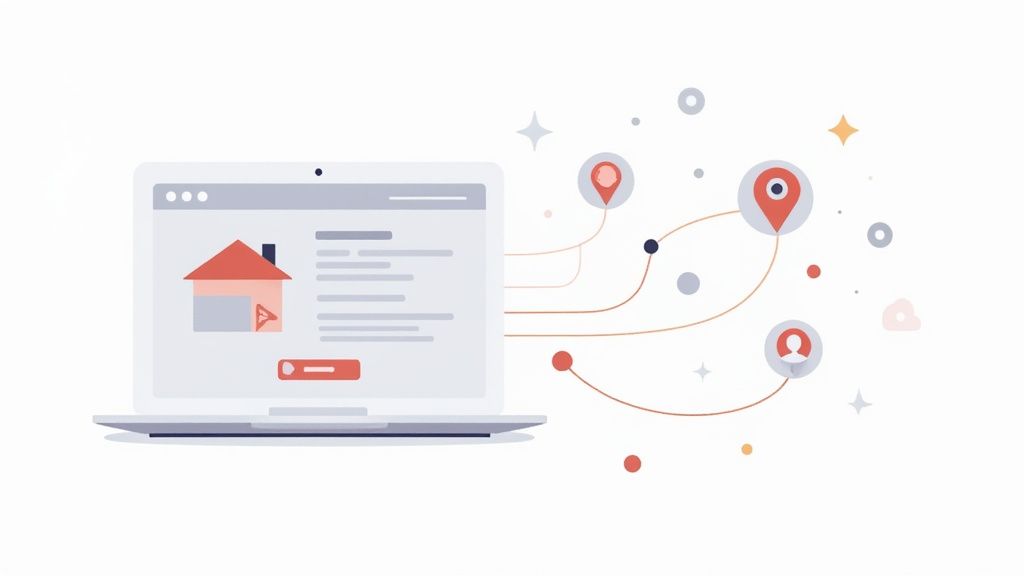
For any in-person event, an embedded map is a must. Don't just list the address in plain text. Use a tool like Google Maps to embed an interactive map directly on your "Venue" or "Location" page. This lets people instantly visualize where they're going and get directions with a single tap.
Finally, make it easy for people to join the conversation. Add prominent icons that link directly to your event's Facebook, LinkedIn, or Instagram profiles. This encourages attendees to connect with each other, follow along for live updates, and share their own excitement. You're not just building an audience; you're building a community.
Optimizing for Search and Social Sharing
You've poured a ton of hard work into building your event site. The last thing you want is for your masterpiece to go unseen. A slick, functional website is only half the battle - people actually have to find it.
This is where a little bit of optimization for search engines and social media makes a world of difference.
Think of it this way: you just built a digital venue for your event. Now, you need to put up the signs to guide people to the front door. Search Engine Optimization (SEO) and social sharing tags are those signs.
Getting Found on Google
Let's start with the on-page SEO basics. You don't need to be a technical wizard to get this right, but ignoring it means you're completely reliant on paid ads or direct links for traffic. Organic search is a powerful - and free - channel for pulling in potential attendees who are already looking for an event just like yours.
The whole point is to clearly signal to Google what your event is all about. This process kicks off with identifying your core keywords. What would someone actually type into a search bar to find you?
- For a local business workshop, keywords might be "small business workshop in Austin" or "marketing masterclass for entrepreneurs."
- For a bigger conference, you might target "annual tech conference 2025" or "fintech innovation summit."
Once you have a handful of target phrases, it's time to weave them naturally into the key parts of your website. Don't go overboard and stuff them everywhere. Just make sure they show up in the most logical places.
Fine-Tuning Your On-Page SEO
With your keywords ready, it's time to put them to work. There are a few high-impact spots on your site where these terms will make the biggest difference for your search visibility.
Here are the key elements to focus on:
- Page Titles (Title Tags): This is the main headline that appears in Google's search results and in the browser tab. It needs to be clear, concise (around 60 characters), and feature your main keyword. Something like, "InnovateTech Conference 2025 | The Future of AI in Business" works perfectly.
- Meta Descriptions: This is the short snippet of text under your page title in the search results. While it doesn't directly influence your ranking, a compelling description of around 155 characters acts like a free ad, convincing people to click. Tell them what the event is and what they’ll get out of it.
- Headings (H1, H2, H3): Use your keywords in the main headings on your pages. Your homepage's main headline (the H1 tag) should state exactly what the event is. Subheadings (H2s and H3s) are great for targeting related, secondary keywords.
SEO isn't a one-and-done task. It's about making your site as clear and helpful as possible for both people and search engines. A well-optimized site doesn’t just rank higher - it builds trust by giving people clear, relevant info right from the search page.
Making Your Content Sharable
Now, let's switch gears to social media. When someone shares a link to your event website on LinkedIn, Facebook, or X, you want it to look incredible. A plain, generic link is easy to scroll past. But a beautiful preview card with a custom image, title, and description? That can stop someone in their tracks.
This magic is controlled by Open Graph (OG) tags. They're just simple snippets of code in your website’s HTML that tell social platforms what to display.
Most modern website builders like Squarespace or WordPress (with a plugin like Yoast SEO) make this incredibly simple. You won't need to touch a line of code - just fill out the social sharing fields for each page.
Here’s what you should customize:
- OG Title: The headline for your social media preview.
- OG Description: A short, punchy summary of your event.
- OG Image: A visually striking graphic that represents your event. A size of 1200x630 pixels is the sweet spot.
Taking a few minutes to set these up ensures that every single share acts as a mini-advertisement, driving more clicks and spreading the word across social networks.
Your Top Event Website Questions, Answered
Even with a solid plan, a few questions always seem to pop up when you're building an event website. It’s a big project, and it's easy to get stuck on the details. Let's walk through some of the most common questions we hear from organizers to get you moving forward with confidence.
When Should I Launch My Event Website?
Ideally, you want your website live three to six months before a big conference or festival. If you're planning something smaller, like a workshop or a local meetup, one to two months is usually plenty of time.
The real trick is to get it online the moment you have the essentials locked down: your event's name, the date, and the venue (physical or virtual).
Launching early isn't just about being prepared. It gives you a massive head start on building authority with Google, which helps people find your event organically. More importantly, it gives your early marketing efforts a place to land and lets you start collecting those crucial early-bird registrations.
Not quite ready for a full launch? No problem. A simple "coming soon" page with an email signup form is a great way to start building a list of interested people even sooner.
What's the Single Most Important Feature on the Site?
This one’s easy: a clear and frictionless registration process. Hands down.
Every other piece of your website - the slick speaker bios, the detailed agenda, the sponsor logos - is all there to funnel a potential attendee to one single action. If that final step is confusing, slow, or feels untrustworthy, you’ve lost them.
Think about how many times you’ve bailed on an online purchase because the checkout was a nightmare. The exact same thing happens here.
Make your "Register Now" or "Buy Tickets" buttons impossible to miss. They should be on every single page. Keep the form itself simple and mobile-friendly, asking only for what you absolutely need to get them signed up. You can always ask for more details later, but that initial commitment needs to be effortless.
How Do I Make Sure People Actually Show Up?
Getting the registration is a huge win, but your job isn't over. The real challenge is turning that registration into an actual attendee. This is where your post-registration engagement becomes your best friend.
The first thing you should do is send an immediate confirmation email with a big, bold "Add to Calendar" link. It’s a simple click that moves your event from their messy inbox into their actual schedule.
An "Add to Calendar" button is one of the most effective, low-effort ways to boost attendance. It turns a passive registration into an active commitment right in their calendar, making it so much harder for your event to be forgotten.
This is where a tool like our service, Add to Calendar PRO, makes things seamless for your attendees. One click, and the event is on their Google, Outlook, or Apple calendar.
After that, a well-timed email sequence is your secret weapon:
- One Week Out: Send a reminder to build some hype. Maybe spotlight a keynote speaker or a session you know everyone is excited about.
- The Day Before: Give them the essential logistics. Think parking info for an in-person event or the direct link for a virtual one.
- One Hour Before: For virtual events, a final, quick "we're starting soon!" email is a fantastic nudge to boost live attendance.
Do I Really Need a Website if I’m Using Eventbrite?
While a platform like Eventbrite gives you a functional page, having your own dedicated website gives you control. It’s the difference between renting an apartment and owning your own house.
A dedicated site lets you:
- Create a Fully Branded Experience: You’re in charge of the design, the flow, and the entire user journey. It will feel 100% like your event.
- Tell a Richer Story: You have unlimited room to build a compelling narrative, show off your speakers in detail, and give your sponsors proper recognition.
- Own Your Data: You can build your own email list and use powerful analytics to understand what your visitors are doing, without being boxed in by a third-party platform.
The best part? You don’t have to pick one or the other. You can embed Eventbrite’s registration widget right onto your own beautiful website. This gives you the best of both worlds: Eventbrite's powerful ticketing system combined with the total marketing freedom of your own domain.
Ready to turn your website visitors into committed attendees? With Add to Calendar PRO, you can effortlessly add one-click calendar buttons to your site, confirmation pages, and emails, drastically reducing no-shows and keeping your event top-of-mind. Explore how our service can elevate your event marketing at https://add-to-calendar-pro.com.