Key Takeaways:
- 🎨 Beautiful UI elements are often the first to fail accessibility audits - and attract lawsuits
- ⚖️ ADA Title III lawsuits rose 37% in early 2025, with settlements ranging from $5,000 to $75,000
- 🔍 Automated accessibility tools miss critical failures that real users experience daily
- ✅ WCAG 2.1 AA compliance requires 4.5:1 contrast ratios, 44px minimum touch targets, and meaningful screen reader announcements
- 💡 Accessibility constraints actually breed better, more creative design decisions
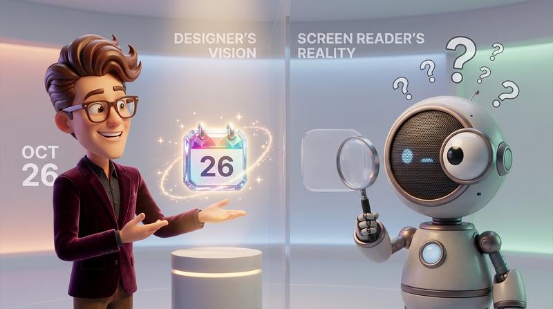
Your design team spent three weeks perfecting that share calendar button. The gradient was chef's kiss. The micro-interactions were buttery smooth. The hover state? Absolutely delicious.
Then a screen reader user tried to use it. And filed a complaint.
Here's the uncomfortable truth: the prettiest UI elements in your product are often the most exclusionary. That share calendar button sitting in your beautiful event page? It might be a ticking legal time bomb.
Why Accessibility Complaints Target the Prettiest UI Elements
It sounds counterintuitive, right? Shouldn't broken, ugly interfaces be the problem?
Nope.
Designers pour their hearts into custom components. They override browser defaults. They create bespoke interactions. And in doing so, they often strip away the native accessibility features that "ugly" default elements provide for free.
The share calendar button is a perfect example. It's small, interactive, and often treated as a "nice-to-have" feature rather than critical infrastructure. So it gets styled aggressively - and tested minimally.
According to recent data on ADA web accessibility lawsuits, ADA Title III lawsuits against websites rose 37% in early 2025. Settlement costs typically range from $5,000 to $75,000 - and that's before attorney fees, redesign costs, and the reputation damage you can't put a price tag on.
The share calendar button your designer loved? It might cost you more than their annual salary to fix after the fact.
The Myth of Beautiful vs. Accessible
Let's kill this myth right now.
Designers have been sold a false choice: you can have a gorgeous interface OR an accessible one. Pick your poison.
This is complete nonsense.
"Design is not just what it looks like and feels like. Design is how it works." - Steve Jobs
The real issue? Most design systems treat accessibility as an afterthought. It's the checkbox you tick before launch. The audit you run once and forget about. The "we'll fix it in v2" promise that never materializes.
But here's what happens when you retrofit accessiblity after launch:
| Timing | Cost | Effort | Risk |
|---|---|---|---|
| Built-in from day one | Low | Integrated | Minimal |
| Added during development | Medium | Moderate | Low |
| Retrofitted post-launch | High | Extensive | High |
| Fixed after complaint | Very High | Emergency | Critical |
The math is brutal. Fixing accessibility issues after a complaint costs 10-100x more than building them in from the start.
What WCAG Actually Requires for Interactive Calendar Elements
Let's get specific. According to the official WCAG 2.1 specification, Level AA compliance (the standard most organizations target) requires:
- Contrast ratios: 4.5:1 for normal text, 3:1 for large text and UI components
- Touch targets: Minimum interactive area for reliable activation
- Keyboard accessibility: Full functionality without a mouse
- Screen reader support: Meaningful announcements that convey purpose and state
Your share calendar button needs to meet ALL of these. Not most. All.
The 4 Silent Failures in Most Share Calendar Buttons
Here's where it gets real. These are the failures that slip past automated tools and designer reviews - until an actual user with a disability encounters them.
1. 🎨 Contrast Ratios That Pass Tools But Fail Real Users
You ran your colors through a contrast checker. It passed! Great, right?
Not so fast.
As WebAIM's contrast guide explains, WCAG 2.1 expanded requirements beyond just text. Criterion 1.4.11 now requires non-text elements like UI components to maintain at least 3:1 contrast against adjacent colors.
That subtle gray calendar icon on your light gray button? It might technically pass for the button text but fail for the icon itself. And here's the kicker - your brand colors aren't exempt from these standards (only logotypes get a pass).
2. 👆 Touch Targets That Work for Thumbs But Exclude Tremor Conditions
Your share calendar button looks perfect at 32x32 pixels. Clean. Minimal. On-brand.
But for users with motor impairments, tremors, or limited dexterity, that tiny target is essentially unusable. The minimum recommended touch target is 44x44 pixels - and honestly, 48x48 is better.
Check out our accessibility compliance checklist for the full breakdown of touch target requirements.
3. 🔊 Screen Reader Announcements That Say Nothing Useful
Your button says "Share" to sighted users. What does it say to screen reader users?
Often: "Button."
Or worse: "Icon, button, clickable."
That's not accessibility. That's technically compliant garbage. A screen reader user needs to know:
- What this button does
- What it's related to
- What will happen when they activate it
"Add this event to your personal calendar" is accessible. "Button" is not.
4. 🌍 RTL Language Support That Breaks Your Carefully Crafted Layout
You've got a beautiful left-to-right layout. The calendar icon sits to the left of the text. The dropdown animates from the right.
Now flip it for Arabic or Hebrew users.
Does your share calendar button still work? Does the dropdown appear in the right place? Does the icon alignment make sense?
For most custom implementations, the answer is a painful "no."
Why 'Works on My Machine' Fails Accessibility
Here's the deal: if you're testing with a mouse, you're not testing.
I mean it. Mouse testing covers maybe 70% of your users. What about the rest?
- Keyboard-only users: Can they tab to your button? Activate it with Enter or Space? Navigate the dropdown?
- Screen reader users: Does your button announce properly? Does the dropdown content get read?
- Mobile users: Does the touch target work reliably? Does the button work in both orientations?
- Users with cognitive disabilities: Is the interaction pattern predictable? Are error states clear?
Automated accessibility checkers catch maybe 30-40% of real issues. They'll tell you if your alt text is missing. They won't tell you if your alt text is useless.
For a deep dive into keyboard navigation and focus states, we've covered the systematic exclusion problem in detail.
The Inclusive Design Approach That Keeps Your Aesthetic Intact
"Constraints can be an advantage in creative work. Not always, but very often." - Jason Fried
Here's the mindset shift that transforms accessibility from burden to superpower: constraints breed creativity.
When you're forced to meet a 4.5:1 contrast ratio, you make better color choices. When you need a 48px touch target, you design cleaner interfaces. When you write meaningful screen reader labels, you clarify your own understanding of what the button does.
Focus States That Enhance Rather Than Uglify
Stop hiding focus states. Yes, that blue outline "looks ugly" on your pristine design.
But here's the secret: you can customize focus states to match your brand. A subtle but visible ring in your primary color. A gentle glow effect. A clear but beautiful indicator.
The goal isn't to eliminate focus states - it's to design them intentionally.
Color Choices That Satisfy Brand AND Contrast
Your brand guidelines say "use #7B7B7B for secondary text." But that fails contrast on white backgrounds.
So you nudge it. #5A5A5A passes while staying within the gray family. Your brand team won't notice. Your users with low vision will thank you.
Every brand palette can be accessibility-adjusted without losing its identity. It just takes intention.
How Add to Calendar PRO Handles the Hard Parts
Look, you could build all this yourself. Spend weeks on WCAG research. Test across screen readers. Handle RTL layouts manually. QA every interaction pattern.
Or you could not.
Add to Calendar PRO ships with:
- ✅ Pre-built components meeting WCAG 2.1 AA out of the box
- ✅ Full style customization without breaking compliance
- ✅ Screen reader support you don't have to QA yourself
- ✅ RTL language support that actually works
- ✅ Touch targets sized correctly for all users
- ✅ Focus states that are visible AND beautiful
The share calendar button your users interact with should work for all your users. Not just the ones testing with a mouse on a MacBook Pro.
For teams serious about accessible calendar sharing without sacrificing design, this is the intelligent shortcut.
Implementation Patterns for Design-Conscious Devs
Let's get practical. If you're building custom share calendar buttons, here's what actually works:
CSS Strategies for Accessible Buttons
.calendar-button {
  min-width: 48px;
  min-height: 48px;
  padding: 12px 16px;
}

.calendar-button:focus-visible {
  outline: 2px solid var(--brand-primary);
  outline-offset: 2px;
}
Keyboard Navigation That Feels Intentional
- Tab focuses the button
- Enter/Space activates the dropdown
- Arrow keys navigate options
- Escape closes the dropdown and returns focus
- Focus trapping keeps users inside the modal
Touch Targets Without UI Bloat
You can have a visually compact button with an expanded touch area:
.calendar-button::before {
  content: '';
  position: absolute;
  inset: -8px;  /* Expands touchable area */
}
Clean visual design. Accessible interaction area. Both.
Accessibility as a Design Constraint That Elevates Your Work
The share calendar button is a small piece of your interface. But it's a perfect test case.
Can you build something beautiful that works for everyone? Can you accept constraints as creative fuel rather than creative limitations?
The best designers already know the answer. They've internalized that accessibility and aesthetics aren't competing goals - they're complementary ones.
Your share calendar button can be the most beautiful element on the page AND fully accessible. It can delight your designer AND pass an audit. It can look amazing AND never trigger a complaint.
That's not a compromise. That's just good design.
Beauty and inclusion coexist. The only question is whether you'll build them in from the start - or pay to retrofit them later.